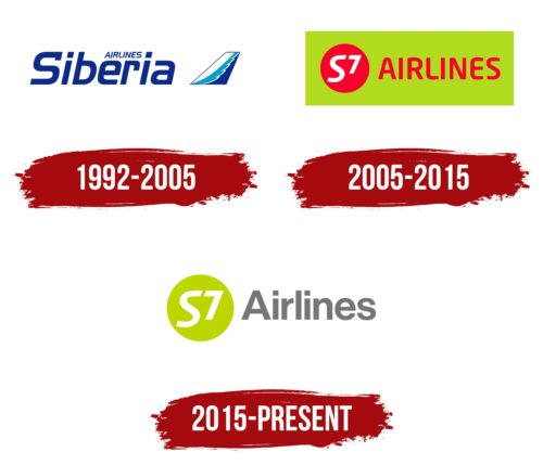
The S7 Airlines logo looks very simple and does not associate with the aviation industry in terms of colors or imagery. This distinctiveness sets the Siberian company apart from its competitors, who strive to showcase their connection to the sky and air travel in various ways.
S7 Airlines: Brand overview
S7 Airlines, initially known as Siberia Airlines, is a prominent airline in Russia that commenced its operations in 1992. With its headquarters located in Moscow, S7 has gained recognition as the second largest airline in Russia, only next to Aeroflot. It is also a member of the Oneworld airline alliance, signifying its global service standards.
With Moscow Domodedovo Airport serving as its principal hub, the airline provides scheduled domestic and international passenger and cargo services. The airline has a broad network, servicing over 150 destinations across Russia, the CIS region, Europe, Asia, and the Middle East.
The airline’s fleet includes approximately 150 aircraft from the Airbus A320 family and Boeing 737s. It is privately owned by the S7 Group, co-owned by Alisher Usmanov and Vladimir Obyedkov, and Globus Airlines.
In 2021, S7 transported 14.7 million passengers, accounting for a 40% share of the Russian aviation market. Although the airline initially emphasized domestic and regional routes within Russia, it has recently expanded its international services.
S7 Airlines has proven its commitment to operational and service standards by acquiring the IATA’s Operational Safety Audit (IOSA) certification. The airline’s logo, featuring a white goose wing, is a nod to its Siberian roots, while its motto, “Sincerely Yours,” speaks to its dedication to passenger service.
Meaning and History
What is S7 Airlines?
This is the largest private airline in Russia, based at Moscow’s Domodedovo Airport and Novosibirsk’s Tolmachevo Airport. The company stands out for its extensive route network, covering Russian cities and international European and Asian destinations. It is known for its modern fleet, primarily consisting of Airbus and Boeing aircraft, and its innovative approach to passenger service, including an advanced online booking platform and a mobile app. The company is recognized for its S7 Priority loyalty program, integrated with the global Oneworld alliance, allowing passengers to earn and redeem miles on flights with many international airlines.
1992 – 2005
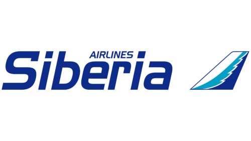
The company S7 Airlines was originally founded as Siberia Airlines, and its initial logo reflects this with the corresponding name. The design is simple, emphasizing the brand’s connection to the cold region of Eurasia. Interestingly, the blue color here represents not the vast skies as with other airlines but snow and frost. Even the italic Handel Gothic font used for the text appears unfriendly and cold.
Next to the text is a right-leaning trapezoid representing an airplane’s wing or tail. It is covered with white, light blue, and dark blue stripes, resembling layers of ice. This is an unfortunate choice for an airline, as every aircraft must undergo de-icing before a flight. Many aviation accidents have occurred because frozen precipitation remains on the wings and tail. Overall, the logo evokes a sense of coldness and has negative associations.
2005 – 2015
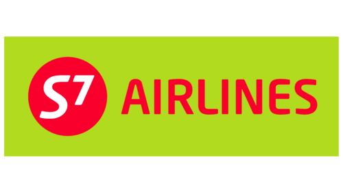
In 2005, the brand was renamed S7 Airlines and changed its identity. The new emblem does not connect the company to the aviation industry. Even the frozen wing, which was a harbinger of disaster, disappeared. The central element is a cherry-red (#D61C38) circle with white “S7” glyphs inside. The designers depicted the sun, but it seems aggressive and burning here rather than warm. The red circle and curved seven with softened corners look like they were taken from the American soft drink 7 Up logo.
Next is the word “AIRLINES,” written in the proprietary Neo Sans font. The uneven, flexible letters give an impression of ephemerality and uncertainty. The logo lacks elements that convey the company’s reliability. The designers addressed this by adding a large rectangle as the base. However, its bright green shade (#BAD405), close to swampy, reduces the clarity of the cherry-red text due to poor color compatibility.
2015 – today
To correct the color palette mismatch, the designers removed the red color, eliminating aggression. However, the logo now appears neutral and emotionless, as the combination of gray, white, and dark lime lacks meaningful impact. These colors do not align with the aviation industry and are unrelated to S7 Airlines’ historical homeland.
The associations with the 7 Up brand have not disappeared but have become even stronger. The green circle now looks like a lime used in the soda drink. The “S7” text inside is still written in Neo Sans font, but the seven is larger than in the previous version. The number is slightly raised, giving the impression that it is taking off. Incidentally, a similar approach is used in the 7 Up logo.
The word “Airlines” is now written in a bold sans-serif font, similar to Neue Haas Grotesk Display 65 Medium or Europa Grotesk Nr 2 SH Bold. The letters have a standard geometric form, which is unremarkable. This indicates that the airline adheres to conventional standards. Moreover, the name is barely noticeable due to the pale gray color.
