![]() Sacramento State Hornets Logo PNG
Sacramento State Hornets Logo PNG
A stylized abstract monogram in a minimalist style, a modern logo for the Sacramento State Hornets, the athletic department of California State University. The emblem is distinguished by its style and seriousness while retaining references to the club’s mascot.
Sacramento State Hornets date to 1947, when California State University, Sacramento was founded. On December 5, 1947, students chose “Hornets” over “Elk,” and basketball debuted in 1948. The mascot Herky appeared in 1955.
Football began in 1954 under Dave Strong, losing its first season, then winning in 1955 against Southern Oregon. From 1954 to 1982, the program played in the Far Western Conference, later moving to the Big Sky Conference in 1996. In the Division II years, volleyball reached national finals in 1979 and 1989, baseball in 1988, and cross country placed second in 1979.
The transition to Division I began in 1991 following a student vote to increase funding. Football entered the FCS in 1993, though financial pressure led to another vote in 1995. In the Big Sky Conference, volleyball won 11 straight titles from 1997 to 2007, while tennis added multiple championships.
The football program peaked in 2019–2022 under Troy Taylor. In 2019, the Hornets won the conference and reached the FCS playoffs, finishing third nationally. In 2022, the team completed an unbeaten regular season, beat UC Davis Aggies 27:21, then defeated Richmond before losing to Incarnate Word 63:66.
Some teams competed in other leagues. Rowing moved to Conference USA in 2013 and then to the American Athletic Conference in 2014–15. In 2025, the university announced its move to the Big West Conference, effective in 2026.
Meaning and History
![]()
The emblems of the Sacramento State Hornets feature a hornet, the university’s main mascot. There is also a clear evolution in the design, transitioning from a frivolous cartoon style to modern abstraction.
What is Sacramento State Hornets?
The Sacramento State Hornets consist of 21 student teams affiliated with California State University. The athletes compete in the NCAA’s first division, are part of the Big West Conference, and are members of numerous prestigious organizations. The football and women’s volleyball teams compete in the Western Athletic Conference, and women’s rowing is in the American Athletic Conference.
1991 – 2003
![]()
The 1991 logo looks childish: it features a striped yellow-and-black hornet with a human face and two hands. It is dressed in a green sweater with the white abbreviation “SAC.”
2004 – 2005
![]()
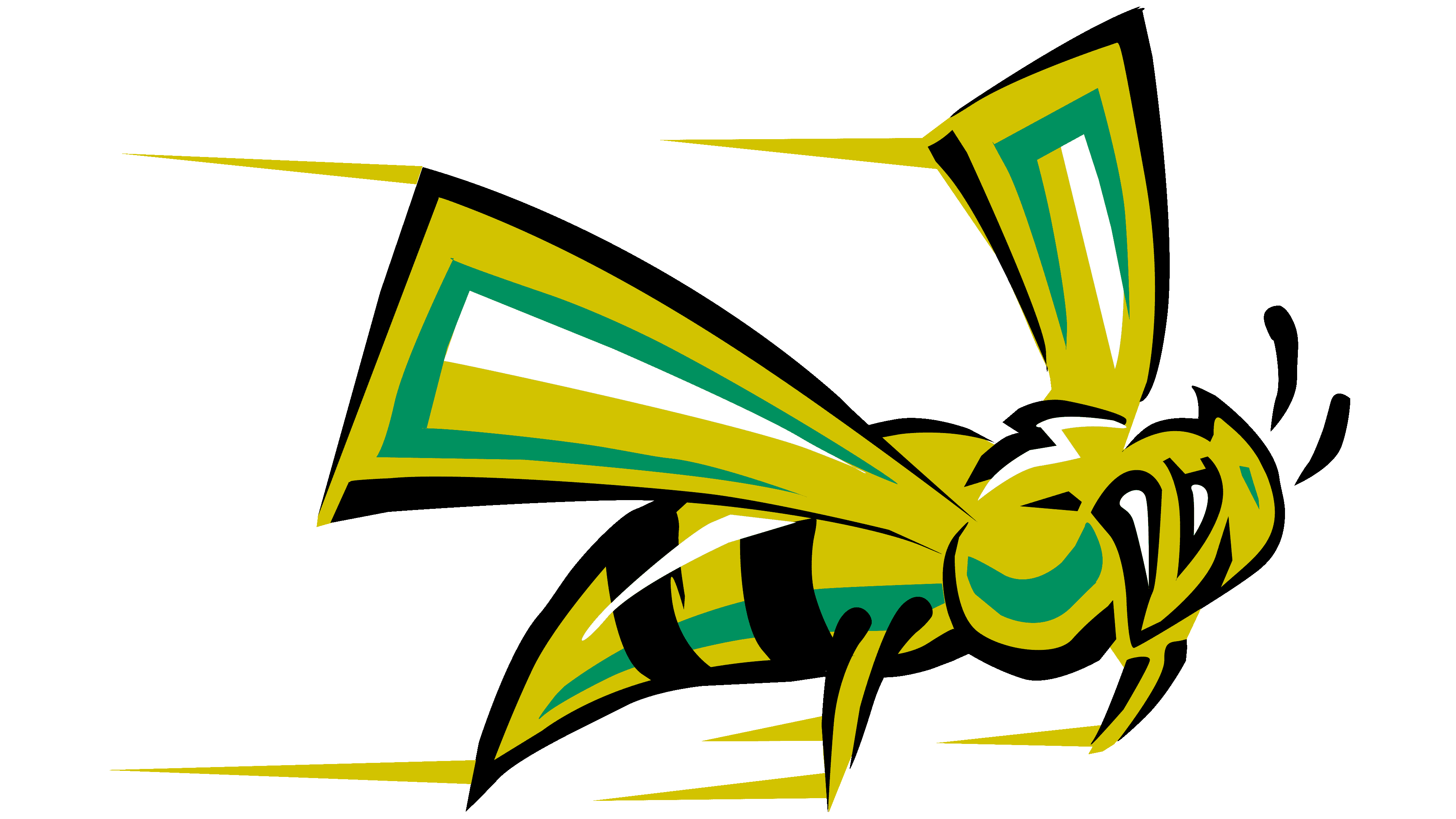
In 2004, a new brand name was adopted. The developers focused on the sports department’s name, so the phrase “Sacramento State Hornets” takes up most of the space. The first two words are written in bold green letters on a black background, making the “Hornets” seem out of place against them. A flying hornet with a sharp sting is in the lower right corner.
2006 – today
![]()
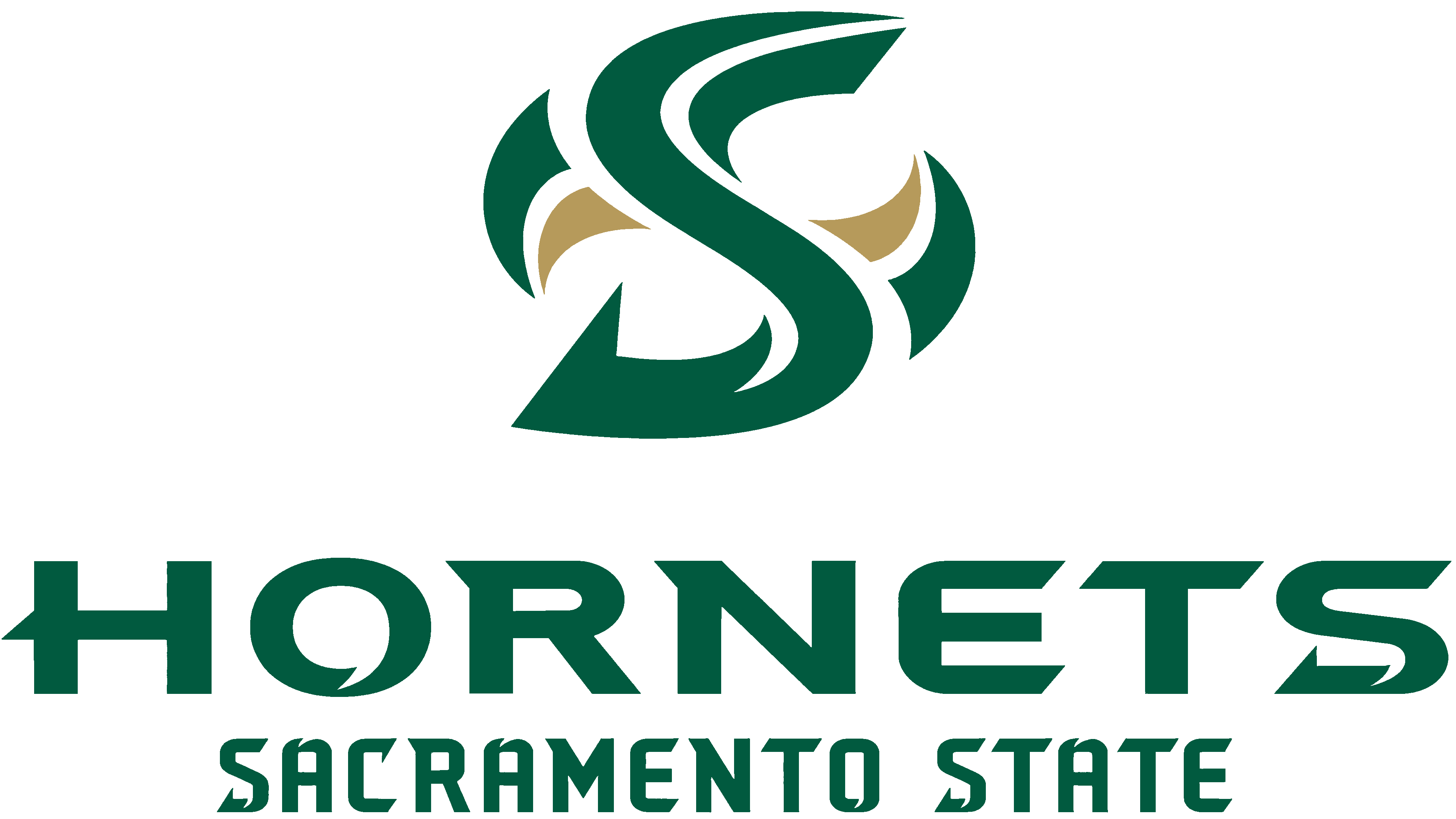
The next logo redesign occurred in 2006. The authors revised the style, removing the drawing and inscriptions. Instead, they introduced a stylized letter “S” with curls and bends. But attentive viewers may notice a veiled wasp hint: small geometric figures on both sides of the letter resemble insect wings.
Font and Colors