The Safair logo promises passengers a comfortable and safe journey and guarantees a high level of professionalism from the airline. It emphasizes the company’s modernity, reliability, and commitment to high service standards.
Safair: Brand overview
Safair has been a leader in the aviation industry for more than five decades with its iconic Lockheed L-100 Hercules cargo aircraft fleet. Based at O.R. Tambo International Airport in Kempton Park, South Africa, Safair has become a world-renowned cargo airline.
1965 Tropair (Pty) Ltd came into being, laying the foundation for Safair Operations.
The turning point came in March 1970 when Safmarine, a well-known South African shipping company, acquired Tropair. Wasting no time, the newly formed company took to the air on March 18, launching its first flights.
In the 1980s, Safair Freighters gained the confidence of the South African Defense Force, becoming their preferred cargo airline for strategic missions.
Safair’s operations are based on an impressive fleet of Lockheed L-100 Hercules freighter aircraft, which are the company’s backbone. These vintage aircraft enable Safair to provide unparalleled service, easily meeting the needs of cargo operations worldwide.
Safair continues to be a leading cargo airline, delivering cargo to the most remote locations worldwide.
Meaning and History
What is Safair?
Safair’s journey as an aviation company began in 1965 as a subsidiary of Safmarine, which focused primarily on cargo and charter operations. In 2014, Safair launched its low-cost passenger airline FlySafair. The new venture proved successful, and by 2020, FlySafair had become a significant player in South Africa’s domestic airline market. Safair’s headquarters remained at O.R. Tambo International Airport in Kempton Park, South Africa, all these years.
2000s – 2010s
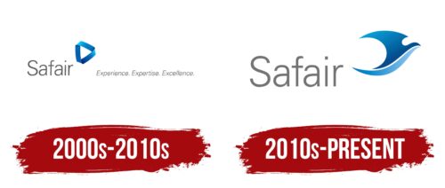
The most noticeable element of the logo is a blue triangle reminiscent of a Möbius strip. Interestingly, a similar triangle can be found on the Google Drive emblem. This unique geometric figure embodies the concept of infinity, which, in the context of an airline, symbolizes the constancy of the aviation industry.
Its shape suggests flexibility and mobility, highlighting Safair’s ability to quickly adapt to changing conditions and offer passengers a wide range of routes. Using the Möbius strip underscores an innovative approach and a commitment to advanced technologies. Blue represents reliability, stability, and safety, aiming to inspire trust in the brand.
The twisted figure separates the company name from its slogan, “Experience. Expertise. Excellence,” which conveys several key ideas:
- It indicates Safair’s extensive experience in air transportation.
- It demonstrates a high level of knowledge and skills.
- It expresses a dedication to impeccable quality and modern technologies.
The text uses a sans-serif font from the Univers family, a clean and versatile neo-grotesque. Its simplicity and clarity emphasize the ideas expressed in the slogan, particularly in its italic variant. The thin letterforms pair well with the elegant figure resembling a Möbius strip.
A restrained gray color contrasts with the striking blue gradient. Together, they balance each other, maintaining a harmonious and balanced image for the airline.
2010s – today
The airline’s logo features a bird flying to the right, designed with smooth, rounded lines that convey ease, comfort, and safety. The pointed ends of the bird elements highlight the staff’s alertness and readiness. The bird comprises two parts, separated by a white stripe. The upper part is dark blue, while the lower is light blue. The gradient effect enhances the feeling of movement and forward progression, echoing the airline’s dynamic nature.
The double blue tones symbolize trust, reliability, and peace of mind, which are important values in aviation. These colors also reflect the vast expanse of the sky and the calmness of a smooth flight.
Below the bird, the company name is presented in a gray, bold, sans-serif font, with letters stretched upwards. This design underscores the professionalism of the airline, providing a solid foundation for the dynamic bird above it. The gray color of the text complements the bird, maintaining a balanced and cohesive design.
The logo’s design elements create a visually appealing and meaningful airline representation. The bird’s shape and coloring communicate comfort, safety, and alertness, reflecting the airline’s commitment to a reliable and pleasant travel experience. The company name’s design reinforces professionalism and trustworthiness, making the logo a strong representation of the airline’s values and identity.


