


![]() Safeway Logo PNG
Safeway Logo PNG
The Safeway logo invites you to come to the company’s stores. There is a wide selection of fresh and healthy products. According to the emblem, the company works for the benefit of customers and controls the path of goods from cultivation to preparation and packaging.
The Safeway supermarket chain is so large that it is the second-largest in North America. She owns many shops, manufacturing plants, and private brands. The company offers various products, including prepared meals, convenience foods, vegetables and fruits, and frozen seafood. In addition, general goods and groceries are sold on the shelves. Additionally, there are departments where you can buy flowers, medicines, freshly baked bakery products, and alcohol. Safeway, founded in 1915 by Marion Barton Skaggs as a small grocery store in American Falls, Idaho, has grown into the second-largest supermarket chain in North America and is now headquartered in Pleasanton, California. Originally named Skaggs Cash Store, it introduced self-service shopping to offer lower prices and quickly merged with Safeway Food Stores to form Safeway Inc. The retailer innovated through nutritional labeling, private-label goods, and modernized supermarkets with ample parking. Facing economic challenges in the 1970s and a hostile takeover by Kohlberg Kravis Roberts & Co in the 1980s, Safeway streamlined operations, selling divisions abroad and returning to public ownership. The company expanded through acquisitions of Vons Companies and Randall’s Food Markets, introduced the premium Safeway Select and organic O Organics product lines, and launched the Lifestyle store modernization program. Since 2015, the company has been part of Albertsons Companies, Inc., maintaining a strong presence primarily in the western U.S. and continually investing in digital transformation, fresh food offerings, online sales, and supply chain automation.
Meaning and History
![]()
Safeway was founded in 1915 when 27-year-old Marion Barton Skaggs bought a small grocery store from his father. Unlike other retail outlets, it operated on a self-service model, which saved on salaries for clerks, shopkeepers, and grocers, thereby reducing the cost of goods. Marion continued to develop the family business. He opened several more locations using a similar business strategy, enlisting his brothers’ help. This is how the extensive Skaggs network came to be.
In 1926, it doubled by acquiring Safeway stores, formerly known as the Sam Seelig Company. Marion immediately seized the opportunity, renamed the company Skaggs-Safeway, and, two years later (after merging with the Sanitary Grocery Company), it became Safeway. He did not want a grocery chain bearing his last name to remain after his death. In addition, the new name reflected the essence of the existing concept: cash payment, with no ability to take goods on credit.
This is how a small startup became the largest retailer, with over $44 billion in revenue. Its unique visual identity began in the early 1950s when the company opened stores with expansive display windows and curved roofs. Samples of corporate architecture have survived here and there. Around the same time (in the middle of the last century), the first version of the S-shaped logo appeared, which has been improved over the years.
What is Safeway?
It is a supermarket chain selling food, household goods, and everyday essentials. The stores offer a wide selection of fresh fruits and vegetables, meat and dairy products, baked goods, frozen foods, and home essentials. The brand is known for its convenience store locations, customer loyalty programs, and private label products.
1925 – 1952
![]()
![]()
After the merger of Skaggs and Safeway, the Skaggs-Safeway company was formed. Then, it was renamed again: the leaders removed the first word from the name. Above the shop entrances were rectangular signs with inscriptions in decorative frames. The text was “SAFEWAY STORES” (above) and “DISTRIBUTION WITHOUT WASTE” (below). The two phases were separated by a horizontal strip that connected the extreme “S” on the first line. These letters were enlarged and resembled dollar signs with strikethrough lines.
1952 – 1980
![]()
The first S-shaped symbol laid the foundation for a whole generation of similar emblems. An early version, The S Medallion, contained a red “S” with cut edges and uneven curvature. Its middle was very wide, making the edges appear short and narrow. Above and below, the letter went over the black ring, and the round base was white.
1980 – 2005
![]()
In the early 1980s, a logo called The Ribbon Leaf was created. “S” has acquired a more elegant shape with gentle curves. At the same time, its ends became pointed. The black ring was removed. Instead, two rounded square brackets were placed to the left and right of the letter, but did not touch it. These elements were deep red, almost burgundy. The general background remained white, as in the previous case. The inscription “SAFEWAY” appeared under the graphic composition. The designers chose a bold black typeface with asymmetrical serifs.
1999 – 2005
![]()
Simultaneously, the original version of The Ribbon Leaf was modified and adopted in the late 1990s. It contained the same elements as the original but in a different presentation. The “S” and the parentheses around it were white. The developers used a negative-space effect to make them stand out, adding a dark pink rectangle with rounded corners as a base. In shape, it resembled a TV screen. At the bottom was the same deep pink SAFEWAY FOOD & DRUG lettering. The supermarket chain’s name was on the first line, and the short slogan was on the second.
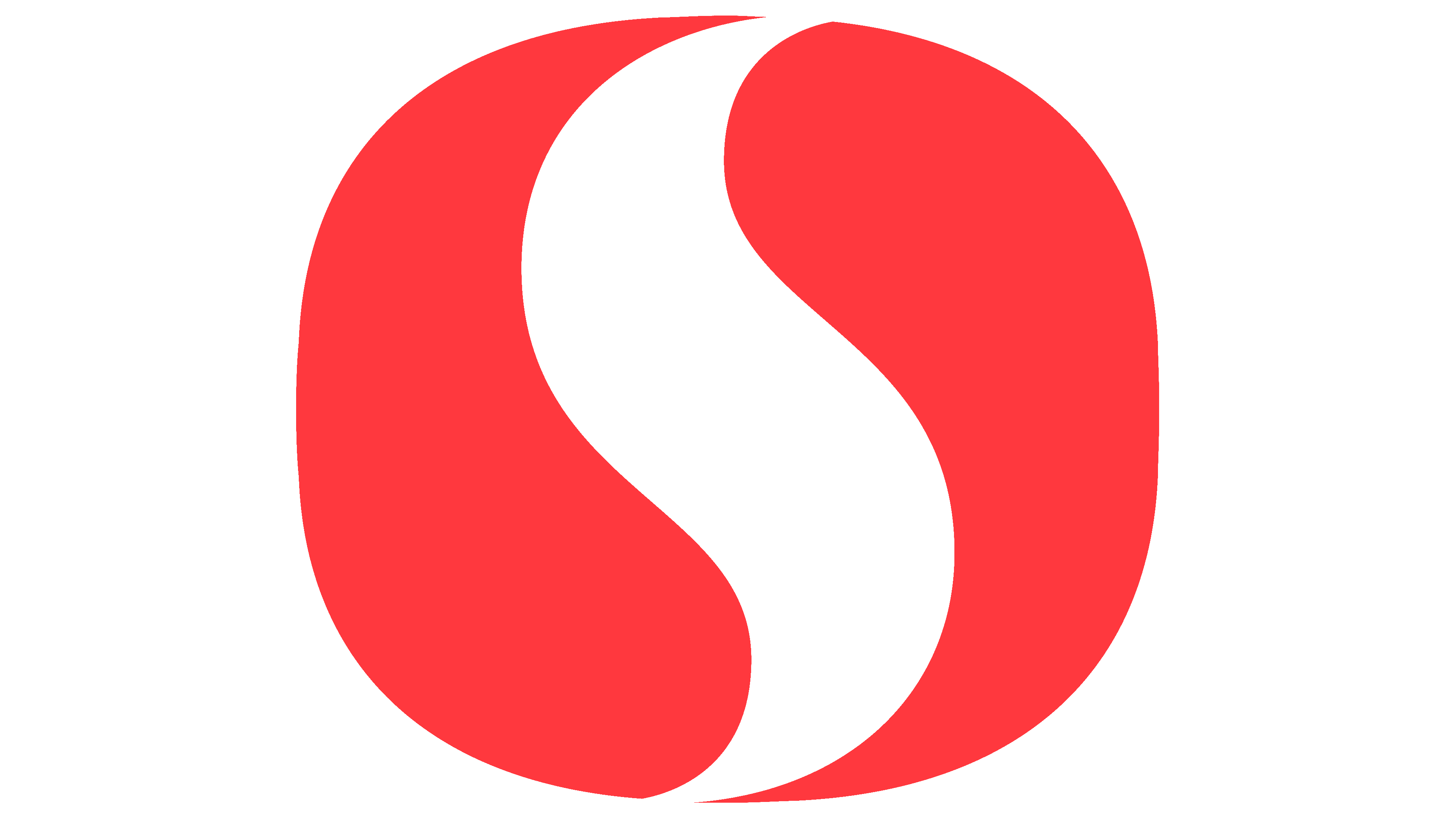
2005 – today
![]()
The Safeway logo, created in 2005, became the most recognizable in the brand’s history. Its shape resembles the classic Yin-Yang symbol, which led to its unofficial name, “Life.” While its structure maintains continuity with previous versions, it appears more modern.
The main element is the white letter “S,” which is no longer enclosed in brackets. It is placed inside a red shape with rounded corners. This is not a perfect circle but rather a heavily modified square. The curve of the letter creates a sense of smooth movement and expressiveness.
The red background contrasts sharply with the white letter. Red is associated with energy, movement, and confidence, making it a great choice for a major retailer aiming to attract customers.
The name “SAFEWAY” is written in black, sans-serif letters. The font is strict and modern, with no decorative elements.
The logo represents the brand’s evolution, preserving traditions and familiar imagery while presenting them in a fresh, more contemporary form. Its simple yet expressive graphics highlight the company’s stability and adaptability to the new realities of retail.
Font and Colors
In the current logo, the designers emphasized the elements’ similarity to the famous yin-yang symbols, which complement each other, personifying harmony, balance, and changeability in everything that exists. Considering the specifics of the brand, one should not look for a philosophical meaning in the emblem itself. This is just a good marketing ploy, an attempt to play up the letter “S” in an interesting way and create a memorable visual image. The S-shaped design is dynamic, with gentle curves and perfect symmetry.
Past versions (1980 to 2005) introduced the Icone Bold serif font. After the redesign, the supermarket chain’s name is spelled differently. The current typeface is very similar to SoftMaker’s Limerick Serial Medium. It is grotesque with selectively sharpened edges. The letters are low contrast because all the strokes are roughly the same thickness.
The inscription is painted in deep black (CMYK 50-40-40-100). The S-shaped element is white (#FFFFFF). The designers used the shade Safeway Red (#E41720) to make the base more visible.