


![]() Sailor Moon Logo PNG
Sailor Moon Logo PNG
The designers proposed the Sailor Moon logo for the English version, which is mystical yet calm. It reflects the spirit of the plot, the fairy-tale nature of the events, the magic, and the extraordinary occurrences. These elements are conveyed through a slightly tilted crescent moon that seems to sway in the sky, a wavy font with bouncing letters, and pastel shades.
Meaning and History
![]()
The main heroine of the franchise is a Tokyo schoolgirl named Usagi Tsukino. She befriended a talking black cat named Luna, who gave her a magical brooch. This artifact allowed her to transform into Sailor Moon. At first, the adventures were only covered in the manga. Then, anime, three feature-length cartoons, three short films, and one television movie were launched. In North America, the manga series appeared thanks to a license obtained by Kodansha Comics.
The Japanese manga Sailor Moon is well-recognized and very popular; it has sold many copies. In total, the number of sold copies exceeds 35 million units. In the emblem, as in the franchise itself, the main character’s magic, lightness, and light character, along with high artistic skill, are clearly evident. The humor is also felt, for which the comic received an international award. To date, there are three known “reincarnations” of its logo.
What is Sailor Moon?
Sailor Moon is a Japanese manga about a schoolgirl named Usagi Tsukino and a talking black cat named Luna. Thanks to a magical artifact, the girl can transform, which is depicted in her adventures. The author of the comic is artist-writer Naoko Takeuchi, who began working on it in 1991. It was first published in a magazine by publisher Kodansha of the Nakayoshi company. Now, the manga has become a franchise.
1994
![]()
In the pilot project, the emblem was indeed filled with magic. It was felt in the night sky, the scattering of bright stars, the large crescent moon, distant planets, delicate gradients, wavy inscriptions, and letters of different shapes and heights. The main element was still the moon, albeit waning. It was located in the center of a dark rectangle, representing a fragment of the night sky. The cosmic landscape optimally balanced the purely earthly object, the inscription stretching across the crescent.
However, the manga’s title was not even; it was like a tidal wave washing ashore. The glyphs were elongated, thin, and tall. Small serifs complemented them. Moreover, the double “OO” looked like pupils of eyes looking to the left. This impression was created due to the narrow, dark inner-letter space, which contrasted with the light circle.
1995 – 2003
![]()
For this variant, designers borrowed some details from the previous Sailor Moon emblem. For example, they retained the crescent, slightly tilting it and making it double. One crescent was inside the other, which seemed to surround it. This was made possible by shifting the moon: the upper part was depicted vertically, while the lower part was depicted almost horizontally. Both were painted in a silver-gray color and complemented by shadows. The inscription also came from the pilot logo. The letters were tall, bold, uppercase (except for “i”), and golden with a glint in the middle. Meanwhile, “S” and “M,” which stood at the beginning of the words, exceeded the size of the other glyphs. The crescent’s duality conveyed the comic’s heroine’s dual nature, her magical transformation from a real schoolgirl into a magical character.
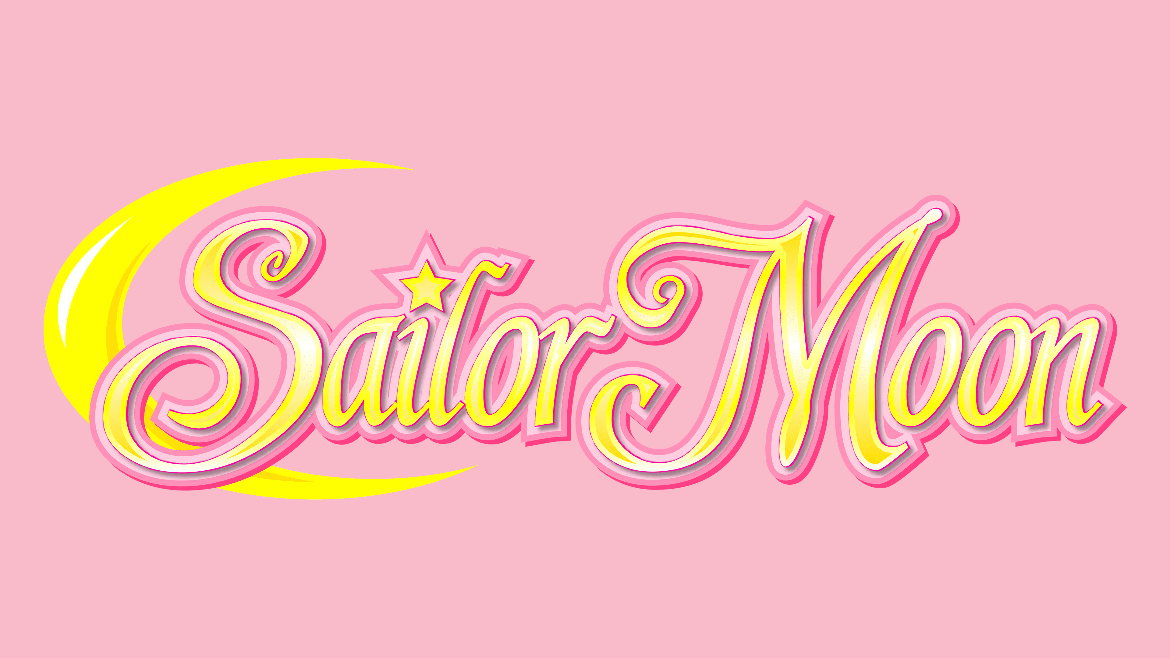
2011 – today
![]()
The modern logo is more cheerful and feminine than the first two. Bright colors, abundant light, a pink border, and a lot of gold characterize it. The inscription is written in a smooth, slightly italic calligraphic font. Most letters have curves and swirls. Designers replaced the dot over the “i” with a small star as a reminder of the magic and the night sky. At the beginning of the manga’s title, there is a golden crescent: it is thin, with horns stretched forward. One of them (the lower one) is so large that it reaches the penultimate letter in the word “Sailor.”
Despite the modernization, the Sailor Moon logo has not lost its magic. It remains magical, cute, and charming. While the shining stars in the night sky and the silvery moon used to create such an atmosphere, now it is maintained by the pink color, the rounded style of writing letters, and the golden crescent.
Font and Colors
An elegant and charming typeface has been chosen for the modern “Sailor Moon” inscription. Each line in it features intricate, airy, light, and soaring strokes. This font is close to Shardee by Bright Ideas studio. The logos’ color palette varies. Sometimes it is dark, while at others it is bright. The pilot emblem features deep blue-black hues evoking outer space or the night sky. It also features various shades of yellow, white, and silver.