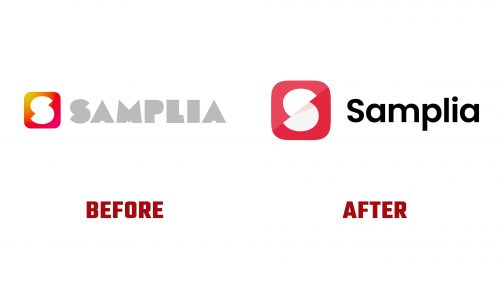
Samplia, known for its innovative approach to distributing free product samples through interactive vending machines, has introduced a refreshed logo that aligns with its evolving brand identity. The new design reflects Samplia’s focus on staying current with technology and customer experience, presenting a modern, minimalistic look in line with contemporary design trends.
The updated logo shifts from the previous geometric and playful design to something sleeker and more refined. The iconic symbol from the old branding remains, but the lines have been smoothed out, giving it a more polished appearance. The color palette now features shades of red and white, replacing the previous gradient of yellow to pink. This change simplifies the design and improves the brand’s clarity and recognizability.
Red is the dominant color, and it is a key choice. Red is often associated with energy, accessibility, and action—qualities that fit Samplia’s mission of making products easily available to consumers. The white elements within the symbol add balance and transparency, reinforcing the brand’s focus on a clear, user-friendly experience. The rounded, soft form of the symbol emphasizes approachability and ease of interaction, which aligns with what the brand offers.
The wordmark “Samplia” has seen a transformation. The new font is a clean, sans-serif typeface that conveys modernity and friendliness. The rounded letters complement the softer lines of the symbol, creating a cohesive look. This font is lighter and more minimalistic than the previous one, which was bulkier and more angular. The move to a streamlined, sans-serif font gives the brand a more contemporary and approachable feel without losing professionalism.
The placement and proportion of the elements in the logo are well-considered. The symbol is positioned to the left of the wordmark, creating a balanced composition that is visually appealing without being overwhelming. The clear spacing between the symbol and the text allows each part to stand independently while forming a cohesive design. This simplicity ensures the logo is adaptable across different media, from digital platforms to physical applications like vending machines and packaging.
Another important aspect of the rebranding is the removal of complex gradients and heavy design elements that characterized the old logo. The new flat design reflects the minimalist trend many modern brands are adopting. Samplia has created a fresh and uncluttered logo by eliminating unnecessary details, aligning with the brand’s goal of offering consumers a simple, streamlined service.
This updated look positions Samplia to continue leading in interactive product sampling, offering brands and consumers a fresh and engaging way to experience new products.


