


![]() Sam’s Club Logo PNG
Sam’s Club Logo PNG
The Sam’s Club logo shows that buyers and goods are always within the network. Becoming a club member is enough, and the entire warehouse of products will be available for purchase. Special programs, discounts, and mutual support await the system’s customers.
Meaning and History
![]()
Sam Walton launched a new type of commerce twenty-one years after opening the Walmart wholesale and retail chain. Sam’s Club made its first major acquisition in 1987 when it bought the SuperSaver Wholesale Warehouse Club in West Monroe, Louisiana. This allowed the brand to significantly expand its network by 24 warehouse points. He began his expansion in New Jersey, in the northeast of the country, gradually increasing the number of stores.
Clubs are, in fact, warehouses. They sell most of the goods in factory packaging and on pallets, that is, in bulk. The goods are stored in containers. The basic assortment comprises clothing, collectibles, jewelry, flowers, electronic equipment, crystals, glasses, meat, and other food products. Many objects have floristry, optics, bakery, photography, tire fitting, pharmacies, and cafes.
At the beginning of 2018, the chain announced a reduction in its employee headcount and the closure of some points of sale. In total, she liquidated 63 stores. Moreover, the staff there were not warned about the categorical measure: they were notified hastily on January 11 with a regular e-mail. At the same time, management announced that, based on the former outlet, Sam’s Club would open other wholesale outlets where former employees could get jobs again. And it was all about the state tax reform.
Despite the closure of several dozen warehouses, the company still managed to save its face. She modified the old emblems, creating new signs in the corporate style. In total, she has five logos in her arsenal.
What is Sam’s Club?
This is a chain of club-type shopping centers from the United States. She is engaged in the bulk sale of goods from Walmart-managed warehouses. Its founder is Sam Walton, after whom it is named. Sam’s Club was established in 1983 in Midwest City, Oklahoma.
1983 – 1990
![]()
At first, a sign with the name of a trading network was considered an emblem. It was used to designate a point of sale and for marketing purposes for placement on advertising media. It was a black inscription on a gray rectangle background. Half of the space was occupied by the large word “Sam’s.” The phrase “Wholesale Club” was slightly smaller and located to the right of it. In very small print in the lower right corner was the phrase “A Division of Wal-Mart Stores Inc.” It was separated from the main text by three strips: one wide and two narrow.
1990 – 1993
![]()
After rebranding the wholesale store chain, management approved a different logo. It was the same style as the old one: font, right angles, and a horizontal rectangle. Otherwise, everything was different. The top background is white, and the bottom is black. The word “Club” appeared in the dark rectangle, while the upper part used the opposite color scheme: the black inscription “Sam’s” on a white background. The developers removed most of the elements, focusing on minimalism.
1993 – 2006
![]()
The changes undertaken in 1993 brought many new things to the identity. The key innovation was the graphic combination of the previous emblem and the current logo’s innovative design. To do this, the authors placed the inscription diagonally in a rhombus. Another important factor in modifying the emblem is color. Black-and-white monochrome gave way to a blue-and-white palette.
2006 – 2019
![]()
The 2006 emblem consisted of an improved rhombus. The developers removed the background from the word “Club” to achieve the perfect balance of graphics and text, but left it with a sleek, grotesque font. The first part of the name, shown above, is set in a different typeface with serifs and mixed case. Above them, the designers placed a miniature sign composed of two superimposed translucent rhombuses. The left one was colored blue; the right one was green.
2019 – today
![]()
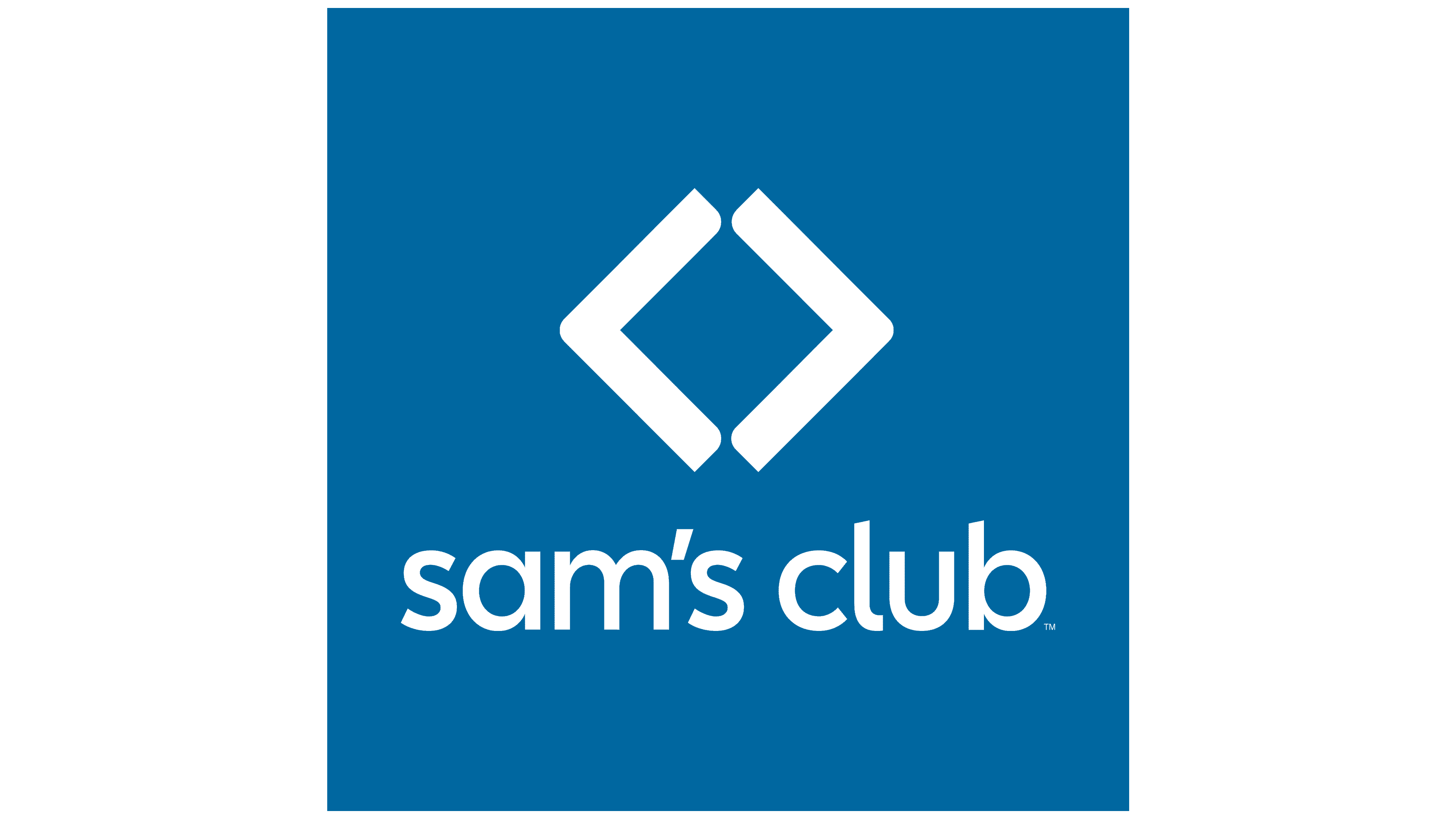
In an attempt to achieve the optimal logo, the retail and warehouse network simplified it as much as possible to show customers the brand’s wide availability and the products it offers. The name was set in a streamlined lowercase font without corners or sharp transitions. On the right, an icon made up of two pointers appeared. They are positioned to form a diamond.
Font and Colors
The identity of a commercial club is based on simple, understandable shapes, such as rectangles, even outlines, rhombuses, and wide and narrow stripes. The only tricky element is the serif word “Sam’s” in the 2006-2019 logo. The remaining details are presented clearly and recognizably, even with the warehouse network name placed diagonally.
One of the typefaces used in the Sam’s Club emblem is New Caledonia Regular. William Addison Dwiggins developed it, and it first appeared at Adobe. The modern typeface is reminiscent of Odudo Soft Regular.

Guided by the principles of simplicity and minimalism, the company chose restrained colors for the logo. These include black, dark blue, olive, white, and blue.
FAQ
What is Sam’s Club’s slogan?
The brand recently revamped its private label Member’s Mark with a new look and tagline. The new tagline, “Made with our members and the planet in mind,” highlights the brand’s focus on sustainability and dedication to its members. This change aims to make the brand more attractive to consumers who prefer environmentally friendly products.
What is Sam’s Club’s signature brand?
Member’s Mark is the brand’s hallmark, known for its high quality and exclusive membership pricing. Its products include organic, kosher, non-GMO, and fair trade options. Member’s Mark focuses on the environment by using eco-friendly packaging. These features ensure that customers receive products that benefit them and the planet.
What does the Sam’s Club logo mean?
The logo has changed significantly and now has a simple, modern look. It consists of two triangular brackets facing each other, forming a diamond in the middle. To the right of this figure is the brand name in lowercase, giving the logo a friendly, modern appearance. This design choice aligns with the brand’s aim to be a membership-based retail store that offers good value for money and easy access for customers. The overall look of the logo is clean and open, reflecting the key qualities the brand wants to convey to its audience.
Did Sam’s Club change its logo?
Yes, the logo has been updated several times. In 1993, the brand moved from a simple text design to a diamond symbol placed in the box to represent the nature of warehouse purchases. In 2019, the logo changed again, replacing the box with two triangular brackets folded together. This new design is simpler and more modern. These updates help the brand stay fresh and competitive in the retail market.
What font is the Sam’s Club logo?
The font used in the logo has changed over time. The brand previously used the New Caledonia Regular font, designed by William Addison Dwiggins. This font is known for its readability and classic style, giving the brand a traditional and reliable look. Today, the logo uses a sleek sans-serif font similar to Odudo Soft Regular. This font choice gives the logo a clean, minimalist appearance, making it look friendlier. This design fits well with the brand’s goal of being accessible and welcoming to all its members.
What does Sam’s Club have?
Warehouse stores carry a wide range of products, including fuel, food, electronics, furniture, clothing, and health and wellness items. These stores focus on accessibility, offering members-only bulk purchases at lower prices. This approach helps families, businesses, and other shoppers save money on essential items. The brand provides a comprehensive shopping experience, offering customers great value and a diverse selection of products.