


![]() San Diego Padres Logo PNG
San Diego Padres Logo PNG
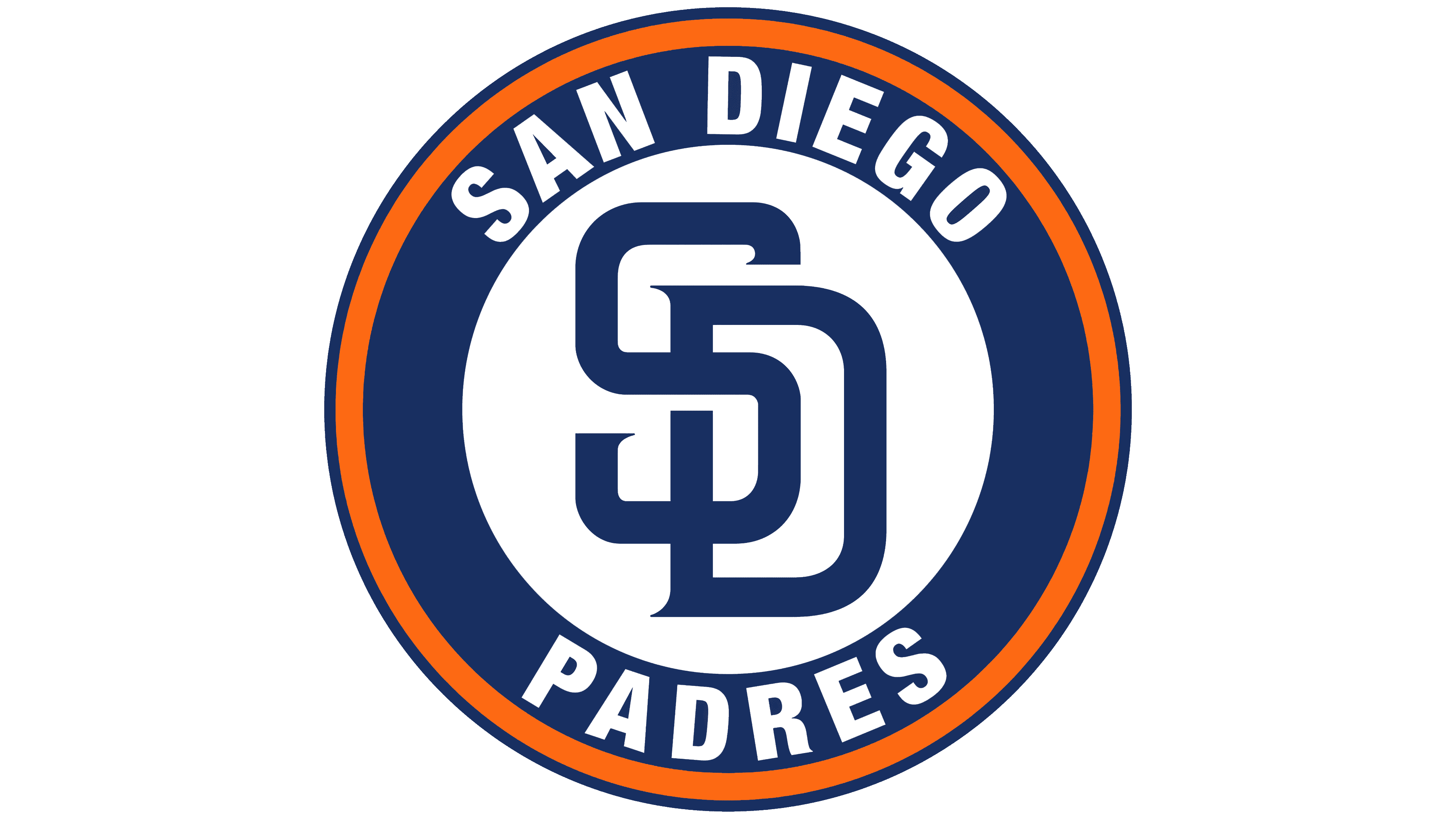
The emblem, in the form of a round, monochromatic medallion bearing a two-letter monogram from the name, represents the San Diego club’s visual identity. The name and logo of the San Diego Padres reflect the brand’s close connection to the city, its history, and its founders.
The San Diego Padres are a professional baseball club that has been part of MLB since 2000 and represents the NL West Division. The team was formed in 1969 and is currently located in San Diego, California. It is the only major sports organization in the city after the Chargers’ relocation.
The franchise was granted as one of four expansion teams. Its first owner was C. Arnholt Smith, the founder of PCL Padres and a businessman involved in airlines, real estate, hotels, tuna fishing, and banking. He managed the club until 1974, when he put it up for sale.
Initially, there was a preliminary deal with Joseph Danzansky, owner of a large grocery chain, who wanted to move the franchise to Washington. However, legal disputes hindered the purchase. At the same time, Ray Kroc, CEO of McDonald’s, left his position and was looking for a new business. After learning about the San Diego Padres’ sale, he purchased the team for $12 million. Thus, the team remained in its hometown.
Ten years later, Kroc, gradually disillusioned with the players’ abilities, transferred management to his daughter, Joan, and son-in-law, Ballard Smith. In 1990, the club went to Tom Werner, who owned it for four years. Then, it was bought by John Moores. Since August 28, 2012, Ronald L. Fowler has been the owner of the San Diego Padres.
The club received its name from the former representatives of the Pacific Coast League. It’s related to San Diego’s history: “padres” translates from Spanish as “father” or “holy father.” This Californian city was founded by Franciscan monks from Spain, who established the first mission. Thus, the administration expressed gratitude to the city’s founders. Moreover, the franchise has never changed its name.
Meaning and History
![]()
Throughout their sports history, the San Diego Padres have had numerous logos and four color schemes. The combination of brown and gold is considered its signature palette. Most graphic-symbolism versions differed markedly until a neutral logo appeared, succinctly reflecting the concept. The very first logo from 1969 depicted a monk wielding a baseball bat, and by 2015, the team had adopted a minimalist version featuring the letters “SD,” symbolizing the team’s name. The team’s original colors were brown and gold.
What is San Diego Padres?
A Major League Baseball franchise named after a team that played in the Pacific Coast League from 1936 to 1968. They are not related except for the common name. The new “San Diego Padres” joined the National League West in 1969 and have not won the World Series since then.
1969 – 1984
![]()
The first logo featured a monk in a brown robe holding a white baseball bat. The image was placed inside a yellow circle. The team’s full name was in brown under the image.
1985
![]()
The next logo lasted one year, during which the “Padres” switched to using the full name. The word “Padres” was placed diagonally in large, dark-brown letters at the center, outlined in red. The phrase “San Diego. Baseball Club” was typed in thin black font.
1986 – 1989
![]()
The phrase “San Diego Baseball Club” was removed from the logo, leaving only the dark brown word “Padres” in the center of the logo.
1990
![]()
The fourth logo was based on an image of a gray ring with an orange outline, with “San Diego Baseball Club” written on it. In the foreground was the word “Padres,” typed in the same font and color as in the previous logo.
1991
![]()
The logo’s color changes occurred in 1991. The ring turned silver with a blue outline, and the inscription on it darkened to blue. The name color changed from dark brown to dark blue.
1992 – 2003
![]()
For the next 11 years, the “San Diego Padres” used a striking logo with changing colors. The ring, present in the previous logo, became white, as did its core, inside which thin dark blue stripes appeared. The full team name and the word “Padres” remained dark blue.
2004 – 2010
![]()
In 2004, the club completely changed the logo concept due to the stadium change. At its core was a pentagon with a yellow outline, inside which was depicted a dark blue sky and blue-green waves. In the upper-right corner, there was a small inscription in sand-colored letters with the city name. The word “Padres” was centered in huge white letters, complemented by a thin sand outline.
2011
![]()
In 2011, there were no changes except for the removal of the word “San-Diego” from the logo.
2012 – 2014
![]()
The logo concept changed again. In the 2012 season, the “Padres” introduced a new logo featuring a dark blue circle with two white outlines. On the outside, the words “San Diego Padres Baseball Club” were printed in white, and in the center were the intertwined letters S and D, corresponding to the city name San Diego.
2015 – 2019
![]()
For the 2016 season, the franchise received a new logo. It is extremely simple – both in terms of elements and color. The rondelle shape, inscription, and other details were removed. The current version features two key symbols, “S” and “D,” vertically arranged on a white background. They denote the team’s first letters and are artistically intertwined. The color is dark blue with full filling. The monogram has no other shades or outlining. The ends of the letter “S” and the side of “D” have light protruding serifs.
2019 – today
![]()
The updated logo did not receive significant changes. The letter color was replaced with black, and the serifs at the ends were slightly reduced.
Font and Colors
Since the team’s inception, it has had eleven logos. It all started in 1969 with the image of a priest hitting a ball with a bat. Subsequently, other images appeared, becoming part of the franchise’s visual style. Usually, it was a version using the word “Padres.”
Having undergone many transformations, the emblem received a monogram consisting of the initials of the first half of the name, “San Diego.” This version first appeared in 2012 when the intertwined abbreviation was included in the logo as a print. A few years later, its minimalist form was approved as an intersecting “S” and “D.”

The debut logo used a sans-serif font, grotesque, straight, and without serifs. Then a triple font appeared, which lasted until 2003: the word “San Diego” was set in a classic thin uppercase font, “Padres” in a separate lowercase “Baseball Club” in italics. From 2004, the central inscription also became slanted and rounded. It was written in a semi-coherent font. Now, the text is absent.
As for the logo’s color scheme, it’s simple: in the current version, brown (monogram) and white (background) predominate. Yellow (another official team color) was only present in the very first emblem.
FAQ
What does the “San Diego Padres” logo represent?
The San Diego Padres logo represents a monogram of the intertwined letters S and D, symbolizing the club’s city. A serif font is used for the letters. The S wraps around the D’s vertical line from the left, disrupting its continuity.
Why is the “Padres” mascot a monk?
The mascot, Swinging Friar, is associated with the baseball club’s name. “Padre” translates from Spanish as “father,” which in many religions is synonymous with “priest.” The “San Diego Padres” inherited the mascot “Swinging Friar” from its namesake in the Pacific Coast League.
When did the “Padres” change their logo?
The new “San Diego Padres” logo appeared in 2020. The structure remained the same, but the designers changed the shape of some lines and recolored the SP monogram from dark blue to brown.
Why are the “San Diego Padres” called that?
The history of this name dates back to 1968, when the owner of the Pacific Coast League’s “San Diego Padres” relinquished the franchise and sold its name to the new team now known as the National League’s “San Diego Padres”. It is a tribute to San Diego’s history, a city founded by priests of the Catholic order.