The San Francisco 49ers logo represents an American football team, demonstrating its commitment to its history. The symbolism reflects affiliation with the respective sport, emphasizing the team name and the region it represents and defends.
San Francisco 49ers: Brand overview
| Founded: | June 4, 1944 |
| Founder: | 49ers Enterprises |
| Headquarters: | Santa Clara, California, U.S. |
| Website: | 49ers.com |
The San Francisco 49ers are a football club that has represented the National Football Conference since 1946 and is part of the NFC West division. It is the first professional team in San Francisco and on the West Coast of the USA. It was founded by Anthony J. (Tony) Morabito, a businessman involved in lumber transportation.
He attempted to acquire an NFL franchise in 1941, but Commissioner Elmer Layden rejected his application. After unsuccessful attempts to join the existing league, Morabito met with Arch Ward, the sports editor of the Chicago Tribune. Ward was planning to create the All-America Football Conference to compete with the NFL. On June 6, 1944, Morabito bought an AAFC franchise for $25,000.
The newly created team debuted on August 31, 1946. Legally, it was registered as the San Francisco Forty-Niners, but the shorter version, San Francisco 49ers, became more popular. Co-owner Allan Sorrell suggested the current name. It was dedicated to the forty-niners, gold prospectors who went west in 1849. This was the time of the “Gold Rush,” when people discovered precious metal in the Sierra Nevada River and rushed to Northern California.
In 1950, after the AAFC disbanded, the club was transferred to the NFL. Vic and Tony Morabito remained co-owners. In 1957, Anthony died of a heart attack during a game. His shares were passed to his widow, Josephine V. Morabito. Victor Morabito died on May 10, 1964. The owners became James Ginella, Louis G. Spadia, Frankie Albert, Franklin Mieuli, Albert J. Ruffo, William O’Grady, Lawrence J. Purcell, O.H. Heintzelman, Jane Morabito, Josephine V. Morabito Fox.
On March 31, 1977, the franchise was bought by Edward J. DeBartolo Jr. In 1998, he was suspended from work for a year due to a corruption scandal. Management was temporarily transferred to his sister, Denise DeBartolo York, and her husband, John York. In 2000, legal disputes forced the owner to take full control of the share package.
Meaning and History
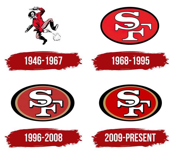
The San Francisco 49ers team used four graphical symbols. The first version was proposed by Allan Sorrell, who, along with Anthony J. Morabito, acquired the AAFC franchise. He saw a photograph of a drunk gold prospector with guns on the side of a railroad freight train and decided it was the best way to convey the concept of the “forty-niners.” All other emblems contain the acronym “SF” and duplicate each other in design.
What is San Francisco 49ers?
The “San Francisco 49ers” is an NFL team named after the California Gold Rush. It was formed in 1944, debuted in 1946 as a founding member of the AAFC, and joined the NFL in 1950. The team has set many league records and won five Super Bowls (as of 2021).
1946 – 1967
The debut logo depicts lawlessness in San Francisco during the 1849 Gold Rush. The central figure is a mustached gold prospector dressed in high boots, plaid pants, and a red shirt. He stands on his left foot at an angle, and his wide-brimmed hat is flying off. In each hand is a pistol. The man holds one barrel over his head while he shoots himself in the foot with the other. Below is white smoke from the shot.
1968 – 1995
The new logo represents the “49ers” as a club from San Francisco. It has the shape of an oval ellipse, associated with a football. Inside the geometric figure is the monogram “SF” – an abbreviation for “San Francisco.” The “S” overlaps the “F” in the upper left corner and is divided into three parts. Both letters are white with a black outline, with long serifs at the ends. The symbol is painted dark red and outlined by a closed black stripe.
1996 – 2008
In 1996, the team slightly changed its logo. The oval acquired an elongated shape and resembled a football even more. The disjointed segments of the letter “F” were connected – now, the letter “S” was superimposed on them. The dark outer border on the sides of the ellipse widened. Inside appeared a metallic outline of gold color – a hint of the Gold Rush and a connection to the name Forty-Niners.
2009 – today
In the latest version of the logo, the design remained the same. The franchise owners only changed the main shades. Dark red became scarlet, dull white – clearly bright, and black and gold – saturated.
San Francisco 49ers: Interesting Facts
The San Francisco 49ers are a famous football team with a lot of history since they started in 1946. They’re known for being great players, winning a lot, and changing the game coolly.
- Starting Out: They got their name, the “49ers,” from those who rushed to California in 1849 looking for gold.
- Super Bowl Wins: The 49ers have won the Super Bowl five times in the 1980s and early ’90s, making them super successful.
- The Catch: One of their biggest moments was “The Catch” in 1982 when Joe Montana threw a winning pass to Dwight Clark to beat the Dallas Cowboys and advance to the Super Bowl.
- Famous Players: Joe Montana, one of the best quarterbacks ever, won four Super Bowls with the team. Jerry Rice, maybe the best receiver ever, broke many records with them.
- Smart Playing: Their coach, Bill Walsh, created the “West Coast Offense,” which changed how teams play with short, quick passes.
- A Great Year: In 1984, the 49ers were almost unbeatable, winning the Super Bowl after only losing one game all season.
- Old Home: They used to play at Candlestick Park, a windy stadium, until 2014. Now, they play in Santa Clara at Levi’s Stadium.
- Big Rivalries: They have big rivalries with the Dallas Cowboys, Green Bay Packers, and Los Angeles Rams, making for some great games.
- Hall of Famers: Several 49ers are in the Pro Football Hall of Fame, which shows how many great players they’ve had.
- Big Comebacks: They’re known for making big comebacks, like overcoming a 28-point difference to win a game.
- Their Stadium Now: Levi’s Stadium is eco-friendly, has solar panels, and hosts the Super Bowl 2016.
The San Francisco 49ers have done a lot in football, from winning big games to having amazing players and changing how the game is played.
Font and Colors
The iconic San Francisco 49ers logo reflects the team’s connection to its hometown. At the same time, it is dedicated to the football theme, as it has the shape of a ball. In the center are the first letters of the name San Francisco – capital S and F. They are whimsically connected in the center of the emblem: “S” overlaps “F,” covering it in the upper left corner and dividing it into three fragments. The monogram is inside an oval, depicting an American football.
This symbol has been used since 1968. Before that, the club had a completely different logo, which was more suitable for the San Francisco 49ers. The image of an armed gold prospector conveyed the mood of the 1940s when the Gold Rush swept America. Against its background, the modern emblem seems too far from the historical context and conceptual meaning of the team.
To make the monogram memorable, designers created their own font for it. Moreover, the letters are not written but hand-drawn. The font belongs to the antique group: “S” and “F” are decorated with wide, long serifs at the ends.
The monogram is white but has a black outline. The main part of the oval is bright red, almost scarlet. The frame of the improvised ball consists of two colors: gold (the only hint of the gold rush) and black.
San Francisco 49ers color codes
| 49ers Red | Hex color: | #aa0000 |
|---|---|---|
| RGB: | 170 0 0 | |
| CMYK: | 0 100 59 26 | |
| Pantone: | PMS 187C |
| 49ers Gold | Hex color: | #b3995d |
|---|---|---|
| RGB: | 175 146 93 | |
| CMYK: | 5 20 50 20 | |
| Pantone: | PMS 872 C Metallic |
FAQ
What does the “San Francisco 49ers” logo mean?
The monogram of the letters SF signifies the city where the team is based. And the elliptical base behind the inscription has the shape of a football. Gold embodies power, wealth, and superiority. It hints at the Gold Rush. Red, in turn, is a symbol of optimism and energy.
Who created the 49ers logo?
It is unknown who developed the current team logo. It may have been done by an in-house team of designers. But the author of the very first version is considered to be Allan Sorrell, co-owner of the “San Francisco 49ers.”
What was the first “49ers” logo?
The debut emblem of the franchise contained an image of a drunk gold prospector holding two revolvers: he shot himself in the foot with one and raised the other above his head. The man was dressed in a red shirt, plaid pants, and black boots. Due to active movements, the hat flew off his head. This image embodied the lawlessness of the era of the California Gold Rush.
When did the “49ers” change their logo?
The most significant update of the “San Francisco 49ers” logo occurred in 1968 when the first version of the monogram in the form of an ellipse appeared. In 1996 and 2009, designers improved the design, changing the shapes and colors of the elements.

