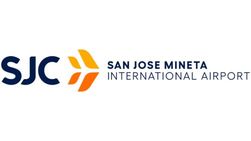
 San Jose International Airport (SJC) Logo PNG
The San Jose International Airport (SJC) logo conveys a sense of lightness, speed, and professionalism. It is associated with air transportation and symbolizes advanced technologies in the aviation industry, as the city of San Jose is unofficially recognized as the capital of Silicon Valley.
San Jose International Airport: Brand overview
San Jose International Airport, located in the heart of California’s Silicon Valley, serves the Greater San Francisco Bay Area. Its roots trace back to the 1920s when a small seaplane base facilitated early commercial flights.
In the 1940s, this field expanded into a full-fledged airport with multiple runways to accommodate the increasing passenger traffic. The 1960s saw the construction of a new terminal building and additional taxiways, reflecting the region’s growth.
The 1990s marked a significant renovation and modernization period for the airport to meet the burgeoning demands of Silicon Valley. New terminals, parking structures, and additional runways were built to support the increasing number of travelers.
In the wake of the September 11, 2001, terrorist attacks, enhanced security measures were implemented, and the airport faced challenges due to the bankruptcy of several airlines.
By the mid-2000s, San Jose had established itself as a crucial regional transportation hub, hosting flights from major carriers such as Southwest, Alaska, American, and Delta. The airport also provided international flights to Mexico, Canada, and beyond destinations.
In the 2010s, new terminals tailored for budget and international airlines were constructed, and continuous upgrades were conducted to handle the growing passenger volume.
SJC is one of the busiest airports in the San Francisco Bay Area, handling approximately 15 million passengers annually on domestic and international flights. Its future development is closely tied to Silicon Valley’s ongoing expansion as a global technology center.
Meaning and History
What is San Jose International Airport (SJC)?
This is a unique air hub located in the heart of Silicon Valley, distinguished by its technological focus and innovative approach to passenger service. The airport is known for its “Silicon Valley Airport” program, integrating advanced technologies such as biometric identification and robotic assistants to enhance the passenger experience.
Before 2023
In 2001, the airport in San Jose was renamed Norman Y. Mineta San Jose International Airport to honor politician Norman Yoshio Mineta. The new name, which had existed for over five years, was added to the logo. The text is rendered in an elegant, thin font, reflecting a commitment to clarity, orderliness, and punctuality. The elongated, sans-serif capital letters are associated with advanced technologies and innovation.
The phrase “SAN JOSE” is underlined by a long gold line with blue dots at each end. This line represents an airplane’s route, and the dots symbolize takeoff and landing points. It signifies the connection between cities, which would be impossible without SJC. The gold color symbolizes prestige, luxury, and high-quality service. Conversely, blue is associated with reliability and professionalism, evoking the sky’s vastness.
One end of the line touches an abstract depiction of a globe. It consists of uneven strokes of varying thickness that together form a likeness of a globe, meridians, and parallels. The globe symbolizes international flights and the ability to travel worldwide, emphasizing the airport’s importance as an air transportation hub. Some lines intersect and resemble airplanes flying in different directions.
2023 – today
In 2023, SJC underwent a rebranding, shortening its trade name to San Jose Mineta International Airport and incorporating it into the new logo. The focus is now on the city of San Jose, ensuring travelers know the airport’s location. The full name of the Japanese-American politician has been shortened to “Mineta,” reflecting a commitment to simplicity and ease of customer service.
The emblem features an abstract depiction of a flying airplane: a top view of its wings and tail. These elements are in the negative space between four convex “leaves.” This design references informational signs used in airports to indicate direction. The airplane symbolizes flights and emphasizes SJC’s role as a place where journeys begin and end.
The logo colors hold special significance:
- Orange is taken from the San Jose flag.
- Yellow represents the warm and sunny climate of the region.
- Blue symbolizes the sky.
Designers presented the airport’s name in full and abbreviated forms to make it easily recognizable. The abbreviation “SJC” is the largest element, serving as the primary identifier. It is rendered in a unique semi-bold font with diagonal cuts and rounded corners. In contrast, “International Airport” is written in thin capital letters, creating a sense of lightness, elegance, and modernity.
The combination of contrasting fonts, vibrant colors, and an abstract design reflects the energy of Silicon Valley, with San Jose being the largest city in this high-tech region.


