


![]() Santos Laguna Logo PNG
Santos Laguna Logo PNG
The Santos Laguna logo reflects the character of a soccer club that emerged from tough conditions and is known for persistence. The team didn’t pursue easy success; instead, they earned recognition through determination and intense competition on the field.
The history of Santos Laguna began in 1982 in Torreón, Mexico, with support from the local social insurance institute, IMSS. Founded officially on September 4, 1983, the team quickly won the second-division championship.
In 1988, the club bought a place in Mexico’s top division (Primera División) from Ángeles de Puebla. Santos Laguna’s first Primera match ended in a draw against Morelia. In 1991, major beer producer Grupo Modelo acquired the club, fueling its growth.
The first championship was won in the 1996 Invierno season. In 2009, the club opened the modern Territorio Santos Modelo stadium, a symbol of the club and region.
Santos Laguna was acquired by Grupo Orlegi in 2013. Since then, the club has won the Mexican Championship in 2012, 2015, and 2018, and claimed the Mexican Cup in 2014. A women’s team called “Guerreras” was introduced into Liga MX Femenil in 2017.
Today, Santos Laguna remains successful, boasting advanced infrastructure and a well-established youth development system, which consistently yields national success.
Meaning and History
![]()
What is Santos Laguna?
It is a successful Mexican soccer club from the northern region, playing in green and white uniforms. The home stadium holds over 30,000 spectators. The team is known for its aggressive attacking style and passionate fan support, who call themselves “warriors.” The club operates a strong soccer academy that has produced famous Mexican players.
1997 – 2001
![]()
Santos Laguna introduced its first official logo in 1997, 14 years after the team’s founding. Its uniqueness was immediately clear: a soccer ball decorated with green hexagons formed the base. The name “Club Santos Laguna” appeared at the center in a classic gothic typeface. At the bottom, one golden star symbolized the club’s first championship in Mexico.
The main distinctive feature was a golden crown above the ball, symbolizing the club’s ambition and desire for leadership. Green referenced the Laguna region, known for agriculture. This style remained central to the club’s identity despite later changes.
2001 – 2008
![]()
Visual changes marked the team’s athletic achievements. A second golden star was added, representing Santos Laguna’s second championship. The crown became smaller and simpler, topped by a small cross, a reference to the club’s religious origins.
The gothic typeface remained, emphasizing historical continuity. The green color deepened, reflecting brand maturity. The updated design effectively conveys the club’s growth while preserving its traditional elements.
2008 – 2011
![]()
After the club earned its third championship, its emblem was updated. The logo became more solid, gaining several new details that emphasize the team’s significance and status. Three gold stars were added to signify the titles won and the club’s successes. They are arranged in a single row at the bottom of the symbol, expressing the team’s ambitions and achievements.
The symbol’s main shape resembles a soccer ball, styled in white with green pentagons. A thick black line runs along the edge, outlining the entire image. At the top is a large yellow crown standing out against the black background. The crown is rendered in detail, with a cross at the top, reminiscent of heraldic elements and emphasizing the club’s prestige.
The club name is written in three lines. The first line contains the word CLUB, set in a straight grotesque typeface in capital letters. Below it is the word “Santos,” highlighted in a distinctive Gothic typeface, similar to Old English Blackletter, with sharp letterforms and elongated downward strokes. This typeface adds distinctiveness and recognizability to the club name. The bottom line bears the inscription LAGUNA, also in capital letters, in a bold, wide typeface.
The green shade of the pentagons became deeper, giving the logo a richer appearance. All elements of the emblem are united by a common idea: to emphasize the club’s high status and its sporting achievements.
2012 – 2015
![]()
After Santos Laguna reached new heights in sport, the club unveiled a refreshed version of its symbol, redistributing compositional emphasis. The main change involved the three golden stars. Previously, the stars were placed directly inside the ball, but now they are positioned outside the main image. They were positioned under the emblem’s lower edge, forming a smooth arc that reflects the club’s recent achievements and underscores their significance to the team.
The central elements remained unchanged. The inscription “Club Santos Laguna” is executed in three lines, and the typefaces are preserved. In updating the emblem, greater attention was paid to text legibility by increasing character spacing. The letters received more space, and their perception became clearer and more comfortable. The background portion still resembles a classic soccer ball.
2015 – 2018
![]()
A fourth championship prompted another update. In 2015, the number of stars increased to four, arranged symmetrically in two pairs beneath the soccer ball.
The new star configuration balanced the logo, emphasizing consistent team success. Golden stars kept a simple style, harmonizing with classic elements.
The crown and lettering stayed unchanged, maintaining Santos Laguna’s stability and traditions. The color scheme and Gothic typeface persisted, highlighting the club’s consistency.
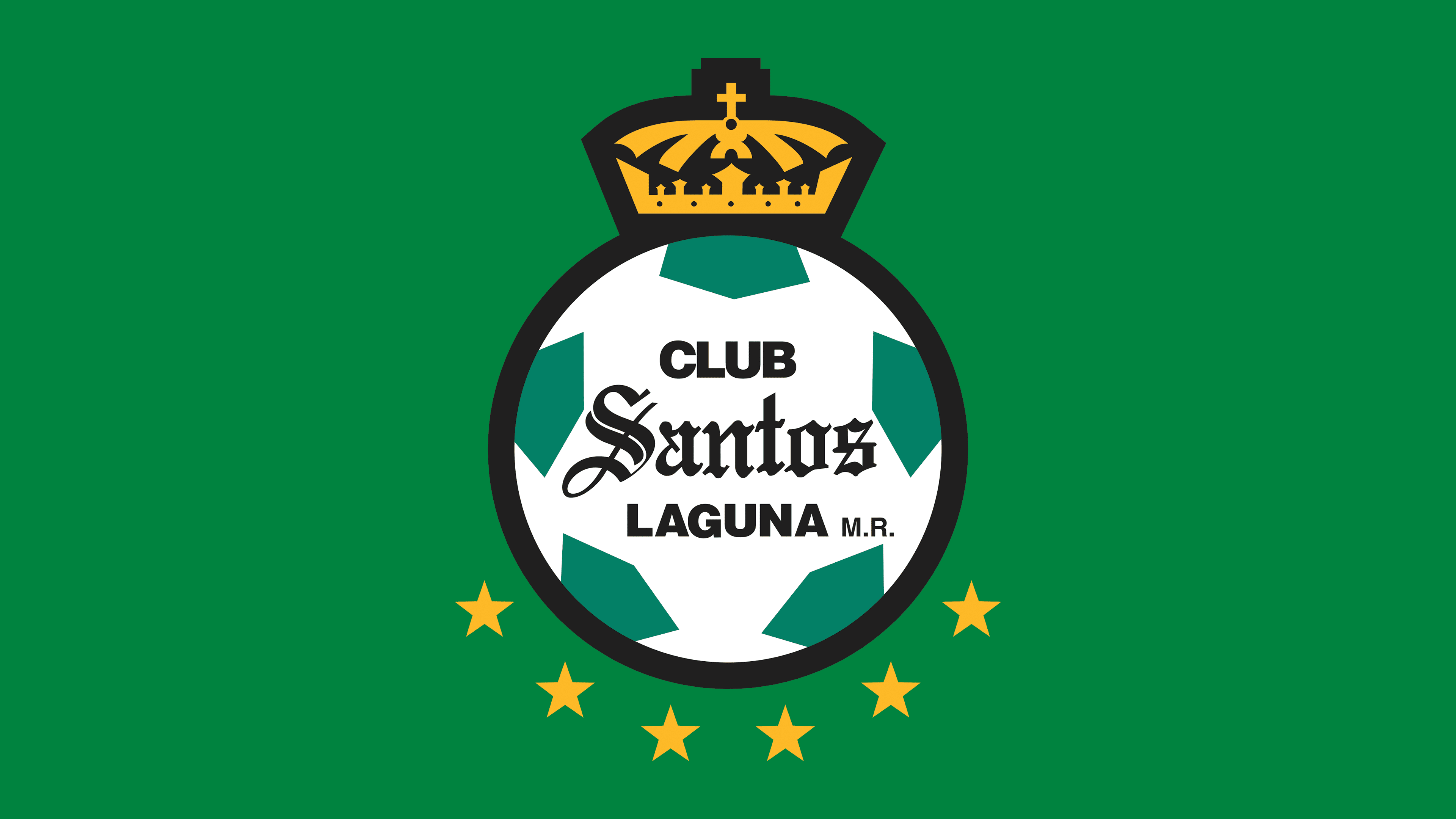
2018 – today
![]()
After another championship success, Santos Laguna once again made minor changes to its logo. An additional gold star was added in the lower part, highlighting another sporting victory for the team. Now, beneath the ball, there is a neat row of six identical stars arranged in an arc.
Other details remained unchanged, maintaining the style in place since 2012. The addition of another star underscores the team’s sporting achievements and maintains a connection to its history.
Font and Colors
The club changed typefaces only once, in 2001. Before then, the words “CLUB” and “LAGUNA” appeared in thin sans-serif lettering, while the central word “Santos” featured a gothic style. Following 2001, designers adopted a thicker lettering style without compromising visual recognition.
The club’s palette includes white, green, black, and gold. White serves as the soccer ball’s base; green highlights the ball’s figures; black outlines and letters; and gold marks achievements with stars and the crown, emphasizing brand status.