 AFC Bournemouth Logo PNG
The AFC Bournemouth logo reflects the history of an English club that rose without star players but became prominent in football through determination and character. It conveys the team’s connection to its city, the match atmosphere in a small stadium, and the fans’ loyalty.
Local businessmen in southern England founded AFC Bournemouth in 1899 as Boscombe FC. The club spent its early years in Hampshire amateur leagues before gaining Dean Court as its home ground in 1910. In 1920, it entered the Football League system and became known as the Cherries, linked to its red-and-black colors. In 1923, the name changed to Bournemouth & Boscombe Athletic FC before becoming AFC Bournemouth in 1971.
For much of its history, Bournemouth played outside England’s top divisions. One notable moment came in the 1970s, when Ted MacDougall scored nine goals in an FA Cup match. Under Harry Redknapp, the club reached the Second Division for the first time in 1987, marking one of its strongest periods before financial problems later changed its direction.
By 2008, heavy debts had placed the club close to collapse. Eddie Howe, a former Bournemouth player, returned as manager while the team struggled near the bottom of the fourth tier. Over the following years, he led a series of promotions, taking the club through the divisions and into the Premier League for the first time in 2015.
Bournemouth remained in the top flight for five seasons, facing clubs such as Manchester City and Liverpool before relegation in 2020. The team returned two years later. In 2023, ownership passed to the American Black Knight Football Club consortium, which appointed Andoni Iraola as head coach and backed a new phase of investment in the squad and club operations.
Meaning and History
What is AFC Bournemouth?
A football club from a seaside resort town in southern England. Players wear distinctive red-and-black striped uniforms, earning them the nickname “The Cherries.” The team’s home stadium is the smallest in England’s top division, creating an intimate atmosphere that brings fans closer to the action. The club rose from the lower divisions to the elite level. Under talented coaching, the team emphasizes an exciting attacking style.
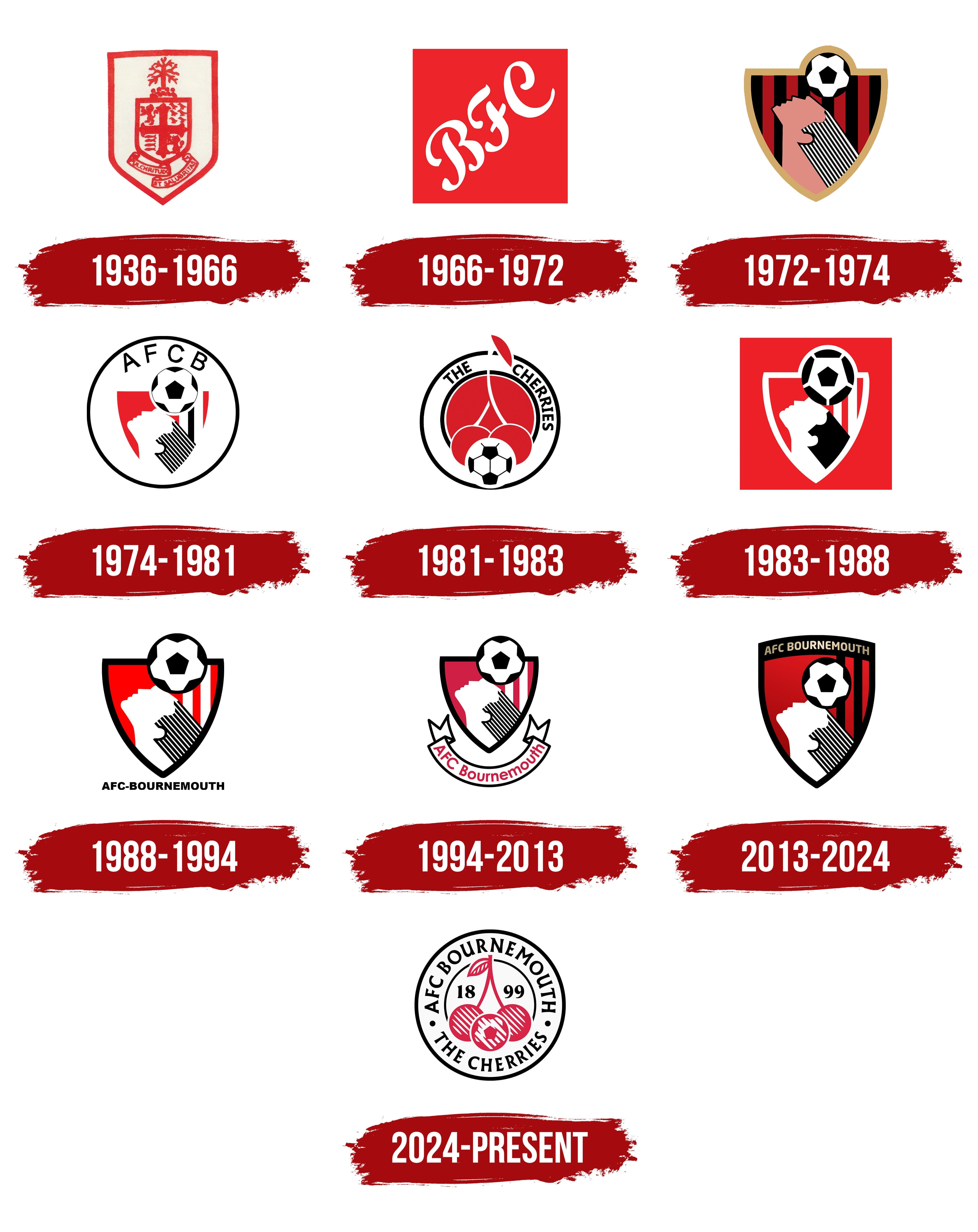
1936 – 1966
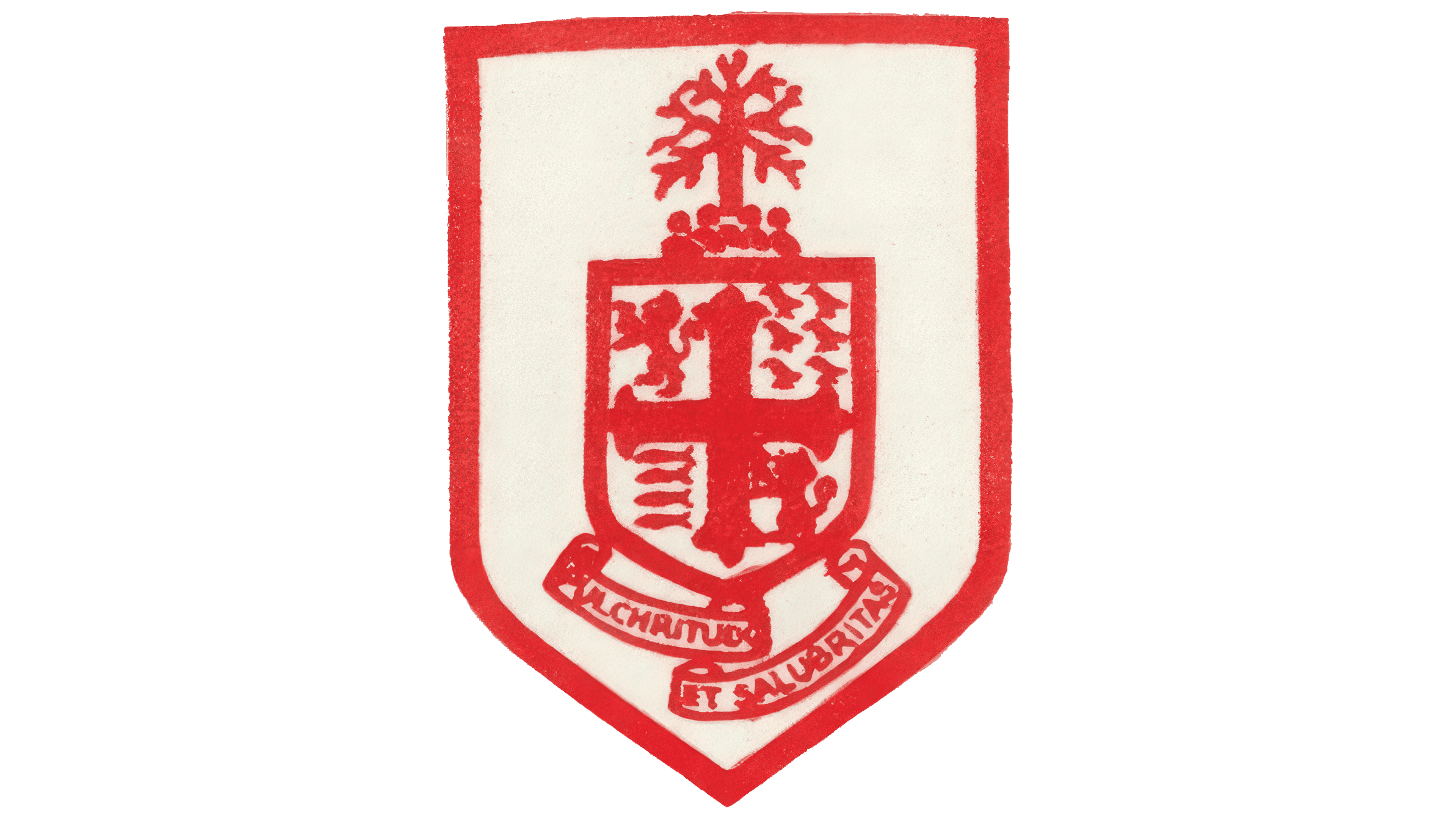
The design of the first Bournemouth and Boscombe Athletic logo was defined by a classic heraldic shield styled in the English tradition. The main element was a red outline symbolizing the club’s determination and the character of its play.
Inside the shield was a cross connected with Bournemouth’s historical symbols. On both sides stood lions, symbols of courage and strength.
Above the shield, a tree reminiscent of the Bournemouth pines appeared, a significant part of the city’s recognizable natural landscape.
Below the shield was the Latin motto “Pulchritudo et Salubritas.” It reflected Bournemouth’s status as a resort known for its healing climate and picturesque scenery. The logo combined symbols of the city’s history and natural motifs, forming an image of a club connected with the atmosphere of southern England.
1966 – 1972

In this version, the logo shifted from a heraldic aesthetic to a focus on football culture, with a primary emphasis on the team’s name. On a red square, three white letters appeared: the initials of Bournemouth Football Club. The typeface featured curved elements reminiscent of Gothic script.
The abandonment of the shield, motto, and symbols in favor of an abbreviation reflected the club’s desire to communicate with supporters more simply and directly. The old elements disappeared, replaced by a concise name mark that is easy to recognize in the stands and urban environment.
The red background preserved continuity with the team’s kit and the city’s visual identity.
1972 – 1974

The move away from letter abbreviations took shape in the appearance of a footballer on a shield background. The new logo depicted a header moment. The player’s head was tilted back, and the ball was positioned above it. The visual focus reflected the club’s nickname, “The Cherries,” and emphasized the intention to showcase a technical style of play.
The design was created by a fan who wished to remain anonymous.
The shield background features red and black stripes, which are associated with the team’s uniform and club symbolism. The image of the footballer with the ball expressed a wish to leave behind heraldic references in favor of a simpler and clearer design.
A golden border completed the emblem’s structure. It added a sense of formality and maintained a connection with the English football tradition, striking a balance between a modern image and historical reference.
1974 – 1981

The emblem was based on a shield with a football flying toward a player’s head. The image set the direction for the new identity, where the club transitioned to a minimalist approach, focusing on precise form and structure. The design was created by a local designer and devoted Bournemouth supporter who aimed to reflect the team’s spirit through a restrained visual language.
Above the main image was the abbreviation “AFCB.” The clean sans-serif font emphasized a modern communication style and complemented the visual center. The inscription, shield, and player image were enclosed within a circular frame.
The design centered around the footballer’s figure. The silhouette captured the energy of the game, connecting the image to the nature of football on the southern coast. Red symbolized the passion of the fans and the drive of the players, while black added contrast and depth.
1981 – 1983

The new emblem was linked to the club’s nickname “The Cherries.” For the first time, cherries became the main symbol. On a red background, smooth white lines formed the shape of a cherry. Between the two fruits was placed a football, giving the emblem a clearer association with the sport.
For English football, this was an unusual decision. Unlike traditional heraldic structures, Bournemouth chose visual simplicity and originality.
At the top of the circular logo appeared the inscription “The Cherries.” The font emphasized the emblem’s sporty character and strengthened the link to the club’s nickname.
The design was created by a local artist who had worked on previous versions. His inspiration stemmed from the region’s history of cherry orchards, lending the symbol an additional cultural dimension.
1983 – 1988

A return to the red square marked the update of the club’s symbol. The background was associated with energy and determination. On its surface, white lines outlined the silhouette of a shield and a footballer balancing the ball on his head. In the new version, the ball’s size increased, reinforcing the focus on football as a key part of the club’s identity.
1988 – 1994
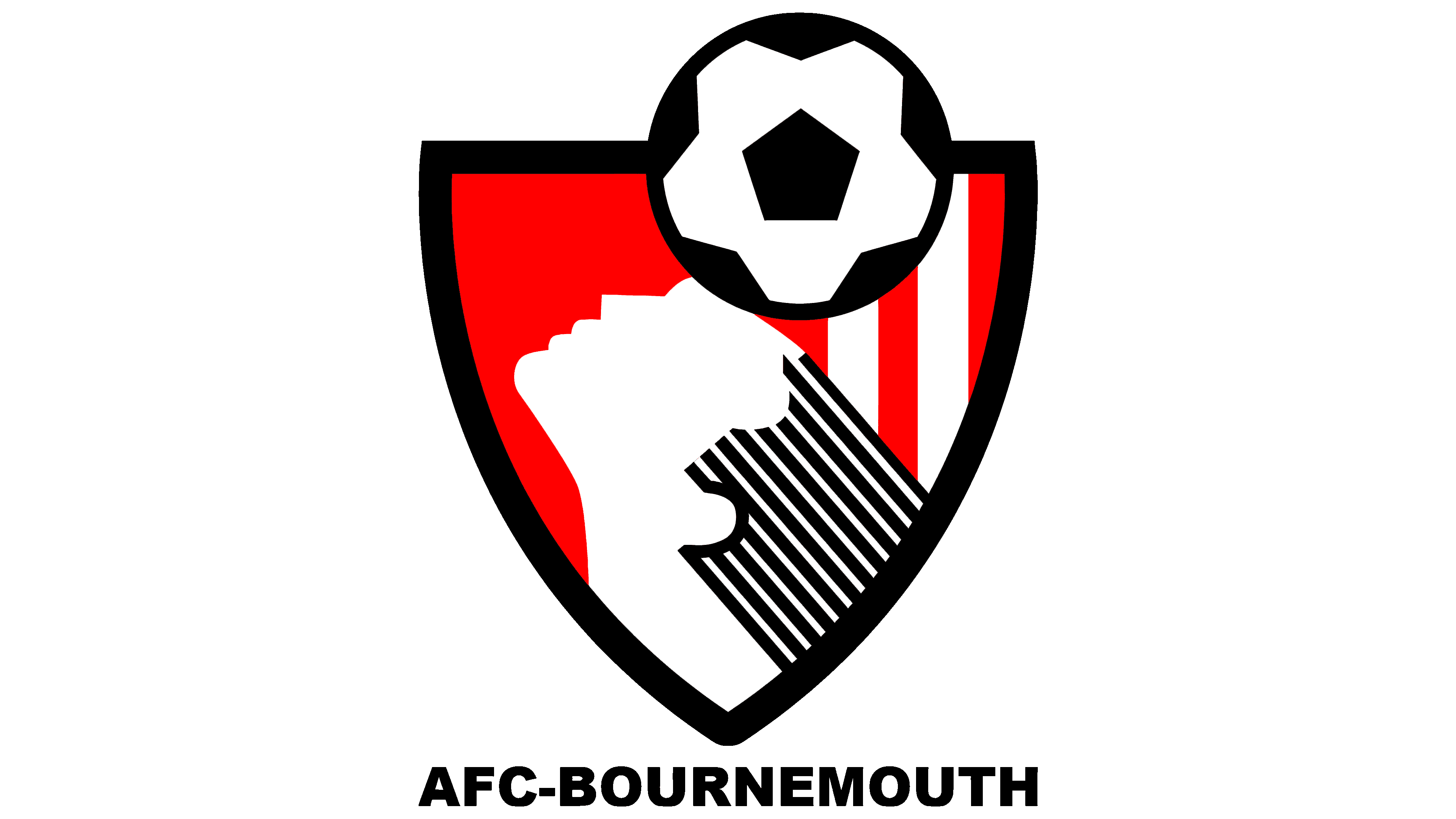
In the new design, the silhouette of the footballer with the ball remained at the center, but in a different style. The entire emblem was outlined in black. The footballer’s hair was rendered with diagonal stripes alternating black and white, maintaining continuity with earlier versions.
The background of the shield was painted in bright red on the left and with red and white stripes on the right, enhancing the visual structure and setting a balanced composition.
Below the shield was the inscription “AFC Bournemouth.” It was executed in a simple, sans-serif font, which is strict and functional. Together, all elements formed a mark that combined the classic football image with a modern design.
1994 – 2013

In the new version, the club turned to classical techniques by adding a decorative ribbon. Below the shield, a smooth arc appeared with the inscription “AFC Bournemouth.” The text was written in a calm sans-serif font that gave the emblem a restrained character and balanced the main image.
The background color on the shield changed to a softer shade of red. It softened the visual impression and marked a shift from aggressive design decisions toward a more solid style. The contour lines became thinner and neater, giving the design a structured and refined look.
The footballer was still depicted in white, and his hairstyle remained in diagonal stripes alternating black and white.
The shield took on a narrower form with smooth outlines. The ball was slightly reduced in size, providing balance between the player’s figure and the other details, creating a harmonious distribution of visual accents within the emblem.
2013 – 2024

Work on the logo update was carried out in partnership with the British agency The Click. As a result, the shield acquired a more elegant appearance. In the upper part, an inscription in the Gotham Bold font appeared in gold. It expressed the club’s ambitions and reflected its growing status in professional football.
The color became deeper. The shield’s red shade was given a gradient, and its vertical lines turned black. Together, they formed a more complex structure. The footballer’s figure retained its familiar position and form on the shield.
This version of the emblem combined the club’s historical motifs with a modern visual style, and the collaboration with the agency emphasized the professional level of the work.
2024 – today
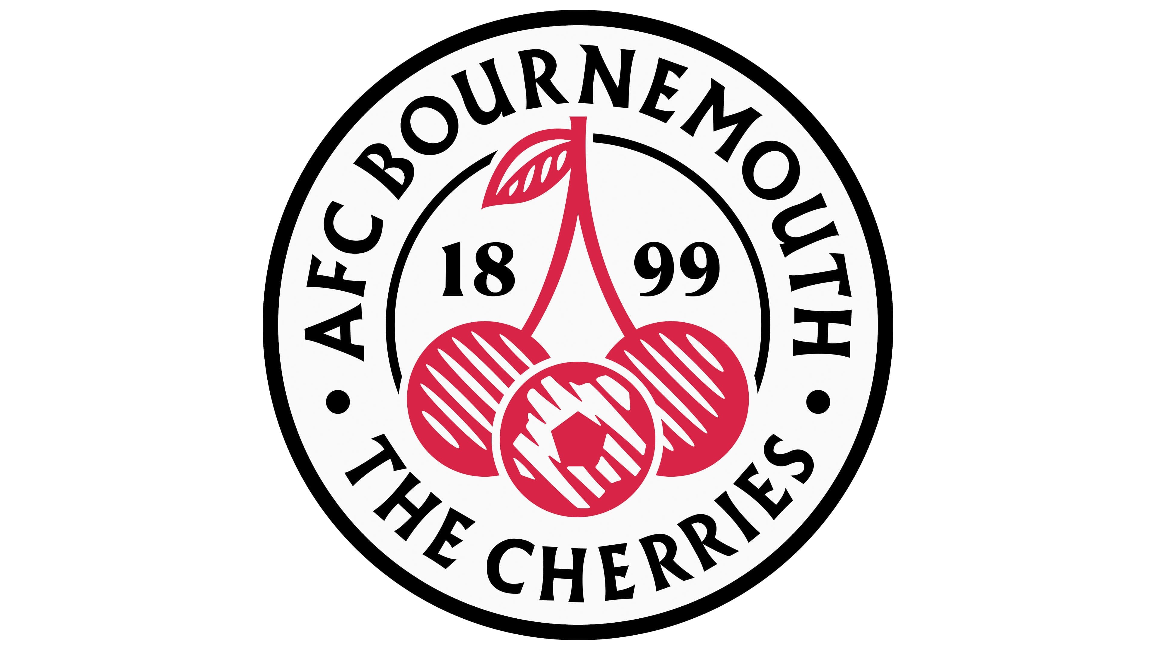
The creation of the new version of the symbol was entrusted to the studio Nomad. The main change was the use of a circular shape. The traditional shield was replaced by a return to the club’s origins. In the center of the circle are red cherries connected by a stem. Between the berries, within the shape, is an integrated drawing of a football, linking the club’s nickname “The Cherries” to the sport.
The design uses red and black, the colors that have accompanied the club throughout its history. Red maintains the association with local orchards and the nickname’s symbolism, while black provides contrast and visual balance.
The ball is executed in an abstract style. It is formed by strokes that visually resemble fragments of a football pattern.
The typography also changed. A stylized version of the Garamond typeface was used for the text, giving the emblem a historical tone. In the upper part of the circle is the name “AFC Bournemouth.” In the lower part is the nickname “The Cherries.”
Between them is the club’s founding year, 1899. It serves as a link between the past and the present.