


![]() Espanyol Logo PNG
Espanyol Logo PNG
Real Club Deportivo Espanyol de Barcelona is one of the few football clubs patronized by the Spanish monarch. He received the right to use the word “Reial” in his name and the crown in the emblem as a privilege. This influenced the way the Espanyol logo looks now. It seems unique and aristocratic.
On October 28, 1900, engineering student Ángel Rodríguez Ruiz founded Sociedad Española de Football in Barcelona. Unlike clubs built around foreign players, it was formed by local enthusiasts. Early kits were yellow because the available fabric was yellow.
The club dissolved in 1906 as students left the city, then re-formed in 1908 as Club Deportivo Español. In 1910, it adopted blue and white in honor of Roger de Llúria. In 1912, King Alfonso XIII granted royal status, adding “Real” to the name.
Español became a strong side in the Catalan Championship, winning it nine times behind FC Barcelona. In 1923, it moved to Sarrià, where it remained for 74 years. As a La Liga founder in 1928, the club won the 1929 Copa del Rey, beating Real Madrid 2:1. Another cup followed in 1940.
Players such as Ricardo Zamora, Alfredo Di Stéfano, and László Kubala passed through the team. The derby with Barcelona defined its domestic record; a 6:0 win in 1951 stands out.
Under Javier Clemente, Español reached the 1988 UEFA Cup final, eliminating Borussia Mönchengladbach, AC Milan, Inter Milan, and Club Brugge, but lost to Bayer Leverkusen on penalties after 3:0 and 0:3 matches. Financial issues forced the sale of Sarrià, and the club moved in 1997.
In 2000, Español won the Copa del Rey against Atlético Madrid, and again in 2006 versus Real Zaragoza. In 2007, it reached another UEFA Cup final, remaining unbeaten but losing on penalties to Sevilla FC.
A new stadium opened in 2009. Relegation followed in 2020 after a defeat to Barcelona; promotion came in 2021; another drop in 2023; and a return to La Liga in 2024 after beating Real Oviedo 2:0 in the playoff final.
Meaning and History
![]()
Almost all Espanyol emblems are round. The only exception is the triangular shield, adopted from 1923 to 1931 during Miguel Primo de Rivera’s dictatorship. However, historical events have never influenced the team’s image, as the team has tried to stay out of politics.
What is Espanyol?
Espanyol is the common name for Reial Club Deportiu Espanyol de Barcelona. The professional football team participates in La Liga and has won the country’s cup four times. It was established in 1901 and was previously known as Sociedad Española de Fútbol.
1900 – 1901
![]()
The first Espanyol logo is a light brown circle with a yellow ellipse inside, with sharp corners. Each segment contains one black letter: “C,” “E,” and “F.” It is an acronym for the Club Español de Fútbol.
1901 – 1910
![]()
The circle’s sides turn red. The letter “E” is also red and noticeably enlarged. The size of “C” and “F” has not changed, but they are now yellow.
1910 – 1911
![]()
In 1909, the sports organization was relaunched as Club Deportivo Español, so the abbreviation changed: the logo now reads “CDE.” The designers used an unusual “quivering” font and made the side letters red and the middle “D” yellow. A red ring surrounds the circle. Inside, there are blue-and-white vertical stripes.
1911 – 1912
![]()
The letters are black and written in a simple sans-serif typeface. The red ring is much thinner than the previous version, and the blue has become darker.
1912 – 1923
![]()
In 1912, Alfonso XIII granted the team royal patronage, including the right to be called Real Club Deportivo Español and to depict the crown on its emblem. The attribute of royalty sits above a circle with white-and-blue diagonal stripes. Gold lines on both sides surround the red ring, which is quite wide because the club’s new name is written on it.
1923 – 1931
![]()
During the reign of the dictator Miguel Primo de Rivera, the circle turned into a triangle. Its bottom is lined with vertical blue-and-white stripes, and at the top is a red rectangle bearing the inscription “RCDE.” The crown has not changed; only the colors have become lighter.
1931 – 1934
![]()
After Alfonso XIII’s abdication, the team returned to the logo used from 1912 to 1923. Noticeable metamorphoses occurred in it: the crown disappeared, and the name began to be written as “CLUB DEPORTIVO ESPAÑOL.”
1934 – 1940
![]()
In 1934, the crown returned, but it was not a royal crown but a tower one. The same gold crown with four turreted teeth adorned the coat of arms of the then-existing Second Spanish Republic.
1940 – the 1960s
![]()
When the Spanish Civil War ended, the club regained its honorary title and returned the 1912-1923 logo. The ring again reads “REAL CLUB DEPORTIVO ESPAÑOL,” and the circle is crowned with a large royal crown.
the 1960s – 1970s
![]()
The designers expanded the ring by reducing the diameter of the central circle and making it burgundy. The inscription is black, and the words are arranged asymmetrically.
the 1970s – 1980s
![]()
Inside the orange ring, RCD ESPANYOL DE BARCELONA is written in yellow letters. The inside of the crown is completely red.
the 1980s – 1995
![]()
The color scheme has changed: the ring is red, and the crown’s top is not painted. The inscription “REAL CLUB DEPORTIVO ESPAÑOL” is white.
1995 – 2005
![]()
The blue lines on the emblem are wider than usual. The crown is depicted in a minimalist style: it hangs over the circle and consists of wide yellow lines, with red spots between them. The ring reflects the club’s new name, adopted in 1995: “RCD ESPANYOL DE BARCELONA.”
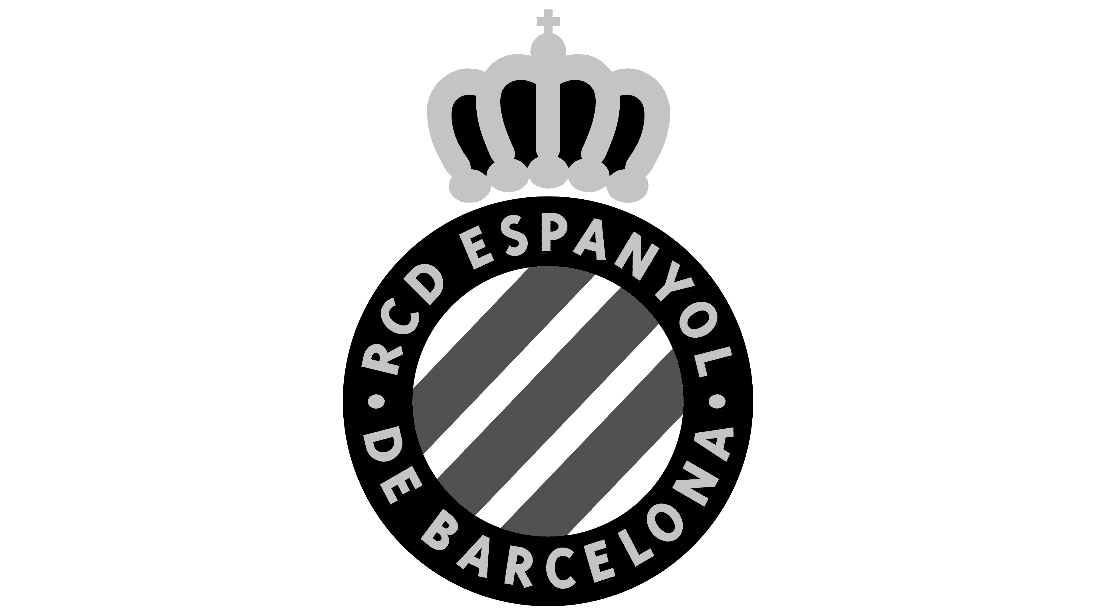
2005 – today
![]()
Minor crown design changes were made: yellow was replaced with gold, and the gaps were painted red. The letters now have black shadows on the right side.
Font and Colors
Almost all Espanyol emblems, except the earliest, feature a pattern of white and blue stripes. This refers to the shield of Admiral Roger de Lluria, who fought for the Crown of Aragon. The Spanish crown serves as a reminder that Alfonso XIII once favored the club. The inscription in the ring is an abbreviation for the full name of Reial Club Deportiu Espanyol de Barcelona.
The designers used one of the standard sans-serif fonts. The color scheme is more varied, including white (#FFFFFF), blue (#007FC8), red (#DF1116), and yellow (#F4CF0C). White and blue have been part of the official Espanyol palette since 1910. Before that, the main color was yellow.