


![]() Ajax Logo PNG
Ajax Logo PNG
The Ajax logo depicts the legendary hero. He serves as a symbol of the club’s strength and loyalty. Hidden within its lines are references to the number of players and victories, while the emblem itself recalls the team’s connection to Amsterdam and its proud history.
Ajax was founded on March 18, 1900, in Amsterdam by Floris Stempel, Carel Reeser, and Han Dade. Named after the Greek hero Ajax, the club began in lower divisions and reached the top league in 1911, though it was relegated again after three seasons.
A turning point came with coach Jack Reynolds, who led the team over three periods from 1915 to 1947. Under him, Ajax won its first Dutch title in 1918 and went on to add several more. In 1928, the club adopted the Ajax profile logo, and in 1934, moved to De Meer stadium.
In 1956, Ajax became one of the founders of the Eredivisie and won its first title in the new league. The major shift arrived in 1965, when Rinus Michels took charge and promoted Johan Cruyff to the first team. Michels introduced “Total Football”, a system based on positional flexibility and pressing. In 1966–1967, Ajax scored 122 league goals.
European success followed. In 1971, Ajax beat Panathinaikos to win the European Cup, then repeated in 1972 and 1973, matching Real Madrid’s earlier run. In 1972, the club also defeated Independiente to claim the Intercontinental Cup. Cruyff’s transfer to Barcelona in 1973 ended that cycle.
In 1987, under Cruyff’s coaching, Ajax won the Cup Winners’ Cup against Lokomotive Leipzig. A new peak came in the 1990s with Louis van Gaal. In 1992, Ajax won the UEFA Cup and, in 1995, claimed the Champions League against Milan, completing an unbeaten Eredivisie season.
In 1996, the club moved to Amsterdam ArenA, which was renamed Johan Cruyff Arena in 2018. The same year, Ajax lost the Champions League final to Juventus on penalties. A later run to the 2019 semi-finals included wins over Real Madrid and Juventus.
Meaning and History
![]()
What is Ajax?
It is an abbreviation for the Amsterdam football club “Ajax” from the Netherlands. Founded in 1900, the club plays at a professional level, is a member of the Eredivisie, and has won 20 KNVB Cup titles and 36 Eredivisie titles. The team is based in Amsterdam and is named after the ancient Greek hero.
1900 – 1911
![]()
At the beginning of the last century, the Amsterdam football club Ajax became one of the few sports teams to adopt an emblem from the outset. From the very first days, the team took the field with a symbol on the chest.
The very first version of the club emblem was a circle outlined in a deep red ring. Along this ring ran a white inscription. At the top was the text AMST. FOOTBALL CLUB, and at the bottom a larger word AJAX. All lettering appears hand-drawn and deliberately uneven.
Inside the circle is a character, an Ajax footballer. The player wears a jersey with alternating red and white vertical stripes and black shorts. Dark socks feature red inserts. The athlete’s figure is shown in motion, with the right leg raised in a kicking swing. Slightly above is a black-and-white football divided into segments.
The entire emblem is associated with football and reflects the club’s link to Amsterdam, as indicated by its name.
1911 – 1928
![]()
In 1911, the Ajax club’s identity received a new impetus. The team won its first major title, moving from the First Class to the top division. Along with sporting success came the need to update the kit and symbols to eliminate any similarities with Sparta Rotterdam. At that time, there were no separate away kits, and the two clubs wore the same colors.
A new home kit has been unveiled for the Amsterdam team. It consisted of white shorts and a matching jersey, now crossed by a vertical red stripe on the chest and back. The red shade itself was made brighter and more saturated.
These changes also affected the team emblem. The new version remained circular with a wide red border. Inside the border, white lettering reads AMST. FOOTBALL CLUB at the top and AJAX at the bottom. A sans-serif typeface was used for the text, similar to Futura Bold. On both sides of the lower part are three short white stripes. They were added to balance the composition.
The center of the emblem features an illustration of a footballer in the updated kit. The red stripe on the white jersey became the defining feature of the new uniform. The player is shown at the moment of striking a stylized football of an old design.
1928 – 1991
![]()
A football club’s emblem sometimes becomes part of its history more than players or coaches do. In 1928, Amsterdam’s Ajax decided to emphasize the connection between the club name and the image of the ancient hero Ajax. In the September issue of Clubnieuws, a new emblem was published, based on an illustration from a commemorative porcelain plate created for the team’s 25th anniversary in 1925.
The emblem features a profile portrait of a hero from ancient Greek legends. The man is shown with a bare torso, his head covered by an ancient helmet. Thin lines, reminiscent of an old engraving, depict the face, curly hair, a thick beard, and the folds of fabric. On the helmet’s relief, the artists depicted a man and a horse, alluding to mythological figures such as centaurs.
At the top of the composition is the large word AJAX, written in dimensional letters. At the lower right, a compact coat of arms was added. It is divided into two halves by a black diagonal line. The upper part is red, the lower remains white. The shield has a rounded bottom. The red on the shield is the only bright accent, standing out against the black-and-white design of the entire emblem.
1991 – 2025
![]()
In 1991, the club revised the emblem’s style to make it suitable for commercial use. The previous version, which had served the team for more than six decades, contained too many details, making it difficult to use for advertising and merchandise.
The image of the legendary Greek warrior in the new version was transformed into a concise symbol. The hero’s face, drawn with thin black lines, is created using several continuous strokes. A minimal number of details is enough for the viewer to recognize the human profile, with visible lines for the nose, beard, shoulder contours, and a Greek helmet with a tall, backward-bent crest. The artists created exactly eleven lines, matching the number of players on a football team, adding extra meaning to the symbol.
The club name is placed inside a circle, wrapping around the figure at the top and bottom. The word AJAX occupies the upper arc, and AMSTERDAM is placed at the bottom. The letters are uppercase. The typeface resembles well-known strict fonts such as Helvetica Bold or Eurostile.
Decorative accents are provided by three pairs of curved red stripes placed on both sides of the inscriptions. The lines follow the circle’s contour, visually completing it.
The new mark proved simple and easy to recognize, and the club used it to promote the brand internationally.
2025 – today
![]()
In 2025, fans will once again see the club’s historic mark, which was in use from 1928 to 1990 and remained on the players’ uniforms for 62 years.
The old version of the emblem depicts the profile of the Greek warrior Ajax. He is depicted with a beard and a helmet adorned with ancient figures, such as centaurs and riders. The shading is fine and detailed, resembling an engraving or etching. The figure’s contours are rendered in black lines, showing hair, facial features, and muscles. Above the portrait is the club name AJAX. At the bottom is a small heraldic shield, divided diagonally into red above and white below.
After nearly a century, the club’s management is once again relying on a time-tested symbol to emphasize respect for the club’s history.
Font and Colors

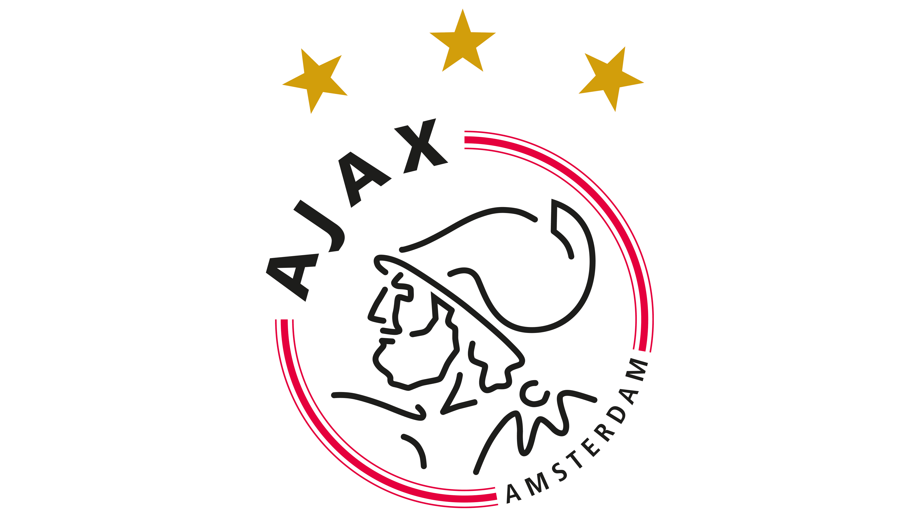
The logo of the Amsterdam football club “Ajax” traditionally depicts the mythological character Ajax, one of the two eponymous ancient Greek heroes who participated in the siege of Troy. The eleven lines that make up the portrait represent the same number of football players. Another important element is the three five-pointed golden stars. They are located at the very top and symbolize the multitude of club titles in the Dutch Eredivisie.
The word “AJAX” uses a sans-serif font, which was introduced into the logo back in 1911. Both letters “A” resemble the letter in the Courier New font. The characteristic low position of the vertical stroke indicates this. The signs “J” and “X” do not belong to Kurversbrug, although this font has been used on all “Ajax” football shirts since 2017. The word “AMSTERDAM” is executed in a classic grotesque style.
All graphic signs contain the colors of the city of Amsterdam: black, white, and red. They are taken from the captain’s armband and are part of the official club palette. In the latest version of the emblem, the six diagonal lines along the edges are red, and the abstract portrait and inscription are black and white, forming the general background.