
WOW builds its new image around a short name that already carries emotion. The brand appeared in 2020 and operates at the intersection of retail, an online platform, and a cultural space. In two stores in Madrid, WOW brings together fashion, sneakers, cosmetics, home goods, books, and travel accessories.
The studio Plural developed the new identity for WOW. After rapid growth, the brand needed a more cohesive system. It had to bring together different categories, labels, and purchasing scenarios. The main emphasis was placed on the name. WOW is understandable to people from different countries. The word is connected with surprise, discovery, and the moment when something stands out among many other things.
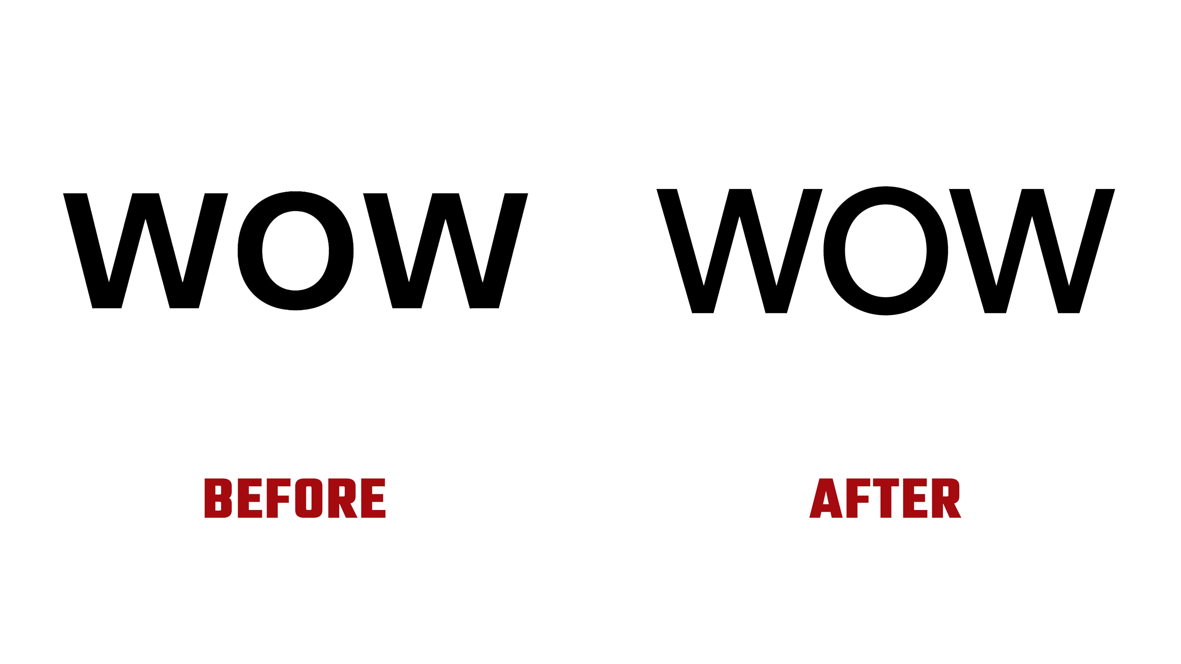
The logo was kept restrained. Plural did not radically change the mark. The lettering became thinner, the spacing between the letters became tighter, and the overall look moved closer to a fashion editorial tone. Through the pause, the word WOW looks calmer, more premium, and better suited to the fashion environment.
For the brand, this presentation works logically. WOW sells items across different fields and constantly uses a large amount of visual material.
A saturated green became the main marker of the identity. It brings together different collections, campaign imagery, and product categories. Against other visual styles, green helps keep WOW in memory.

The type system is built on Beausite Classic and JHA Times Now. The sans serif provides a modern foundation, while the serif adds a magazine-like tone close to boutiques and fashion platforms. Text is often centered, which makes the presentation look calm and cohesive.
The shopping bag received a major role. Plural uses it as a carrier for the mark at different scales. In retail, green bags, tags, and boxes move the brand image from the screen into a physical experience. The purchase becomes part of WOW through color, name, and the object in the customer’s hands.
The updated identity shifts WOW from a store-format focused on trendy products to a more unified platform for discovery. The logo, together with the green color and strict typography, helps bring fashion, beauty, home, and culture together under a short name.