The Lithuanian Culture Institute updated its identity with andstudio. The institute has operated since 2008 and helps Lithuanian art reach the international stage. It supports translations of Lithuanian authors, artist residencies, overseas projects, and visits by foreign professionals to Lithuania.
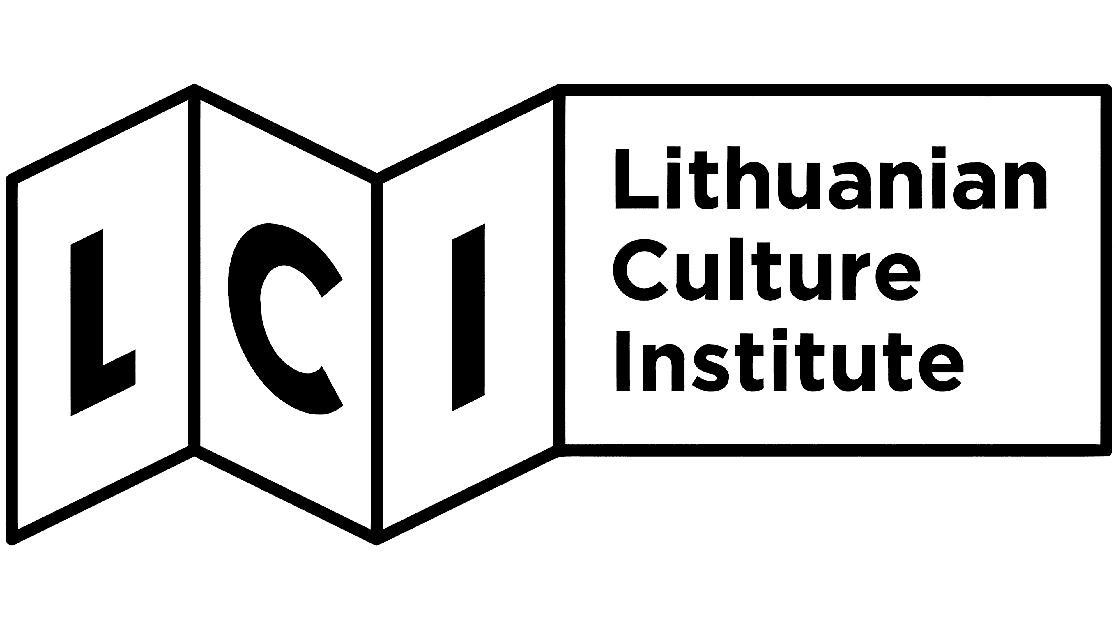
The previous LCI mark resembled a folded brochure, a map, or an open book. The shape connected the institute to culture, travel, and the country’s presentation abroad. For the institute’s current work, the image had become too object-based and too close to a single medium rather than to a system of connections.
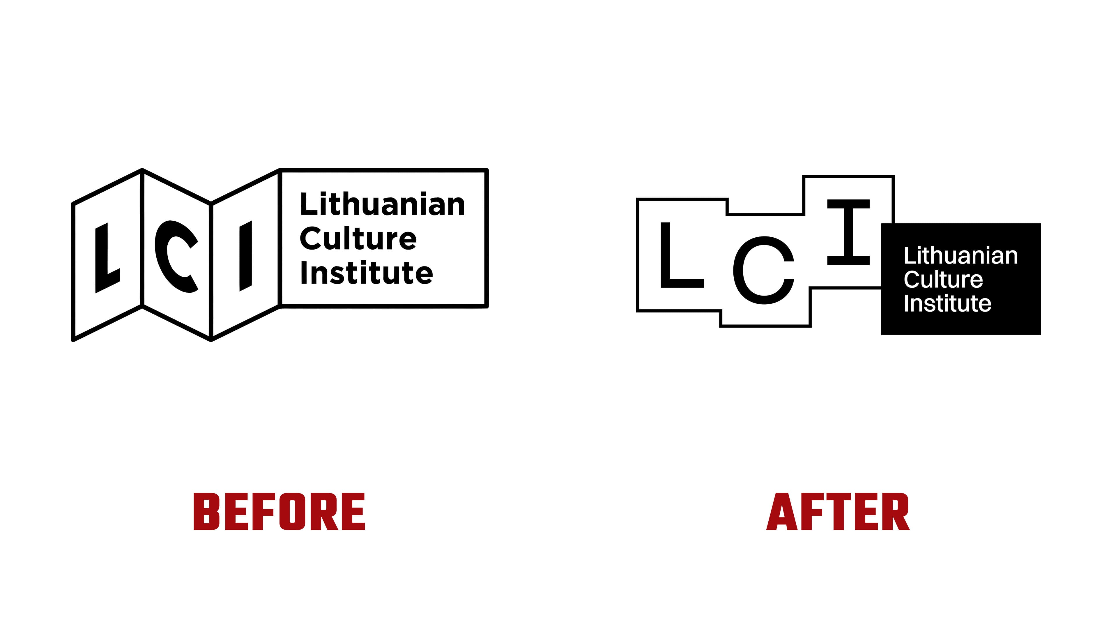
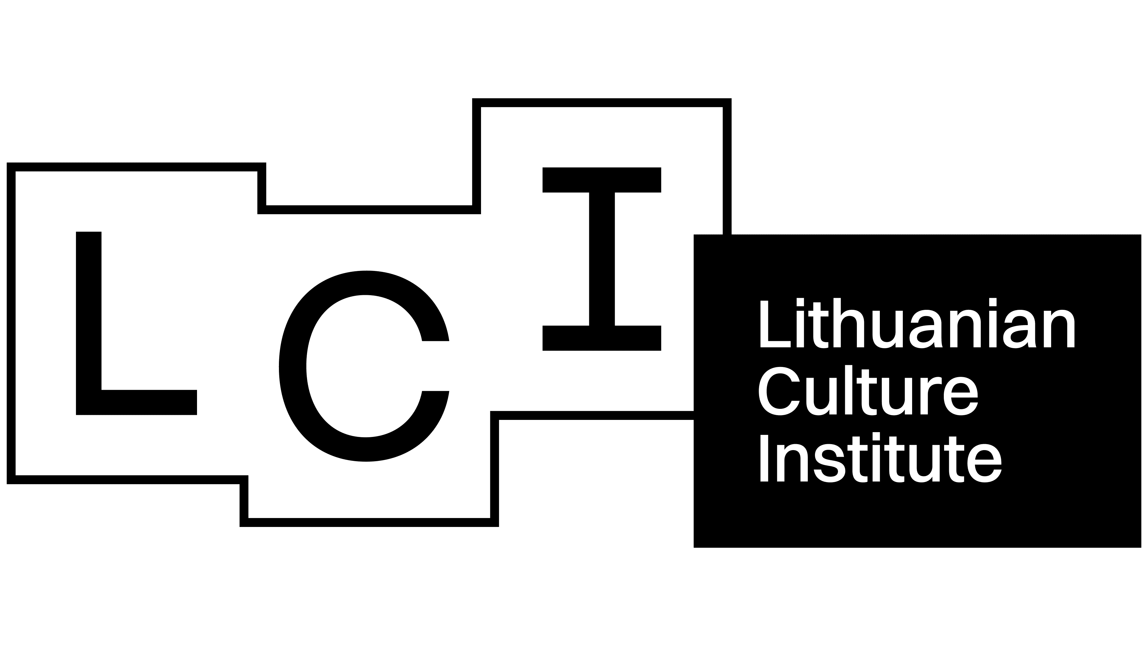
In the updated version, andstudio kept the abbreviation LCI and the full name Lithuanian Culture Institute. The presentation changed. The letters are placed in separate blocks, with a black panel carrying the name beside them. The mark gained a flat modular structure and flexibility across different formats.
LCI reads as a scheme for cultural exchange. The blocks connect to a pavilion, an exhibition plan, a project route, or a network of partners. The mark works through three letters, outlines, space, and the contrast between a light base and a black panel. LCI works with artists, curators, publishers, musicians, designers, and international organizations. The logo reflects exchange between people and institutions.
The typeface changed from Infra to Switzer by Indian Type Foundry. It works better with the thin lines of the blocks and suits websites, printed materials, presentations, and international correspondence. The abbreviation LCI became the brand’s main short code.
The identity moved away from museum solemnity toward an open organizational image. The Lithuanian Culture Institute now appears to be a framework through which projects, authors, and ideas reach new audiences.