


AOTO launched in 2026 as a service for car dealers. The brand helps handle tasks across vehicle sales, from floor plan financing and leasing to business support and post-purchase deal assistance.
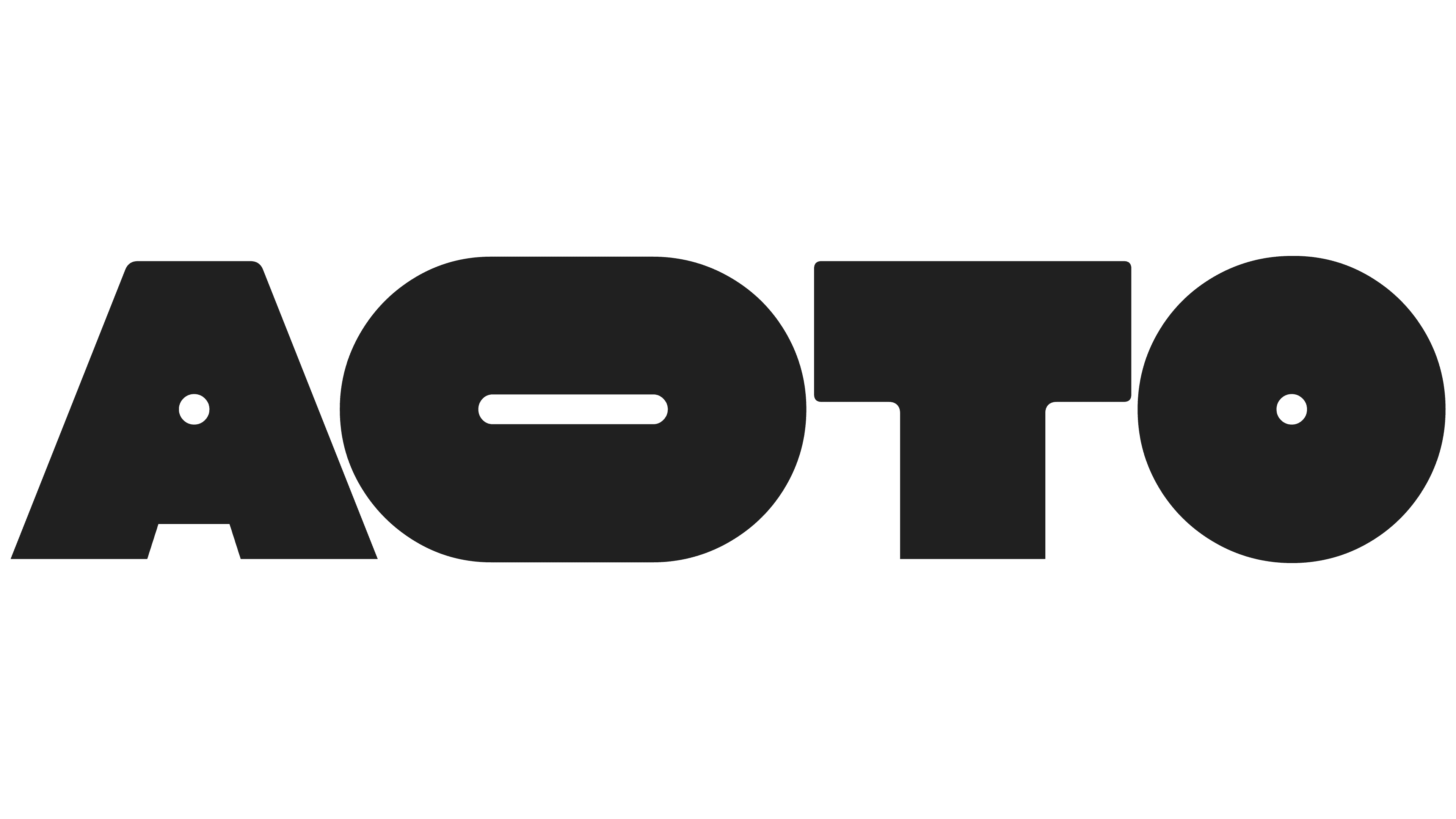
Gärde Design developed the identity for AOTO. The logo is built around four large letters. They look heavy, dense, and almost mechanical.
The letters “A” and “T” create a sense of construction. The two “O” letters in the logo refer to wheels, roads, and the automotive market through their shape. One “O” is stretched horizontally, giving the mark a subtle connection to transportation while keeping an abstract look.
Small round cutouts inside the letters add a technical detail. They resemble fasteners, holes in a component, or factory markings. On a black background, the white mark looks tough and compact. For AOTO, this approach is sufficient to connect the image with the industry, dealer services, and the market’s working mechanics.
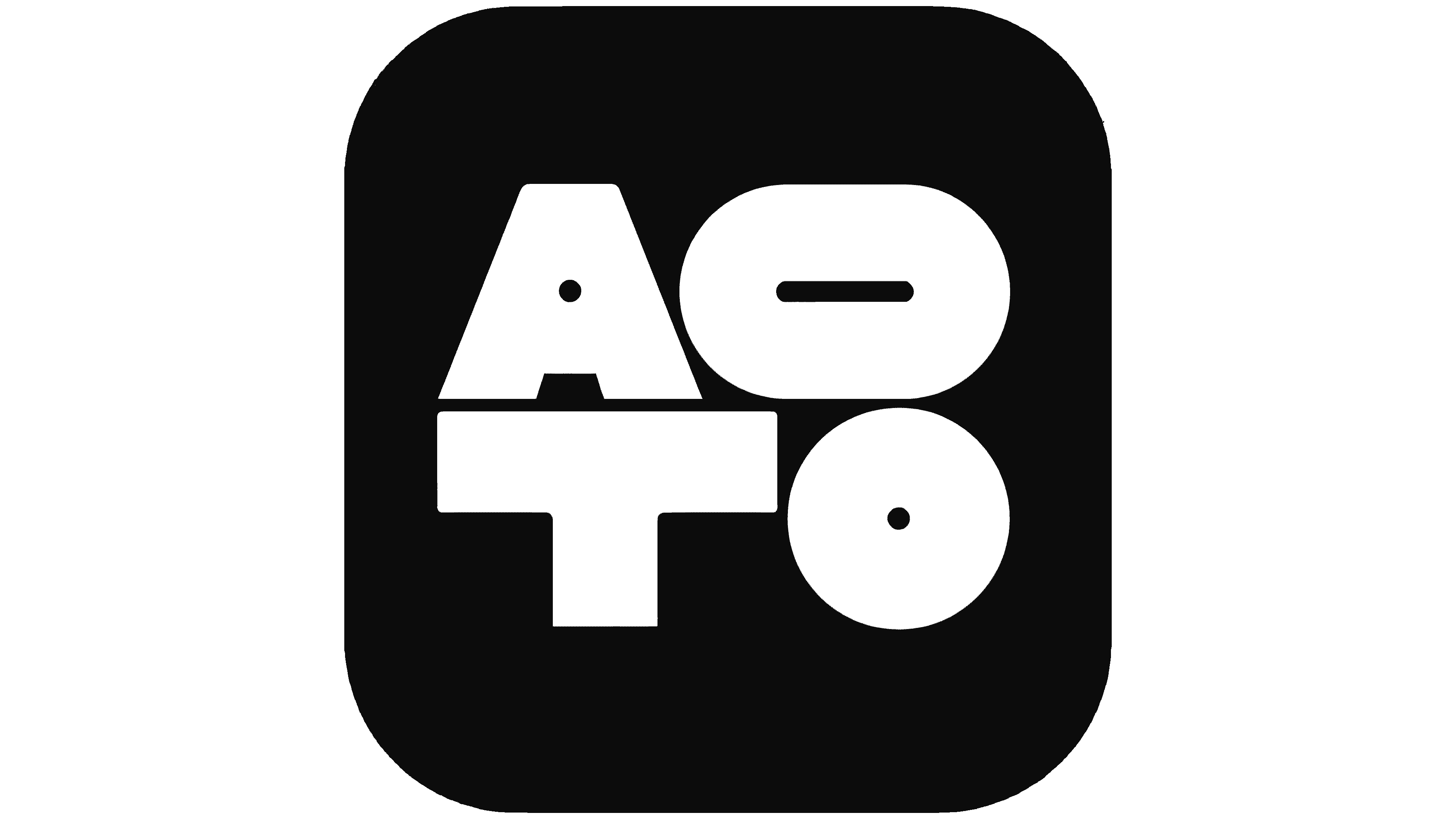
In animation, the letters stretch and change pace. The technique links the mark to acceleration, a deal, and the fast turnover of vehicles. In static form, the logo keeps the feeling of a tool.
The system uses Gaio by Gärde Design. It supports the mark’s large geometry and works for interfaces, presentations, documents, and business materials.
The new logo concisely explains the brand’s role. AOTO operates where dealers need speed, financing, inventory, sales, and post-deal service. The mark looks like part of a working system for the auto market, where delays cost money and processes are connected.