The Mexican Social Security Institute oversees all aspects of medical and pensions, so the IMSS logo is a symbol of care for those who are weak, frail, and need help. It is a symbol of support, not just in vain, but real because the image of the advocate is carefully crafted.
IMSS: Brand overview
| Founded: | January 19, 1943 |
| Founder: | Manuel Ávila Camacho |
| Headquarters: | Mexico City, Mexico |
| Website: | imss.gob.mx |
Meaning and History
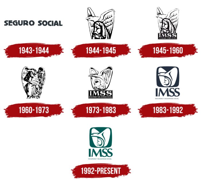
During the existence of IMSS, the visual recognition of the institute has gradually grown and has now reached its peak. At the same time, seven variants of the logo were used at different times. Most of the changes were minimal. Only the first version is unique, where in addition to the verbal inscription, there were no other elements.
What is IMSS?
This is an extremely important social institution for Mexico, which has been dealing with medical and social issues for almost a century.
1943 – 1944
The initial version of the IMSS logo was presented almost immediately after creating the Social Institute. It lasted only a few months and contained only the verbal inscription “SEGURO SOCIAL.” Although black letters on a white background looked gloomy, they conveyed the purpose and objectives of IMSS. A classic bold sans-serif font was used. The spacing between capital letters was kept to a minimum, except for the space between words.
1944 – 1945
The first redesign significantly changed the logo. Instead of a verbal inscription, it featured the IMSS emblem. It was based on an eagle with its head turned to the left and wings raised. Between them is a woman with a child. Visually, it looks as if the bird is protecting people. The emblem of the Institute is designed in black and white, but at the same time, it looks modern and confident.
1945 – 1960
It was decided to highlight the mother and child in the image, which was not so noticeable against the background of a powerful eagle. Moreover, the bird was now on a rectangle that served as a frame for the word inscription. The top line says “IMSS,” and the bottom line shows the name of the Institute. At the same time, this part is made in barely noticeable letters, which in some variations of the logo become almost unreadable. The main inscription is made in a classic bold sans-serif font. These are white letters on a black background.
1960 – 1973
The new redesign resulted in the “IMSS” name being removed again from the logo. The main image has also been changed. The woman with the child was now full-length, as was the eagle. Now he looked even more powerful, completely protecting his companions.
1973 – 1983
The image has been changed again. Even though all three characters remained intact, namely the eagle, the woman, and the child, they were now drawn in a futuristic style with confident rounded lines. The rectangular shape with a word inscription in two lines returned to the logo. It was white letters on a black background. On the top line, in bold sans-serif type, “IMSS” was written, and on the bottom, the full name of the Institute.
1983 – 1992
This logo redesign brought significant changes. For example, the emblem of the Institute was inside a black square. It is worth noting that the image has become more concise and minimalistic, but at the same time, it was associated with the activities of IMSS. A little lower, under the square, the abbreviation of the Institute is indicated in black letters on a white background. The wordmark is based on a classic bold font with thick lines and rounded corners.
1992 – today
For the first time in the existence of the Institute, he abandoned the faded black and white tones. The latest to date redesign is based on a deep green color. This version of the logo completely repeats the previous one, but the lines have become more confident and bright, and therefore the image is transmitted more clearly.
Font and Colors
The classic bold sans-serif font was used to write the verbal inscription. In some versions of the logo, in addition to the abbreviation IMSS, the full name of the Institute was also used, but it was made using small letters that are quite hard to make out.
A black and white color palette was used until the last redesign, which was subsequently changed to green and white. The latter option looks more harmonious and confident. Green is associated with life and development, which is extremely important for the company, part of the Ministry of Health.
IMSS color codes
| Deep Jungle Green | Hex color: | #005b57 |
|---|---|---|
| RGB: | 0 91 87 | |
| CMYK: | 100 0 4 64 | |
| Pantone: | PMS 3292 C |
