The SATA Air Açores logo conveys the airline’s aspiration for flight, ability to stay confident, and professionalism. The emblem is an identifier, showcasing the airline’s uniqueness and place in the aviation industry.
SATA Air Açores: Brand overview
SATA Air Açores plays a key role in the Portuguese aviation industry, offering reliable and efficient air transportation to the enchanting Azores archipelago in the Atlantic Ocean.
In 1941, Sociedade Açoreana de Estudos Aéreos embarked on a mission to make air transportation more affordable in the Azores region.
As air transportation grew in popularity, SATA Air Açores reached new heights by expanding its fleet and operations. The airline increased its capacity and reliability by switching from seaplanes to conventional aircraft.
A turning point came in 1998 when SATA Air Açores merged with SATA Internacional, specializing in medium and long-haul flights. This integration strengthened SATA Air Açores’ operations, extending its reach beyond the Azores and connecting the archipelago to various international destinations.
Meaning and History
What is SATA Air Açores?
SATA Air Açores was founded in 1941.The Portuguese gem of aviation is based in beautiful São Sebastião, Ponta Delgada, in the Azores, Portugal. The aircraft carrier began its journey focused on serving the Azores, an archipelago known for its special natural beauty and cultural heritage.
1941 – 1987
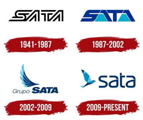
The original SATA logo emerged after the company Sociedade Açoreana de Estudos Aéreos Lda. was renamed Sociedade Açoreana de Transportes Aéreos. The first letters of its new name (“S,” “A,” “T,” “A”) formed the basis of the emblem, which stylistically resembles the NASA “worm” logo.
The text is rendered in an unusual outline font: each glyph is white inside, bordered by thick black lines. The ends have open gaps, turning the abbreviation into a maze-like pattern. This design signifies the brand’s openness and readiness for progressive ideas.
The letters, especially the two “A”s, have a futuristic shape that lacks crossbars. This style reflects the company’s commitment to modern trends in the aviation industry. The sleek monochrome logo characterizes SATA as a responsible airline with great ambitions and a dedication to customer satisfaction.
1987 – 2002
The updated SATA Air Açores emblem features simple geometric shapes that form the brand name.
- The “S” resembles a slanted number “5,” made from three horizontal parallelograms with rounded corners at the joints.
- Both “A”s consist of a trapezoid with an angled overlay.
- The “T” is based on a rectangle, with the top represented as a narrow inverted trapezoid.
This geometric design aligns with the futuristic style the company initially chose. However, the font is now bold rather than outlined, with narrow gaps between the elements. The massive letters convey the airline’s stability and strength. Their visual weight is balanced by the elongated shape of the figures, adding visual dynamism to the emblem.
The logo predominantly uses dark blue, associated with luxury, tranquility, and comfort. The exception is the two trapezoids at the base of both “A”s, which are sky blue. This color evokes a sense of lightness and flight.
2002 – 2009
After the redesign, the logo became simple and stylish. It now features the inscription “Grupo SATA,” using two radically different fonts: the first word in thin italics and the second in bold capital letters. The contrast in glyph thickness makes the company name highly visible, and the diagonal form adds a sense of motion. The visual dynamism of the emblem is important since the airline’s operations are associated with high speed.
The brand used the symbolic image of a bird to show its close connection with flights and aviation. Its silhouette is formed by two wings: dark blue and sky blue. This color scheme is associated with the sky and water, reflecting the company’s service of transporting passengers to the Azores in the Atlantic Ocean.
2009 – today
The SATA Air Açores logo features the Açor bird, symbolizing a natural guide that carries passengers across land and water. The bird is depicted in a geometric style using nine shapes: a compound pentagon, a trapezoid, and seven triangles of various sizes. These shapes represent the nine islands of the Azores, highlighting the airline’s regional roots.
To the right of the bird is the airline’s name, written in smooth, curved letters with beveled edges resembling a beak. The lowercase, bold letters are colored in dark blue, enhancing readability and adding a touch of elegance.
The geometric design of the Açor bird blends nature and modern design, conveying precision and reliability. The bird symbolizes the airline’s role in connecting people and places. The dark blue text signifies the depth of the Atlantic Ocean, central to the airline’s routes.
The smooth, curved letters with beak-like bevels reinforce the aviary theme, integrating the essence of flight into the logo. The dark blue color suggests trust and stability, essential qualities for an airline.
The SATA Air Açores logo combines geometric elements and thoughtful typography to create a distinctive and meaningful emblem. The Açor bird and the carefully designed lettering encapsulate the airline’s identity and its connection to the Azores. The logo is both modern and reflective of the region’s natural beauty and spirit.


