The cheerful Saved by the Bell logo conveys the comedic character of the TV series, which is included in the top 10 best sitcoms of all time, according to AOL TV. It’s bright, pleasing, dazzling – more precisely, impressive to the target audience. Cute features smooth out its roughness because the emblem is simultaneously geometric and angular.
Saved by the Bell: Brand overview
| Founded: | 1989 |
| Founder: | NBC |
| Headquarters: | United States |
Meaning and History
Even though the original sitcom and its continuations have different logos, common features can be seen in them. These are colorfulness, massive block-type letters, the absence of serifs, the combination of two types of fonts, a dark background, and strict geometricity. The style of the first variant set the tone for all subsequent emblems, which also served as intros.
What is Saved by the Bell?
Saved by the Bell is an American media franchise that includes a pilot project, an original sitcom, two spin-offs, several comics, and novels. The television projects were predominantly shot in the late 90s. They tell stories that unfold in a school environment. The series’ development took place in isolation, meaning that they are united only by title, theme, and the genre of teen comedies. The first one premiered in 1989, while the second and third came out in 1993. They were broadcast on NBC. The pilot series also ran for a year on the Disney Channel.
1989 – 1993
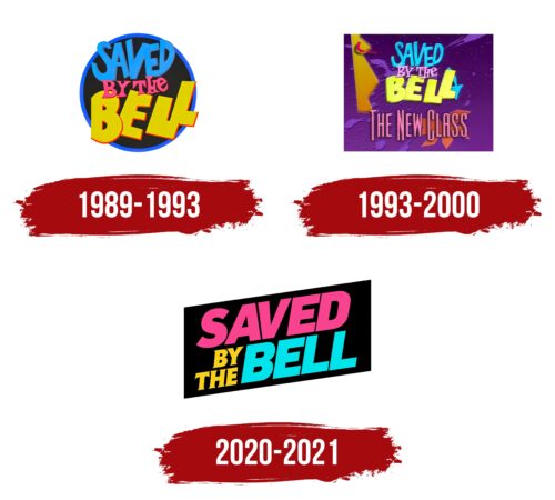
For the four years, the show aired, an engaging round logo flashed on the screens of eager viewers. It’s designed in a youthful style, so it perfectly attracts its target audience. The funny cartoonish appearance harmonizes well with the taste of the students. At the same time, it’s a geometric sign with carefully selected details. The textual logo consists of an inscription set in three tiers.
- The top tier contains the word “SAVED.” It’s blue, with subtle gray shadows on the right side. The letters are so close together that they connect with each other, forming a common construction. A similar effect is observed in the combinations “SA” and “VE.”
- In the middle level is the central part of the name – “BY THE.” Both elements are centered and slightly overlap the third word. They are painted in a bright pink color, complemented by red lines on the edges. All glyphs are decorated with bulky serifs of a triangular shape.
- The bottom line includes the final fragment of the franchise’s name – “BELL.” To optimally align the short word in length with the upper elements, the designers depicted it as very large. The large letters are painted in a warm yellow color and combined with red stripes. On top, some glyphs are combined, but here they do not merge into a whole. The inscription is made in italics in a block style.
For the background, a mysterious dark circle in a blue frame was chosen. It resembles a black hole, which is pulling in the inscription.
1993 – 2000
The release of the full-length film marked a square logo with a classic sign in the middle. Changes in it are minor: the red outlining lines on the right disappeared, but left-sided shadows almost matched the letter color that appeared. Blue and yellow remained in the original palette, while the pink became pale and unexpressive. At the bottom, the phrase “The New Class” appeared. It consists of vertically stretched glyphs without serifs. The text has a purple square with chaotic splashes of large and small drops, like it’s a cosmic space, as a background. On the left is a complex geometric figure composed of three triangles.
2020 – 2021
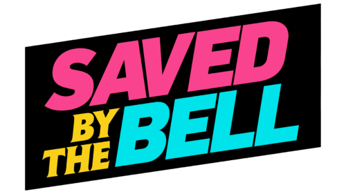
The next themed TV show also received its own signature logo. But it’s composed a bit differently than the others. It’s a black parallelogram with diagonal inscriptions inside. The text is divided into two groups, which occupy all the space of the geometric figure in two rows. The letters stand separately from each other: despite the minimal distance, they do not merge. The word “Saved” is done in a saturated pink, “by the” – sunny yellow, “Bell” – light blue. Serifs are only present in the middle fragment. They are miniature and sharp.
Font and Colors
The Saved by the Bell logo consists of an inscription set in three different types of typefaces:
- For “Saved,” the designers chose a similar to the Go Long font with narrow letters stretched upwards;
- The phrase “By The” is set in a Roman font, reminiscent of Font Diner Swanky with stocky glyphs;
- For “Bell,” a massive variant was used, which echoes the style with Sans Black, where the letters look like separate blocks.
In some emblems, characters are supplemented with shadows, adding three-dimensional volume to them; in others, they are flat. But there is a common similarity: these are uppercase bold fonts made to order by NBC.
The corporate palette of the media franchise emblems includes bright colors in particular; yellow, pink, and blue predominate among them. They are well balanced by black. Purple sometimes appears.
Saved by the Bell color codes
| French Fuchsia | Hex color: | #f9438e |
|---|---|---|
| RGB: | 249 67 142 | |
| CMYK: | 0 73 43 2 | |
| Pantone: | PMS 213 C |
| Yellow | Hex color: | #f8d019 |
|---|---|---|
| RGB: | 248 208 25 | |
| CMYK: | 0 16 90 3 | |
| Pantone: | PMS 116 C |
| Dark Turquoise | Hex color: | #00e3ea |
|---|---|---|
| RGB: | 0 227 234 | |
| CMYK: | 100 3 0 8 | |
| Pantone: | PMS 3262 C |
| Black | Hex color: | #000000 |
|---|---|---|
| RGB: | 0 0 0 | |
| CMYK: | 0 0 0 100 | |
| Pantone: | PMS Process Black C |


