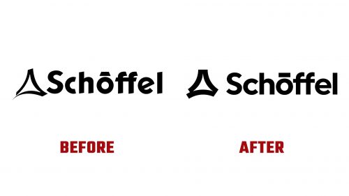
Schöffel, the well-known outdoor clothing brand, has introduced a redesigned brand identity with a modern logo. This update aims to sharpen the focus on authentic nature experiences and reflect a commitment to quality.
The company’s history dates back to 1804 when Georg Schöffel started selling socks, stockings, and nightcaps as a traveling merchant in Bavaria. Over the years, the business grew, opening its first clothing store in 1950 and expanding into children’s and men’s trousers by 1961. By the mid-1960s, under Hubert Schöffel’s leadership, it specialized in sportswear. By 1975, it had become Germany’s market leader in hiking apparel. Today, the seventh-generation family business, led by Peter Schöffel, employs around 200 people.
The brand will undergo a redesign in the coming months to solidify and expand its position as a leading manufacturer of functional outdoor clothing. The central message, “Ich bin raus” (“I’m out”), used for over a decade, will be reinterpreted to emphasize joy, self-determination, and mental wellness. This new direction was first presented at the Outdoor by Ispo trade fair in early June.
The new design is clear, minimalist, and modern. Corporate colors will be light green and dark green, with vibrant RGB values for digital media. A new visual component, the “seam,” symbolizes reliability, safety, and 220 years of tailoring expertise. Christina Widmann, Executive Design Director at Jung von Matt Brand Identity, explains that the seam represents quality, durability, and a connection to nature.
The logo has undergone a subtle yet impactful transformation. The original, introduced in 2000, has been refined with increased stroke width and straightened lines. The new triangular shape, resembling a mountain silhouette, represents the core segments: outdoor, ski, and bike. This visual element symbolizes customers’ “Ich bin raus” moment, whether enjoying nature, climbing a mountain, or skiing.
The new “seam” and redesigned logo share a cohesive visual language. Widmann emphasizes that the seam is an ideal symbol due to its versatility and strong character. The new design integrates classic elements with this newly developed identifier, enhancing visual identity across all touchpoints.
The company has adopted a new typeface: Ginto by Dinamo. This typeface complements the other brand elements and rounds out the presentation, replacing the previous Klavika typeface.
The new design will be implemented in the Autumn/Winter 2025 collection. Although it will take some time to become fully visible, the commitment to innovation and quality remains steadfast. This ensures the visual identity aligns with core values and customers’ evolving needs.


