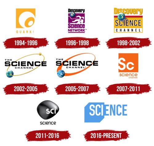
The Science logo is related to the theme of television. There are several such emblems, but all contain at least one element indicating that they represent a scientific film studio. In modern identity, the similarity of most of them to the symbols of the periodic table of chemical elements serves as a sign of this.
Science: Brand overview
| Founded: | 1994 |
| Founder: | Warner Bros. Discovery |
| Headquarters: | Silver Spring, Maryland, U.S. |
| Website: | sciencechannel.com |
Meaning and History
Since its inception, this channel has undergone several rebrandings. For example, when announced in 1994, Discovery Networks called it Quark! In 1996, when the project was launched, it received another name – Discovery Science. It was included in the package of novelties along with Discovery Civilization, Discovery Kids, and Discovery Home & Leisure. In 1998, the channel became known as Discovery Science Channel, and in 2002 – it as The Science Channel. Since 2007, it has been operating under the name Science Channel. Now, the shortest possible version consisting of one word is in use.
Each of these options is directly reflected in the visual identity of the TV project. Several logos, including the current one, fully correspond to its concept, as the creators based it on the periodic table of chemical elements. They sought to reflect the scientific orientation of the shows in the emblem. And they achieved this through the abbreviated name placed in a square. In total, Science has eight different format emblems.
What is Science?
Science is a television channel from the Warner Bros. Discovery portfolio. It was launched in 1996, and before that time, it existed as a pilot project (since 1994). It features shows about space achievements, scientific research, technical progress, innovations, engineering, ufology, and more. Its headquarters are concentrated in Silver Spring, Maryland.
1994 – 1996
Before the launch of the TV project, its logo contained an improvised “Q,” with which the name – Quark! – began. In turn, it consisted of a short word and had an exclamation mark at the end, emphasizing the channel’s scientific nature. The meaning of this physical concept is simple: the basis of matter, i.e., everything that exists in the world. Quarks (elementary particles) combine into more complex structures. The inscription is made in uppercase sans-serif. At the top, there is an orange square with several concentric circles of different sizes.
1996 – 1998
When Quark! was relaunched as Discovery Science Network, it received another emblem. However, it was not a partial redesign but a complete identity replacement. The symbol had the shape of a vertical rectangle with a white astronaut, a blue globe, and a purple name. The inscriptions occupied three lines – one word per row.
1998 – 2002
The next rebranding brought a different style of identity. The logo was horizontal, with a three-level name and without an astronaut. In the first line, the word “Discovery” was separated from the rest by a red stripe. A wide sandy-yellow rectangle contained the large inscription “Science,” and a narrow white rectangle housed the word “Channel.” The designers retained the blue-green planet as a symbol of the channel being about various scientific aspects of life on Earth.
2002 – 2005
This Science emblem resembled a model of Earth in orbit. Opposite the blue-green planet, a small golden dot rotated. The channel’s latest name was placed over the graphic elements. It was entirely black. Concrete Pictures worked on this symbol.
2005 – 2007
Designers removed the green color from the Earth, leaving blue and adding white – as if it were a view of the Earth from the porthole of a spaceship. They replaced the golden oval with an orange one. As it moved away from the planet, the stripe narrowed, getting smaller and smaller. The inscription remained the same – three-level and black, with the middle word in the name highlighted in large font.
2007 – 2011
Design studio Thornberg & Forester modernized the Science logo. As a result, the article “The” disappeared from the name. This was the first innovation. The second was related to the implementation of the concept of the periodic table of chemical elements as if the channel were also included in that list. Therefore, an orange square with the designation “Sc,” reminiscent of the real element scandium, appeared in the emblem. The full name was placed below in two rows and was typed in a grotesque font.
2011 – 2016
Agency Imaginary Forces proposed a droplet-shaped logo variant. However, the improvised “drop” did not hang downward but was in a horizontal position. Designers colored the background in dark gray with reflections and placed the first three letters of the word “Science” on it. They were uppercase. The lower inscription was made with thin and rounded glyphs.
2016 – today
Specialists from Sibling Rivalry Studio, commissioned by Discovery Communications, created a new logo for Science. It is also oriented towards the theme of the periodic table of chemical elements, so it consists of a square with an inscription inside. However, the designers went a little further and turned the square into a cube, which is clearly visible in its outline. Instead of the first two letters of the channel’s name, they used three. At the same time, the developers did not remove the other glyphs but made them wider and converted them to uppercase. The color palette of the emblem received a sky-blue color.
The transformation of the Science logo is related to the regular renaming of the brand or the periodic change of its image. Therefore, each time a new name arose, the channel’s management changed its visual identity.
Font and Colors
All Science emblems contain text. In the latest versions, it is made with the fonts ITC Avant Garde Gothic (a modified version) and DIN Condensed. The only thing that unites these and other typefaces is the absence of serifs. The palette does not vary much because each logo predominantly features only one color. Mainly, orange, purple, dark gray, sandy-yellow, black, and blue are used. They are usually complemented by white.
Science color codes
| Blue Gray | Hex color: | #529ee9 |
|---|---|---|
| RGB: | 82 158 233 | |
| CMYK: | 65 32 0 9 | |
| Pantone: | PMS 2925 C |


