


![]()
Scope, a UK-based charity advocating for disability equality, has launched a new logo and updated brand identity. This redesign reflects the organization’s ongoing mission to create a society where everyone has equal opportunities while embracing a fresh, modern look.
Since its founding in 1952, the organization has been dedicated to championing the rights and inclusion of disabled people, working tirelessly to break down barriers and promote equality. This rebranding marks the start of a new chapter, aligning with its 10-year strategy, “An Equal Future.” The changes aim to help the charity connect with more people, inspire action, and strengthen its message.
![]()
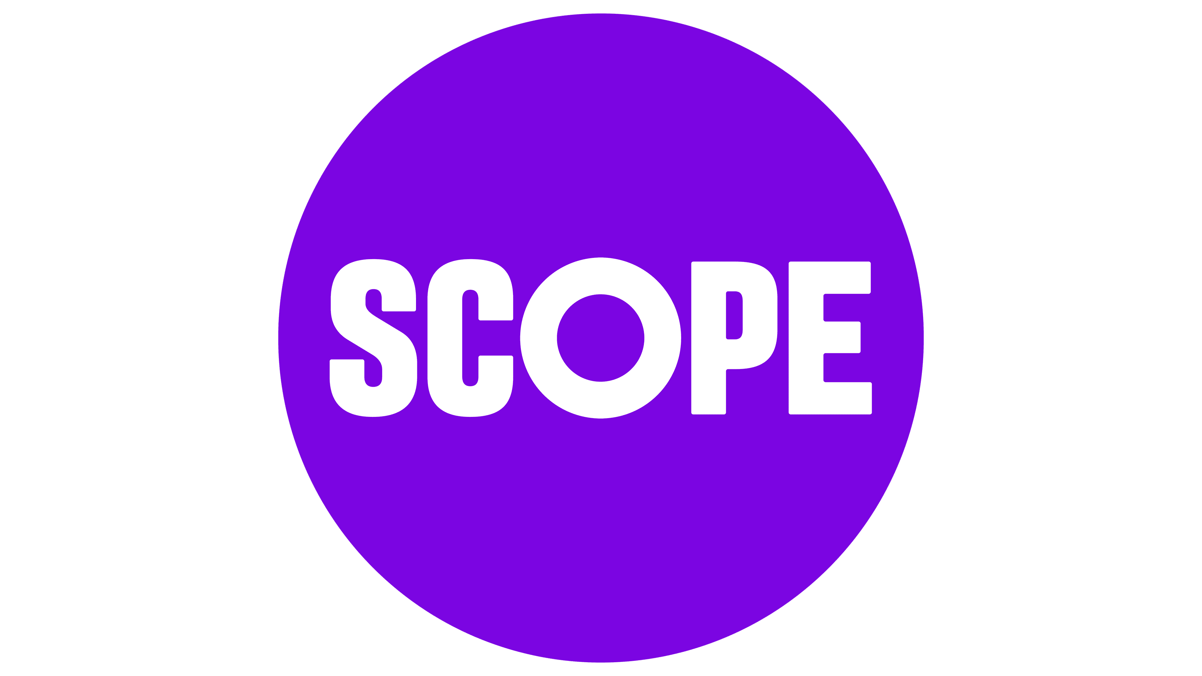
The new logo features a bold, contemporary sans-serif typeface, making it instantly recognizable and confident. The clean design communicates clarity and purpose, underscoring the role of the charity as a leading voice for change. Its signature purple has been reimagined in a richer, more vibrant tone, symbolizing energy, reliability, and inclusivity.
The updated logo focuses solely on the word “Scope,” removing the previous tagline, “Equality for disabled people.” While the tagline is no longer part of the logo, the mission remains at the heart of the organization’s work. The streamlined design increases versatility, making it adaptable across various platforms and applications.
One of the standout elements of the rebrand is the addition of a circular motif, central to the new visual identity. This circle represents “space to amplify,” reinforcing the charity’s commitment to centering disabled people in its work. The circle is used creatively across the design system, appearing as action bars, decorative accents, and consistent iconography.
Accessibility was a key focus in the rebranding process. The chosen typeface, Labil Grotesk, is designed for readability and clarity, with distinct character forms to enhance accessibility. Supporting fonts include Arial for digital use and Hargreaves for body text, ensuring inclusivity across all formats. Other accessibility improvements include optimized line spacing and high-contrast icons on yellow circular backgrounds for easy recognition.
![]()
The new identity also emphasizes diversity and inclusion through photography and imagery. Disabled models and influencers played a central role in the branding campaign, reflecting the organization’s dedication to representation. Over 3,000 color combinations were tested with disabled participants to ensure optimal visibility and contrast.
This rebranding reinforces the charity’s commitment to amplifying the voices and experiences of disabled people. By modernizing its visual identity and prioritizing accessibility, the new look highlights the dedication to creating a future where everyone is valued and supported. This bold design positions the organization as a leader in advocating for equality and driving meaningful change.