“Sign a contract with us,” the Scotiabank logo calls, “we are ready to work tirelessly for your well-being.” The emblem demonstrates the energy contained within the framework of the law and accepted standards as a result – profitable transactions and profits.
Scotiabank: Brand overview
Scotiabank is a Canadian bank with Scottish roots. At first, the Bank of Nova Scotia involved transatlantic trade between three parts of the world: Europe, America, and Africa. Then, he launched a branch system and began developing new territories up to the Caribbean. Having entered the international level, the financial institution moved to Ontario’s province and changed its name 75 years later to make it universal. This is how the global Scotiabank brand appeared, not tied to a specific geographic location.
The bank, founded in 1832, acquired over twenty companies and opened hundreds of representative offices abroad. It is present in the Dominican Republic, Jamaica, Mexico, and almost fifty other countries, where about 92 thousand employees work under the famous red and white Scotiabank emblem (as of 2020). Its services focus on the international market, so the globe is the main graphic symbol.
Meaning and History
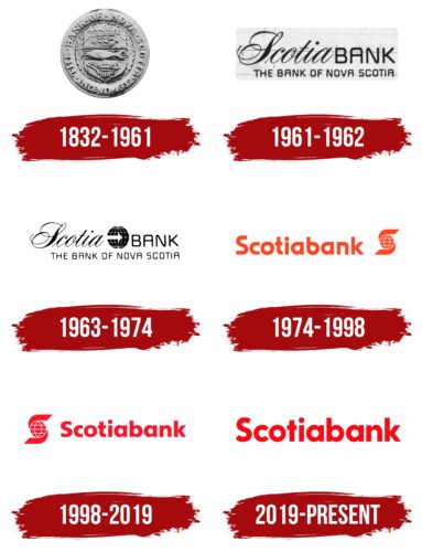
The modern visual style is relatively new. Before this, the financial institution used a wordmark that Allan Fleming developed in 1961. The sketch is still kept in the Toronto archives of the Scotiabank Group. The designer at Cooper & Beatty shortened the name Bank of Nova Scotia to Scotiabank and combined two contrasting fonts to make the typography stand out. For Scotia, he used an 18th-century typeface imitating calligraphic handwriting, and for BANK, he used a sans serif with rounded corners, similar to machine-readable fonts.
The rest of the company’s logos look completely different. And there are at least four of them because Scotiabank has been looking for its unique style for a long time. When he finally strengthened his position in the international market, he needed a universal symbolism.
What is Scotiabank?
It is a bank of Canada ranked in the top 3 in terms of market capitalization and household deposits. It appeared in 1832, initially with its head office in Halifax (Nova Scotia). His move to Toronto (Ontario) took place in 1900. Now it is a huge structure of the international level, which serves over 25 million clients and offers a wide range of services.
1832 – 1961
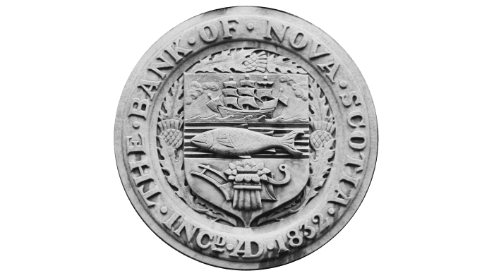
In 1832, the Bank of Nova Scotia appeared – the future Scotiabank. It was so-called until 1975. The banking institution branches were decorated with a round coat of arms depicting a heraldic shield, divided into three parts. In the upper segment was a three-masted sailboat; in the middle – a fish, and in the lowest – a bandaged sheaf against the background of an old plow. The point is that the bank was created for transatlantic trade. The ships flew between the three parts of the world and transported valuable goods, including agricultural products. Therefore, all elements of the emblem had a logical relationship.
The shield was placed on a wreath of flowers and thistle leaves. He was also surrounded by a wide frame—a ring with the inscription “THE BANK OF NOVA SCOTIA INC 1832″—with bold dots between the words. Alexander Scott Carter designed this coat of arms in 1921. A color reproduction appeared a little later.
1961 – 1962
In 1961, the designers created a logo with a double inscription. As stated on the bank’s official website, this was the earliest use of the “Scotiabank” wordmark. The top line contained the brand name, visually split in half in different fonts. For “Scotia,” a handwritten typeface in the Spencerian style of the 18th century was chosen. She represented Scotiabank as a trustworthy institution with a long tradition. But the following letters (“B,” “A,” “N,” and “K”) were converted to uppercase and written in a custom grotesque, which was based on decimal digits from the E-13B font for MICR. The second line was occupied by the phrase “THE BANK OF NOVA SCOTIA.” It was typed in a geometric sans-serif typeface.
1963 – 1974
In 1962, Scotiabank began to develop the Asian market—primarily the Japanese one. He placed a stylized globe image on the logo to show his global presence. The light blue globe was streaked with parallels and meridians. At the same time, a white arrow was inside it, directed from the left side to the center. The brand name often supplemented this symbol, and the words “Scotia” and “BANK” were separated in different fonts, as on the 1961 emblem.
1974 – 1998
In 1975, the financial institution changed its name to Scotiabank to make the brand international. Simultaneously, a logo appeared with this word and the iconic icon as a stylized “S.” In front of the letter was a globe—a symbol of the multinational company’s coverage of the world with its network of branches. The primary color was red, and the secondary color was white.
Interesting fact! The company held a competition among its employees for the best logo for the company. As a result, Henry (Hank) Hiroyuki Sagara became the winner. The stylish S symbol invented by him until this time serves as the basis for the company logo.
1998 – 2019
At the turn of the millennium, the emblem’s appearance was changed by a rebranding. The letter “S” with a globe has moved to the left. The inscription “Scotiabank” has been slightly reduced and moved to the right. The red has taken on a deep pink hue.
2019 – today
In May 2019, the bank’s owners decided to simplify the logo and split it into two parts. The wordmark with the updated font has become the main element of Scotiabank’s visual identity. The “S” graphic continued to be used as a secondary icon. Moreover, the icon’s design has changed markedly: the globe, lined with parallels and meridians, has turned into a simple red circle, and the letter has been transformed from two curving lines of the same color.
Scotiabank: Interesting Facts
Scotiabank, also known as The Bank of Nova Scotia, is a major Canadian bank with a global reach. Founded in 1832 in Halifax, Nova Scotia, it’s grown into a global financial services provider.
- Global Operations: Starting in Halifax, Scotiabank now operates in over 55 countries, particularly in Latin America, the Caribbean, Europe, and Asia, making it Canada’s most international bank.
- Early Days: It supported transatlantic trade between Europe, North America, and the West Indies, reflecting Nova Scotia’s maritime and trade heritage.
- Banking Innovations: Scotiabank introduced Automated Banking Machines (ABMs) and online banking in Canada, making banking more convenient for customers.
- Sports Sponsorships: Scotiabank is known for supporting sports, sponsoring teams, events, and venues like the Scotiabank Arena in Toronto, enhancing community involvement.
- Arts Support: The bank also backs the arts, notably through the Scotiabank Giller Prize, Canada’s esteemed fiction award, and supports various cultural festivals.
- Community Engagement: Scotiabank’s Bright Future program funds initiatives in education, health, social services, and the environment, showing its dedication to community development.
- Tech and Innovation: Scotiabank invests in digital banking and fintech and collaborates with startups in digital labs and innovation hubs to improve customer service and efficiency.
- Economic Role: As one of Canada’s largest banks, Scotiabank is key to the national economy, providing extensive financial services to millions.
- Diversity Efforts: The bank is dedicated to diversity and inclusion, striving for a workforce that mirrors the diverse communities it serves. It has been recognized for its efforts in gender equality and inclusivity.
- Archives: Scotiabank maintains a rich archive of its history, including documents, photos, and memorabilia that highlight its growth and Canada’s banking evolution.
From its beginnings in Nova Scotia to becoming a significant player on the global stage, Scotiabank’s story is one of adaptation, innovation, and a strong commitment to customers, communities, and stakeholders worldwide.
Font and Colors
The main symbol of an international financial organization used to look like a real globe, albeit without continents. The same graphic element can now be found on the BBC Panorama logo. In 2019, designers simplified the image as much as possible, focusing on geometric shapes. To do this, they removed the vertical and horizontal stripes and, at the same time, separated the two parts of the letter “S,” which was hidden behind the planet. The emblem remains recognizable but resembles an abstract eye with a large round pupil.
The previous Scotiabank wordmarks are based on the Sharp Sans font. This geometric sans-serif was created by the typographer Lucas Sharp. The first version of the typeface was published in 2009, and a revised update came out in 2016. The last logo has a slightly different letterform. In particular, “t” has no bend at the bottom, and the edges of “S” and “c” are cut at a sharper angle.
The colors were also constantly changing. In 1998, orange-red (# F14524) changed to rose red (# EE1229). Then, the pink tint disappeared, and the lettering turned dark red (# EC0712).
FAQ
What is Scotiabank’s slogan?
The slogan “You are richer than you think” reflects the brand’s approach to personal finance. It shows that clients have more financial potential and opportunities than they may realize. The brand helps clients discover and maximize their financial resources, guiding them to better financial decisions and increased wealth.
What is Scotiabank’s banking code?
Bank codes are important for financial transactions. The brand’s establishment code is 002, used in Canadian banking. This code is required for domestic transactions such as electronic funds transfers and direct deposits.
For international transactions, the brand uses the SWIFT code NOSCCATT. This code is required to send and receive bank transfers worldwide. These codes ensure smooth and secure financial transactions within Canada and abroad.
What does the Scotiabank logo mean?
The logo reflects the brand’s personality and its global reach. It has a clear font with wide letter spacing for easy reading. The color red shows energy and confidence. The globe icon symbolizes the brand’s commitment to offering services worldwide. The globe was originally part of the text but is now used separately to emphasize its importance. This logo reflects the brand’s mission to connect and support customers globally.
Why did Scotiabank change their logo?
The brand changed its logo to make it more modern, simple, and readable. The globe was removed from a complex S-shape that was difficult to understand. The new logo now features the brand name in a clear red font. The globe icon is still used but is separated from the text. This change ensures the logo is clear and aligns with the brand’s goal of being more accessible and modern.
What is the font of the Scotiabank logo?
The logo uses Frutiger Black, a humanist sans serif known for its clarity and readability. The brand uses ITC Century for other purposes as a key part of its corporate image. These fonts give the brand a distinctive and professional look. Using Frutiger Black in the logo shows the brand’s clear and modern visual identity.

