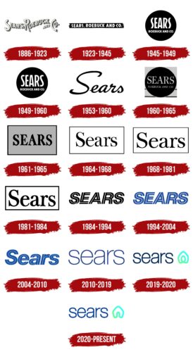
The logo of the American retail chain Sears is characterized by its simplicity. It contains only text – the name of the commercial company in various forms. In the modern emblem, a graphic icon in the form of a miniature house, drawn with a single continuous line, has appeared. It conveys the principle of uniting all points of sale.
Sears: Brand overview
| Founded: | 1892 |
| Founder: | Richard Warren Sears, Alvah Curtis Roebuck |
| Headquarters: | Hoffman Estates, Illinois, U.S. |
| Website: | sears.com |
Meaning and History
Initially, the Sears company, founded by two entrepreneurs, dealt with mail orders and the delivery of goods. To do this, they printed catalogs, where they included available products and their prices. The catalogs then went to the countryside, where anyone could get everything they wanted. However, difficulties began in the country, as a result of which consumer purchasing power declined, and many products remained unclaimed.
In the end, Alvah C. Roebuck sold his share to Richard W. Sears and left the business. Later, Julius Rosenwald joined him, and the company had to be registered again. Despite Roebuck’s departure from the company, the entrepreneurs initially left his last name in the title because it was already well-promoted and recognizable. Over the years, the stores’ visual identity changed 15 times.
What is Sears?
Sears is an American department store chain. It has been operating since 1892, starting with catalog orders and mail delivery. Its founders were two entrepreneurs: Richard Sears and Alvah Roebuck. Later, Roebuck left the business, and his place was taken by Julius Rosenwald. The new partners re-registered the company in 1906. The main management of the department stores is located in Hoffman Estates, Illinois.
1886 – 1923
The first official Sears logo contained the phrase “Sears, Roebuck, and Co.” The inscription was made in the form of a wavy line, so its parts did not coincide in height. The letters were uppercase and outlined, with a monochrome shadow on the right side. The smallest in size was the connecting union, while the other words remained large.
1923 – 1945
The second version of the inscription became the new logo in 1923. It was the same phrase but designed in a different style. It had a black background in the form of a wide horizontal stripe, in which white words of equal size were placed. The font was bold and bubble-like.
1945 – 1949
The next redesign brought a round emblem. The spherical space was colored black, with the text visible, typed in white letters. The word “Sears” was written in a large font, while the phrase “Roebuck and Co” was in a smaller font, centered. The text occupied two lines.
1949 – 1960
Designers kept the logo structure but changed the font in the first word of the store chain’s name. The wavy letters “S” were removed, and standard ones appeared instead.
1953 – 1960
From 1953, a parallel emblem with italic text, reminiscent of handwriting, was used. It adorned the signs in front of the department stores. The first “S” was uppercase, while the other glyphs were lowercase. The letters were executed in smooth, semi-bold lines.
1960 – 1965
The management of the Sears supermarket chain returned to the circle, so the emblem consisted of a black disk with the name inside. However, the inscription was now set in a serif font, not a sans-serif. Moreover, the serifs were thin and sharp. The two-level arrangement of the text was preserved.
1961 – 1965
After the rebranding and the shortening of the store names to a single word, the chain received an updated logo. It consisted of an inscription outlined by rectangular frames. Both the border and the letters were black. The simplified adaptation was related to placing the emblem in newspaper advertisements.
1964 – 1968
The logo became simpler and cleaner. For this, the developers made the frame even thinner and replaced the uppercase font with a lowercase one (except for the first letter). The serifs were preserved.
1968 – 1981
The emblem was changed again, but this time the designers only corrected the font. They increased the size of the letters and added width to them.
1981 – 1984
To make the inscription on the logo more visible, the developers made the letters bold.
1984 – 1994
The design studio Bob Girsen & Associates participated in creating this emblem. They removed the frame that enclosed the inscription. First, the frame was removed. Second, another stripe was added to the letters, making them double. The uppercase font was brought back.
1994 – 2004
The black color of the department store name was replaced with blue.
2004 – 2010
The identity update affected the font. Developers changed the letters to lowercase, leaving only the “S” uppercase. The double lines in the glyphs were preserved. The redesign was related to the establishment of Sears Holdings.
2010 – 2019
The wordmark of the Sears company received another font – thin, rounded, smooth, sans-serif. All letters were changed to lowercase and increased in size.
2019 – 2020
The department store chain updated its visual identity after successfully emerging from bankruptcy proceedings caused by declining sales within the parent company Transformco. However, the logo resembled the emblem of Airbnb – a platform for searching and renting accommodations. Therefore, the new identity was criticized. The emblem featured a neon-green house with the department store name beside it. The inscription was in dark blue lowercase letters.
2020 – today
The modern version of the logo contains the same house as before but without the central loop. The developers removed it to reduce the similarity of the symbol to the Airbnb emblem. Now there is nothing instead of it – just an empty space. The bright building with a gable roof is drawn with a single closed line. The inscription has a light blue color palette.
Updating its logo in 2019, Sears sought an identity filled with home warmth and cordiality. However, it turned out the opposite, as they were accused of plagiarism: a similar symbol has long been used by the online accommodation platform Airbnb. It has the exact same house with a heart in the center and a similar concept.
Font and Colors
Over its many years of existence, this store chain has changed 16 emblems with different versions of the name inscription. Some typefaces were bold and wide, others narrow and tall. In particular, some resembled fonts like Neue Helvetica 96 Black Italic, Helvetica 35 Thin, and Nimbus Sans Black Italic.
The corporate palette is less diverse than the typography. It is mainly built on monochrome versions of black or blue colors. Now, a light green neon spectrum color has appeared.
Sears color codes
| Royal Azure | Hex color: | #033e9b |
|---|---|---|
| RGB: | 3 62 155 | |
| CMYK: | 98 60 0 39 | |
| Pantone: | PMS 661 C |
| Bright Mint | Hex color: | #5affb0 |
|---|---|---|
| RGB: | 90 255 176 | |
| CMYK: | 65 0 31 0 | |
| Pantone: | PMS 3405 C |
| Neon Cyan | Hex color: | #37fff7 |
|---|---|---|
| RGB: | 55 255 247 | |
| CMYK: | 78 0 3 0 | |
| Pantone: | PMS 3265 C |

