


![]() Seattle Mariners Logo PNG
Seattle Mariners Logo PNG
The correct direction is what a professional MLB baseball team demonstrates. Therefore, the Seattle Mariners logo resembles a compass with an accurate bearing. The circular shape mirrors the contours of the globe and enables more accurate orientation in the surrounding world, namely on the sports field. The compass also serves as a symbol for sailors.
The Seattle Mariners are a professional-level baseball team competing in the MLB. The team represents the AL West Division and is based in Seattle, Washington. It was founded in 1977.
This American club emerged from litigation between the AL and city authorities, with Senator Slade Gorton representing the city authorities. The lawsuit was filed because the league violated a contract by illegally taking the Seattle MLB representative. Confident that the city would get its team, the county built the multi-purpose Kingdome Stadium. It was there that the “Seattle Mariners” debuted.
After the official expansion process, a new franchise appeared in Seattle. Its owners were a group of individuals (Stanley Golub, Walter Schoenfeld, Lester Smith, James Stillwell Jr., and James Walsh) led by Danny Kaye. They managed the club for three years, after which it was transferred to George Argyros, who managed it for nine years. The team’s owner from 1989 to 1992 was Jeff Smulyan.
In the first half of the 1990s, the “Seattle Mariners” again became the subject of trade talks. Then-Senator Slade Gorton approached Nintendo of America to identify a Japanese investor to financially support the American club. Yamauchi made a counteroffer, and Smulyan accepted it. However, the agreement was not approved by Fay Vincent, the head of the property committee.
After pressure from Seattle residents, management, and the public, the official finally made concessions on the deal. But on the condition that the Japanese businessman would own less than 50% of the shares, and the Baseball Club of Seattle, LP would remain the key manager. It currently owns the franchise.
The team’s name appeared a year before its founding. Officials initiated it, and in August 1976, they announced a competition. As a result, out of 600 options proposed by 15,000 participants, “Mariners” was chosen. Several people suggested this name, but Roger Szmodis from Bellevue gave the best justification. He became the winner.
The club’s symbolism has been associated with the maritime theme from the beginning. Early versions featured a trident, while modern ones featured a compass. The initial logos were associated with water rather than baseball, so they changed several times.
Meaning and History
![]()
This baseball team was founded in 1977, so its logo history is quite short, with only four versions. But, on the other hand, they are so diverse that finding two identical copies is simply impossible. Designers tried to diversify them to introduce significant novelty. The only thing that unites them is the theme. Now, the simple concept and the new logo are easier for fans to understand.
What is Seattle Mariner?
The “Seattle Mariner” is an American professional baseball team in the MLB. It is part of the AL and competes in the Western Division. The club appeared in 1977 as an expansion franchise. Until 1999, it played home games at Kingdome Stadium, then moved to T-Mobile Park in a different location. The team owes its name to the region’s honorary attitude towards sailors.
1977 – 1980
![]()
The first original Mariners logo consisted of a large yellow circle with a thin dark blue outline, the name “Seattle Mariners,” and, just below, “Baseball Club.” In the word “Mariners,” the letter “M” is replaced with a marine blue trident.
1981 – 1986
![]()
The Seattle Mariners slightly changed their logo. Now, the background features a five-pointed star, white with a dark blue outline, and in the foreground, a voluminous blue letter “M” shaped like a trident, outlined in thin yellow.
1987 – 1992
![]()
The new team logo used the abbreviation of the word “Mariners” – “M’s.” The letters were executed in blue and placed in the center of a large white baseball with blue stitches.
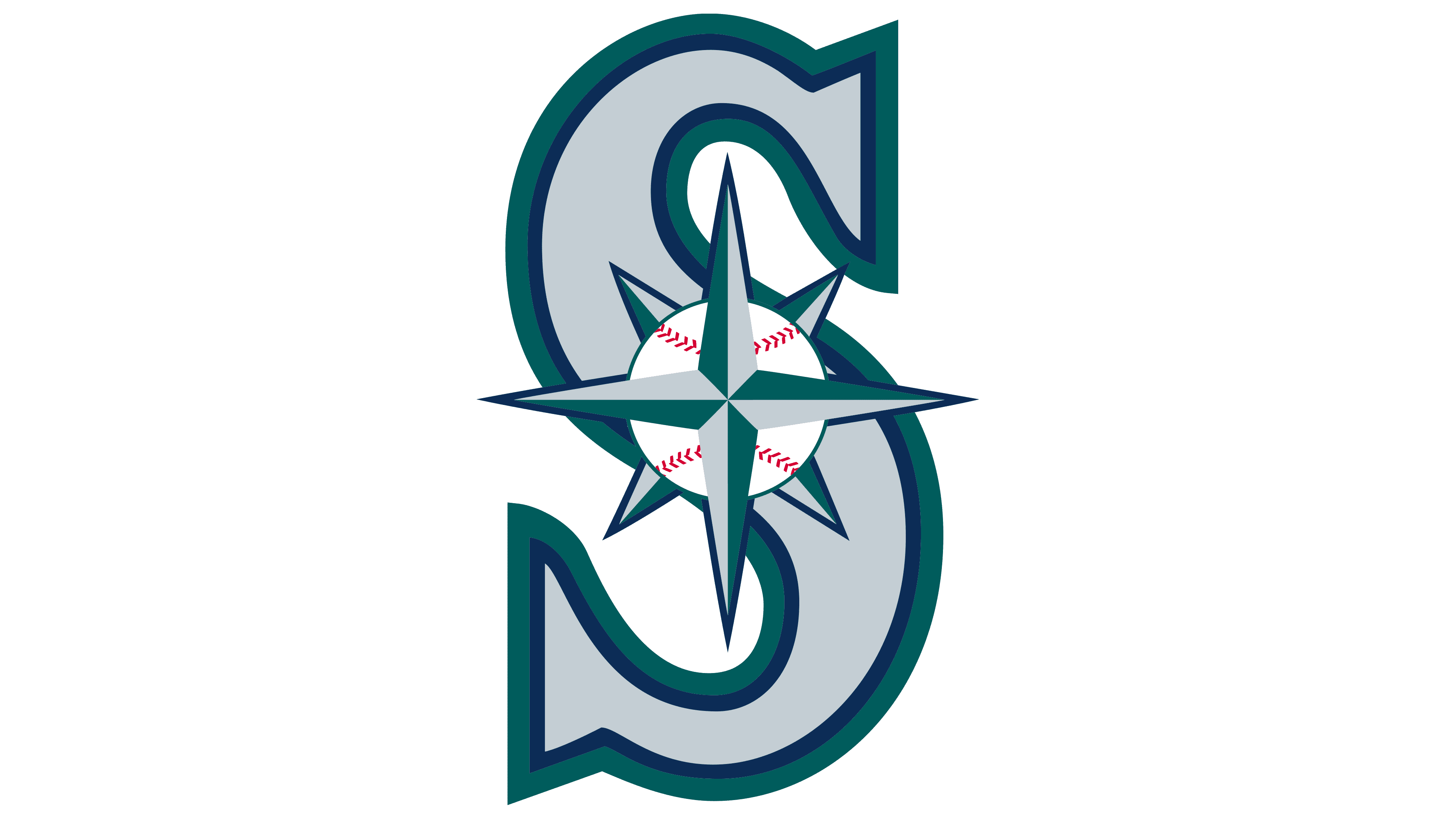
1993 – today
![]()
The modern version, approved in 1993, harmoniously combines two directions: baseball and water. Following the Seattle Mariners’ name, the developers proposed a marine compass. Using this as a basis, they meticulously linked this attribute to a small ball placed at the center.
As a result, a stylized element was created, vaguely resembling a classic rondel: a circle within a circle with a wide band and one or several strokes. Only in this case are arrows radiating from the center point to the geographical cardinal points. The rays are two-tone (light and dark), so they look three-dimensional. Above the ball is the inscription “Seattle”; below it is “Mariners.” There are three border stripes next.
Font and Colors
Before the era of the marine compass, there were three logo variants: the debut (consisting of an inscription), the middle (consisting only of graphics), and the transitional (a combination of drawn and textual elements). In addition, the emblem initially featured a water/sea theme, as the first two logos depicted a trident in different forms. In subsequent versions, an image of a ball appeared, and in the current version, a harmonious combination of the team name and the sport it plays.
In the original version, the inscriptions were set in a smooth, sans-serif font. Its originality is given by the peculiar “e,” whose crossbar is not horizontal but vertical. The capital “M” is interestingly played with: instead of the usual symbol, Neptune’s trident, the ruler of the watery expanses, is used. The modern emblem contains a condensed, chopped font. It resembles Compacta Regular, which was developed by Fred Lambert and used by Linotype. The only difference is the smoother sans-serif symbols.
The main colors of the “Seattle Mariners” emblem are dark blue, metallic silver, and northwest green. Early versions also featured cream and yellow.
FAQ
What does the “Seattle Mariners” emblem represent?
The modern Seattle Mariners logo is associated with the water theme. First, it’s the team’s name. Secondly, its base is located on the bay shore. Therefore, the club uses a stylized ship’s wheel or marine compass with multi-directional arrows as an emblem. There are 8 of them in total: 4 large ones pointing north, south, west, and east, and as many small ones located in the gaps between them.
Why did the “Mariners” change their logo?
There were two significant changes in the “Seattle Mariners” emblem. The first concerns the transition to the baseball theme, as the emblem was more maritime than sports-themed. This event occurred in 1987. The second change occurred in 1993, when the team decided to combine two directions: sports and maritime.
What colors are the “Seattle Mariners”?
The “Seattle Mariners” have several official colors: silver, aqua, dark blue, green (turquoise), cream, and yellow. Each of them was used in the logos.