


![]() Seattle Seahawks Logo PNG
Seattle Seahawks Logo PNG
Among American football teams, the only team from Seattle is the Seattle Seahawks, whose emblem vividly and accurately reflects the name’s meaning. The mascot on the Seattle Seahawks logo reveals the meaning of the name, highlighting the team’s primary feature: a pursuit of victory.
The Seattle Seahawks entered the NFL in 1976 as part of the league’s expansion following the AFL merger. Approval came in 1974, when Seattle Professional Football Inc., led by Ned Skinner and Herman Sarkowsky, secured the franchise and pushed forward construction of the Kingdome. Ownership was headed by Lloyd Nordstrom, who paid $16 million but died on January 20, 1976, just before the first season.
The club debuted in the NFC, switched conferences in 1977, and later settled in the NFC West. Its name was chosen through a 1975 fan contest with more than 20,000 submissions. “Seahawks” appeared 151 times, referencing the osprey, a coastal predator tied to the region’s identity.
In 1988, Ken Behring and Ken Hofmann acquired the team for $178 million. In 1996, Behring attempted to relocate the franchise to Los Angeles, citing earthquake concerns, and moved office operations before contractual obligations tied to the Kingdom blocked the move.
The failed relocation forced a sale. In 1997, Paul Allen, co-founder of Microsoft, purchased the team and kept it in Seattle. His ownership stabilized the franchise after years of uncertainty. Following his death in October 2018, control passed to his estate, maintaining organizational continuity.
Meaning and History
![]()
All emblems of the “Seattle Seahawks” are dedicated to the sea hawk. It is an illustration of a ceremonial bird ‘s-head mask among Native Americans. Initially, this style resembled the aesthetics of Native American tribes on the Northwest Coast, including the Tlingit, Chinook, coastal Salish, Haida, and Kwakwaka’wakw. Later, designers modernized the graphic sign, giving it a more aggressive, dynamic look.
What is Seattle Seahawks?
The Seattle Seahawks are the only NFL franchise that has changed conferences twice since the merger of the two leagues. It was formed in 1964 when a group of activists from Seattle Professional Football Inc. decided that the city needed its professional football team.
1976 – 2001
![]()
When the team debuted in the NFL, its logo featured a Kwakwaka’wakw native mask. The drawing, like the ritual object, is characterized by symbolic abstraction. The osprey’s head is turned to the right. It consists of several elements in white, green (“forest green”), and blue (“royal blue”) colors. The bird’s eye is a filled circle; the eyelids are open semi-circular stripes, and the beak is an arc pointing downwards.
2002 – 2011
![]()
On March 1, 2002, NFL Properties artists modernized the primitive logo. They simplified the design, removed the eyelid lines, and gave the sea hawk an aggressive look. The pupil is now shifted forward, the eyebrow is curved, and the shape of the beak is smoother than in the original version. The left side of the head is cut at an angle to create an illusion of movement. The palette also changed: the blue shifted toward a lighter tone (“Seahawks blue”), and the forest green was replaced with dark blue (“Seahawks navy”) and lime green.
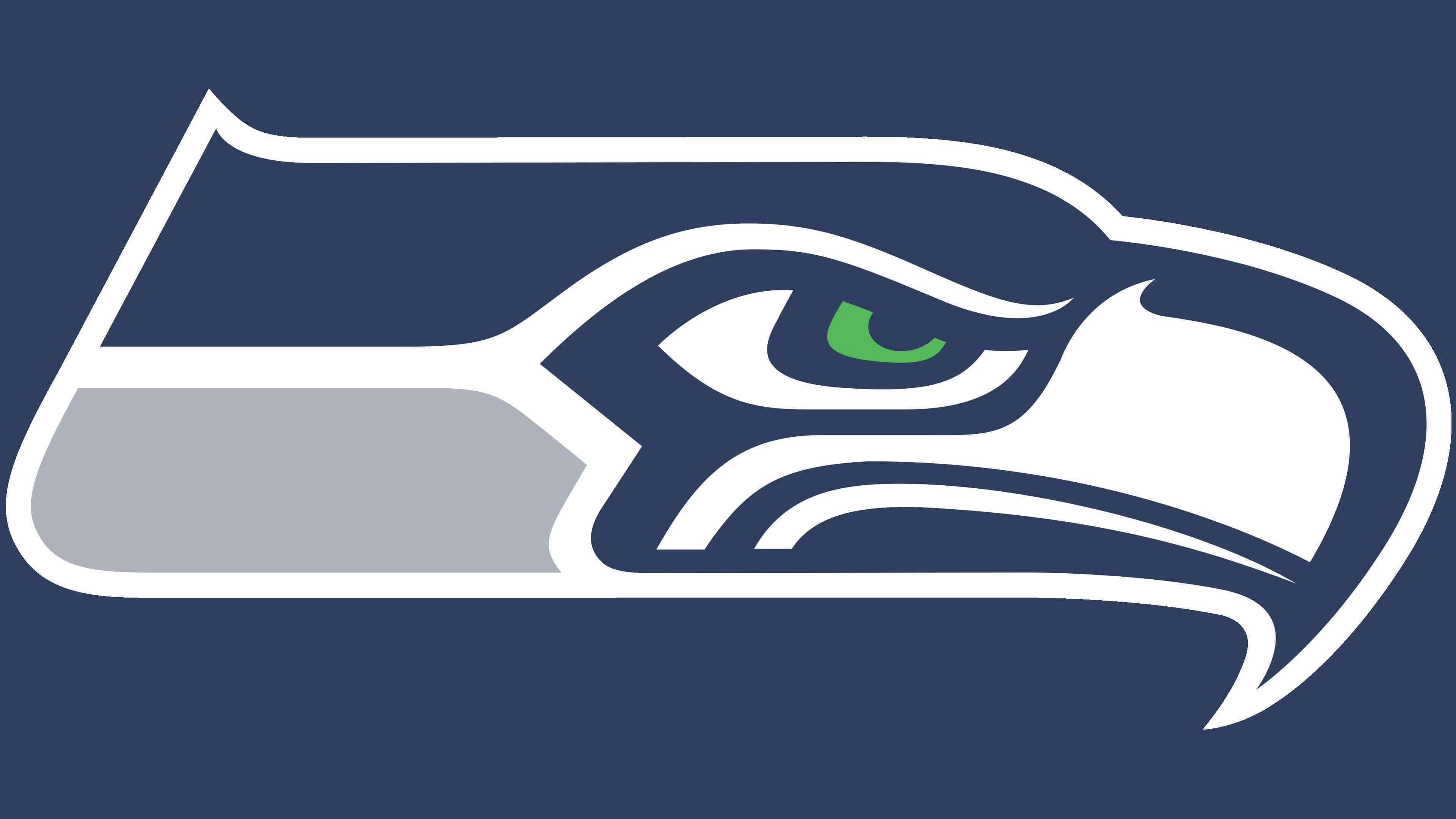
2012 – today
![]()
Ten years after the redesign, the team updated the logo again. The lower left corner became dark gray (“wolf gray”). This shade was used instead of “seahawks navy,” which completely disappeared from the picture. The emblem, as before, depicts an osprey’s head in profile. It symbolizes the football club’s aspiration for glory and success. The stern look is taken from Egyptian mythology, where hieroglyphs in the form of a falcon are often found.
Font and Colors
On all emblems of the Seattle Seahawks team, a sea hawk is depicted, and not just any, but in the form of a ceremonial mask of the Native Americans of the Northwest coast. According to historical records, it once belonged to the Kwakwaka’wakw tribe, who used similar items in their rituals. The logo reflects the region’s cultural heritage and the aesthetics of Native American tribes.
The prototype for the current emblem was the 1976 version. It, in turn, was copied from a real object. In the new millennium, NFL Properties artists changed the design to move away from the mask image. The modern interpretation of the osprey’s head seems caricatured. At the same time, the redesign gave the logo a lack of dynamism and aggressiveness.
The bird’s eye is a reference to Egyptian mythology. In Egyptian writing, hieroglyphs depicted a falcon, which the emblem creators focused on. The image of the sea hawk itself symbolizes the aspiration for success.
The Seattle Seahawks’ brand isn’t highlighted. The absence of original fonts is not very noticeable because the graphic part itself looks unusual. In the first version of the logo, two colors were used: royal blue and forest green. On March 1, 2002, new shades replaced them: lime green, Seahawks navy, and Seahawks blue. In 2012, wolf gray was added to the palette, replacing the sea.