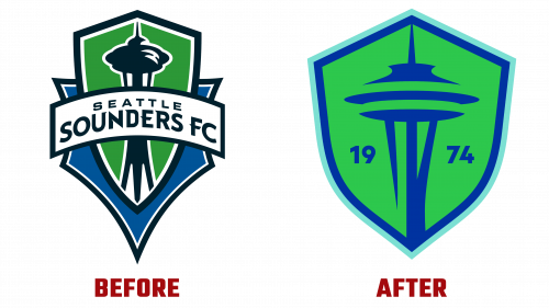
In a bold move that blends tradition with modernity, Seattle Sounders FC, a Major League Soccer (MLS) club since 1974, has unveiled a refreshed brand identity. The Seattle-based design studio Column was the creative force behind this transformative change, aiming to honor the club’s deep-rooted history while projecting a forward-thinking vision.
The centerpiece of this brand overhaul is the Seattle Sounders FC logo, featuring a redesigned crest. The emblem has undergone a significant metamorphosis, moving away from its previous intricate strokes and jagged imagery to focus on Seattle’s beloved landmark—the Space Needle. The new crest opts for a minimalistic approach, utilizing a single-color portrayal to give the Space Needle the spotlight it deserves. This cleaner, more focused design aims for immediacy and timelessness, effectively encapsulating the Sounders’ enduring connection to their city and fanbase.
Challenging the status quo of sports branding, the new identity also incorporates innovative liquid graphics and animations. Added to a refreshing palette that fuses various shades of blue and green with gradients of black, these graphical elements infuse an air of uniqueness and a modern aesthetic to the club’s visual identity.
The rebranding process has also given the club’s wordmark a contemporary touch. It features a wave-like motif that threads through the team’s name—a design element that holds historical significance for the Sounders. The updated wordmark, however, refines this wave element, having it begin and end with the letter “S” to offer a unified and complete look.
Further adding dimension to this rebranding is a custom typeface that amalgamates elements from iconic fonts like Futura and Olive Antique. The resulting type of family retains a sense of familiarity while providing substantial flexibility. This typographic decision was made to evoke nostalgia and novelty, perfectly aligning with the club’s mission to honor its past while adapting to the future.
All told, the rebranding of Seattle Sounders FC is not just a cosmetic adjustment. It’s a statement, a celebration of the club’s past achievements, its current ambitions, and a nod to its future endeavors. The newly imagined Seattle Sounders FC logo and accompanying brand assets promise to be a lasting emblem that resonates with soccer enthusiasts for decades. By striking a careful balance between historical significance and modern design principles, Seattle Sounders FC has successfully positioned itself for a future as rich and promising as its past.


