


![]() Seinfeld Logo PNG
Seinfeld Logo PNG
In creating the Seinfeld logo, designers started with the idea that it’s a comedy show that highlights everyday situations without profound meaning. Hence, the emblem was cheerful and vibrant but devoid of symbolism. It resonates with the series’ humor and draws attention to its title.
Seinfeld began with Jerry Seinfeld and Larry David, who met in New York comedy circles around 1976. Seinfeld built a steady stand-up career and appeared on The Tonight Show with Johnny Carson in 1981. David worked on ABC’s Fridays and later on NBC’s Saturday Night Live, where only one of his sketches aired in a full season.
In 1988, NBC asked Seinfeld to develop a sitcom, and he brought in David. Their idea rejected the usual sitcom comfort: no moral lesson, no soft ending, no personal growth. David later reduced the rule to “no hugging, no learning.” The pilot, The Seinfeld Chronicles, aired on July 5, 1989, with Claire instead of Elaine and Kramer named Kessler because NBC feared a claim from the real Kenny Kramer.
Test audiences reacted poorly, and Castle Rock shifted its focus to another pilot. NBC executive Rick Ludwin still secured money for four more episodes, one of the smallest orders in U.S. television history. The show was renamed Seinfeld, and Julia Louis-Dreyfus joined as Elaine Benes. The first regular episodes aired in May and June 1990, then the series entered NBC’s schedule in January 1991.
Ratings grew through the early 1990s. Seinfeld became a core part of NBC’s Thursday “Must-See TV” block with ER, Friends, and Frasier. Larry David won an Emmy for “The Contest” in 1992, while the series later led the Nielsen ratings in its sixth and ninth seasons. David left after season seven, returned for the finale, and the last episode aired on May 14, 1998, drawing 76 million viewers. In 2021, streaming rights moved from Hulu to Netflix.
Meaning and History
![]()
The evolution of the Seinfeld logos reveals the sitcom’s changing mood. When the pilot episode debuted, the intro briefly showcased a somewhat grim emblem: a white-bordered inscription on a black background. This somberness contrasted with the comedic genre, as the show’s creators initially doubted its prospects and were pessimistic. The second episode aired almost a year later. The project’s authors were still unsure of its success, as the logo remained pessimistic and black-and-white. On the other hand, it might have been a deliberate move: trying to hide something funny under a mask of seriousness.
But the comedic mood eventually prevailed over inexplicable gloom, and in 1991, the sitcom finally adopted a positive logo with a red inscription on an orange background. It contains the word “Seinfeld,” which is not only the title of the series but also the surname of Jerry Seinfeld, the comedian who played himself. He also co-wrote the script with Larry David and continued to develop the storyline on his own after his co-author’s departure.
Of course, each season of the show has its emblem. They share a common structure: the project’s title against a diagonal ellipse. But the colors vary across versions. The most famous is the emblem of the eighth season, which was meant to be the final one. Its black-and-white checkered pattern resembled a racing flag signaling the finish. Nonetheless, the project was decided to continue for another year, leading to a new, unique badge featuring stars and Saturn. All these individual logos are considered alternative versions.
What is Seinfeld?
According to Entertainment Weekly, The Washington Post, and other publications, Seinfeld is considered one of the best comedy series in television history. It aired from 1989 to 1998 and influenced future American TV shows, borrowing its narrative style, concept, and overall vibe. This nine-season sitcom contains 180 episodes, chronicling the life of comedian Jerry Seinfeld and his friends. The main characters consistently find themselves in absurd situations, with many episodes inspired by the real-life experiences of the writers Larry David and Jerry Seinfeld.
1989
![]()
On July 5, 1989, the sitcom’s pilot episode, known at the time as The Seinfeld Chronicles, premiered. The logo featured the title, divided into three centered lines. The word “SEINFELD” was in capital letters, while the other two lines were lowercase. However, the font remained consistent throughout a cursive from the Optima family. The inscription, as white as the thin rectangular frame around it, stood out vividly against the black background.
1990 – 1991
.![]()
The show was virtually forgotten for almost a year due to doubts about its success. In May 1990, a new episode was finally released with a modified emblem. The sitcom’s title was shortened to Seinfeld to avoid association with the unsuccessful ABC series The Marshall Chronicles. This word became the foundation for the logo, which now uses a more formal, confident Helvetica Bold Condensed font. Notably, all letters were capitalized, but the designers enlarged the first “S” in width and height. The inscription remained white, set against a dark backdrop.
1991 – 1998
![]()
When it became clear that the sitcom had a promising future, it adopted an optimistic wordmark from 1991 until the final episode in 1998. The show’s name is written in a cursive red font with a yellow ellipse set diagonally in the background. The letters and the background geometric shape are outlined in thin black, adding depth to the image.
This logo is associated with the series’ comedic genre, which mocks everyday situations. It appears upbeat, though it contains nothing humorous. The feeling of joy is generated by the sunlit palette and playful details, such as the triangle replacing the dot over the “i.”
Font and Colors
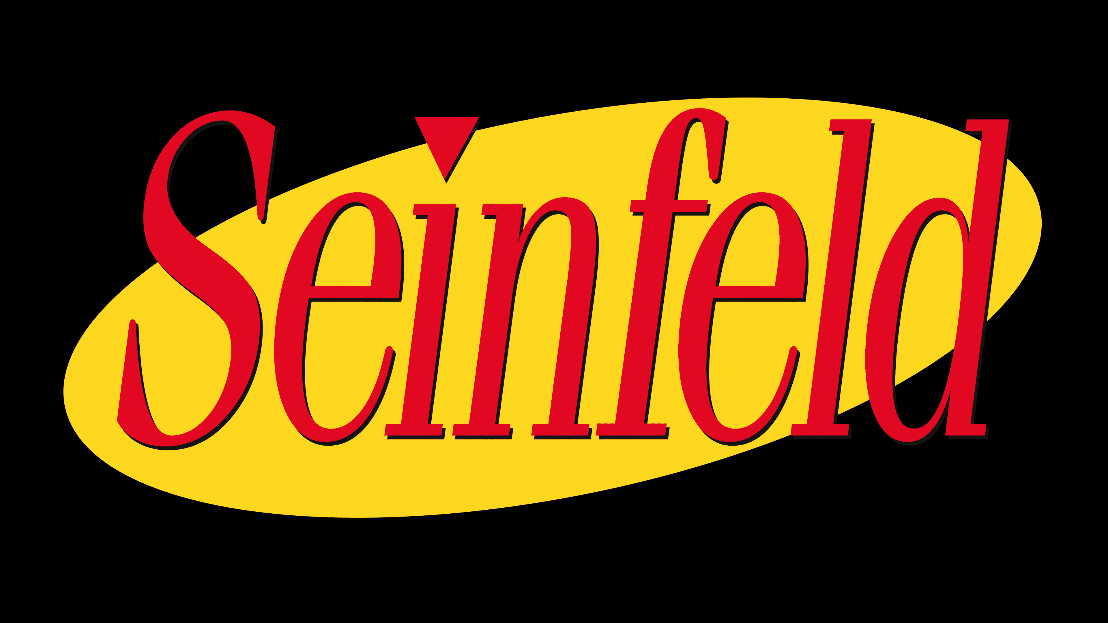
The Seinfeld title utilizes a slender italic font with rectangular serifs. It resembles the ITC Fenice Std Light Oblique, designed by Aldo Novarese. However, in the sitcom’s logo, the font is slightly modified. Specifically, designers added a triangle over the letter “i” to visually balance the font’s oval base.

While the earlier brand emblems were black and white, the 1991 version reflects the show’s bright future, red and orange, a combination that evokes positive emotions, joy, and energy.