![]() Seldon Logo PNG
Seldon Logo PNG
The Seldon logo reflects the world of machine learning, where accuracy, automation, and reliability are key. The brand creates tools that simplify working with artificial intelligence, helping businesses effectively manage models and adapt to industry changes.
In 2014, a team of software development and machine learning experts founded Seldon in London, recognizing the need for reliable solutions to manage machine learning models at scale. Early on, the company launched its first open-source product, Seldon Core, a flexible tool quickly adopted by the technical community. Significant advancements soon followed, introducing features to streamline model lifecycle management and performance monitoring. After securing substantial funding, the team grew rapidly and released an enhanced version of Seldon Core with improved scalability. The company’s comprehensive deployment platform debuted shortly after, offering advanced capabilities such as A/B testing and model versioning, tailored for enterprise clients. As partnerships with major cloud providers expanded, Seldon became influential in the growing MLOps sector, adding automation features to simplify model updates. Later innovations included real-time performance monitoring tools and explainability features to clarify model behavior. Eventually, Seldon tackled complex challenges in large-scale distributed machine learning systems, introducing advanced tools to identify and resolve model issues in production. Recent product updates have emphasized compatibility with modern frameworks and enhanced monitoring capabilities. As of early 2024, Seldon continues to refine its technology, consistently providing enterprises with effective tools for managing their machine learning models.
Meaning and History
![]()
What is Seldon?
It is a technology company that helps businesses use machine learning to solve complex problems. She developed a platform that simplifies working with AI models, allowing teams to implement, monitor, and control them in real-world projects. Based in the UK, the company makes cutting-edge technology accessible and convenient by helping organizations integrate artificial intelligence into their processes and scale its application.
2014 – today
![]()
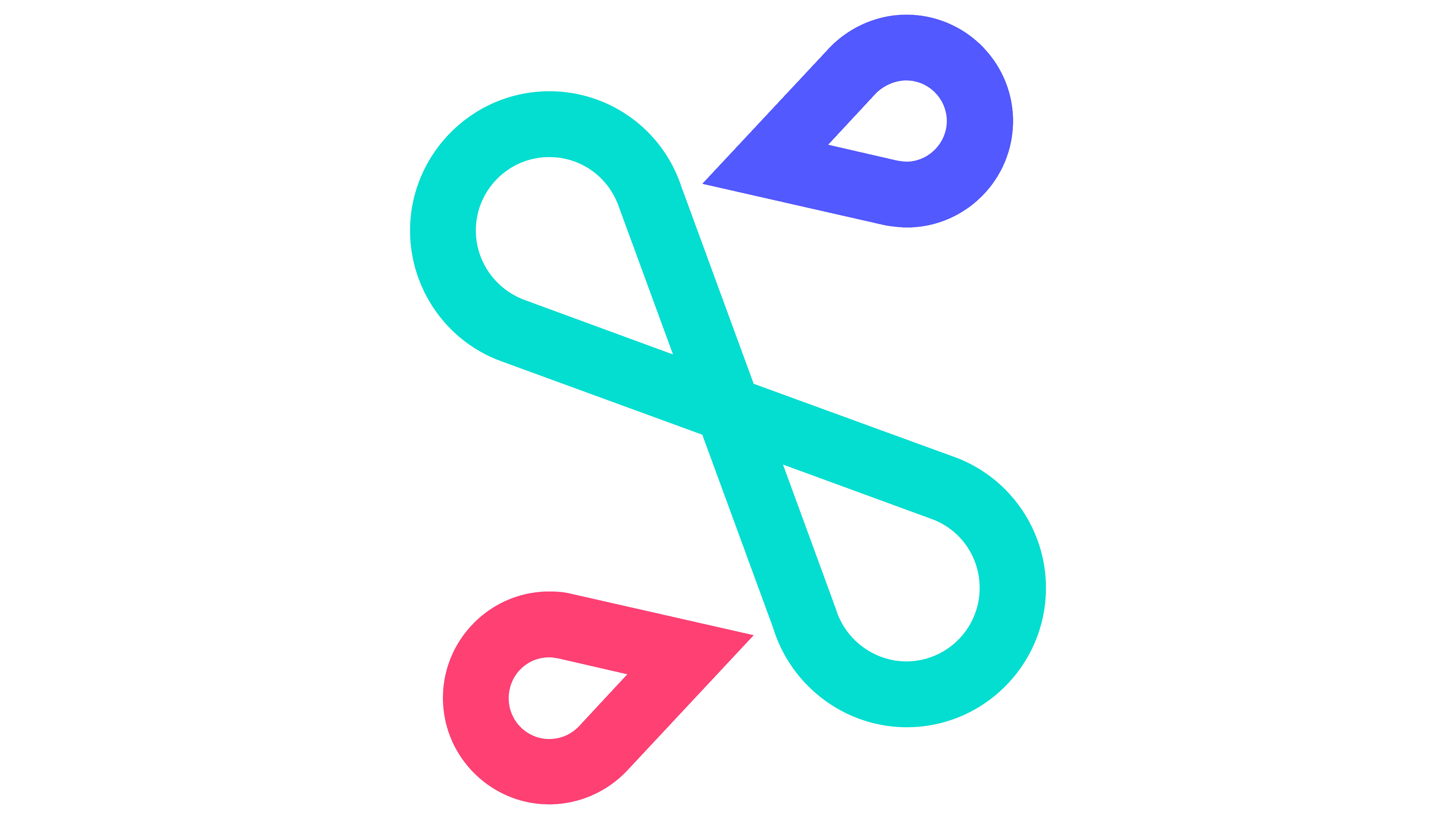
The Seldon logo tells a story of simple and practical solutions. The emblem’s symbol appears in motion; it resembles a slightly tilted, simplified figure eight, suggesting a continuous workflow. The colors are simple and pleasing to the eye: soft turquoise is the primary color, with two small contrasting accents – a red and a blue drop in opposite corners. This creates a visual rhyme with infinity and dynamism, essential aspects of the company’s operations.
The “SELDON” lettering looks interesting and unusual because of the letters’ shapes. They lack sharp angles and are gently rounded yet maintain a strict appearance. The lines are uniform in thickness, preventing the text from appearing heavy, even though it is in uppercase. An intriguing detail is that the letter “N” is flipped, adding a distinctive accent to the text.
The emblem suits a company that specializes in supporting and managing machine-learning models. The brand’s activities, like the logo’s symbolism, emphasize convenience and simplicity in handling complex tasks, and the smooth forms help eliminate any sense of heaviness.