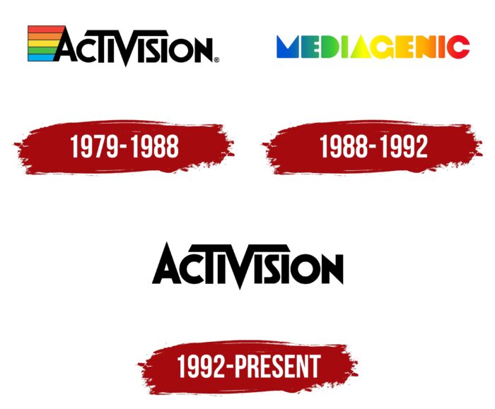
The driving logo of Activision expresses the mood of the computer games the company develops. Its sharp angles are combined with roundings, and asymmetrical elements break the ideal balance. It maintains the visual dynamics of the logo.
Activision: Brand overview
| Founded: | October 1, 1979 |
| Founder: | David Crane, Alan Miller, Bob Whitehead, Jim Levy |
| Headquarters: | Santa Monica, California, US |
| Website: | activision.com |
Meaning and History
Activision is a pioneer of sorts. Its founders were the first to decide to separate from the firms that produce consoles and sell games independently (1979). 4 programmers from Atari not only took away half of the income, which Atari could not accept for a long time (litigation until 1982) but also began to advertise the names of the developers along with the products. The venture was successful, and gradually the company bought up other small developers, becoming a leader in its industry, which attracted large buyers.
The company’s logo has changed twice due to the change of the company’s name and the subsequent return to the old name.
What is Activision?
Microsoft-owned major American video game developer founded in 1979. Company headquarters in Santa Monica.
1979 – 1988
The first logo consisted of an image followed by the company’s name.
There were colored stripes in front of the letter A. Their length decreased as the letter A was tilted. The meaning of the emblem is as follows:
- Shades of the RYB model (red, yellow, blue) and combination. This model of color formation is considered traditional. With its help, artists and designers create art. Activision created masterpieces, games in color, pleasing to the eye.
- The analog color television that the PS was connected to create a picture tracked the ratio of blue and red colors, which were extreme on the logo, from which the rest of the spectrum was formed.
- Stripes were also hinted at PS cords, where cables with red, blue, yellow, green, and white heads.
The name of the company on the emblem was in black font. In addition to the first A, two letters inside the word were made capital: “T” and “V.” And V from above had two lines extending to the sides, reminiscent of television antennas. The right branch covered the “isi” section, and the left branch formed a single whole with the “T” head. The letter combination meant TV – television. This indicated the development of games for consoles that work together with the TV.
The central V divided the name into two parts: Activ (an asset or resource) and vision (vision, vision, foresight, a beautiful sight). The company created a resource that creates a beautiful, spectacular performance on TV. And she did it easily (in youth slang, the expression means “easy”).
The letter V resembled a flying bird with wings, which predicted the heyday of the company and leadership positions.
1988 – 1992
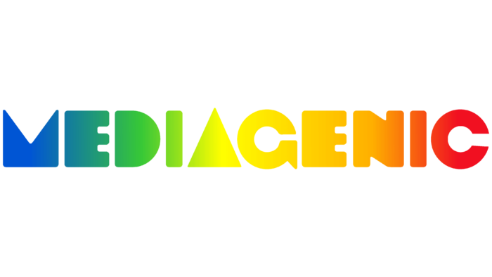
Activision decided to play not only games but also business applications. Therefore, she chose a new name, becoming Mediagenic. But things went wrong. The company stayed in this guise only until 1991 and went bankrupt. The logo of this period corresponds to the new name.
The Mediagenic emblem retained a reminder of its former name thanks to its color. It has an iridescent coloration in the form of a transition from blue to red through yellow. The separation between the colors occurs along with the central letter “A.” This divides the name into two words: blue-green Media (media) and yellow-red genic (genius or genius). In the literary version of the translation, this is:
- “Company, ingenious in the field of media.” In this sense, media refers to the Internet. Deciding to try a new niche in such a name, the company reflected the diversity of its activities.
- “Mediagenic, attractive to users.” A company that creates a game interface that is convenient and interesting to receive information.
An unusual font was chosen for the name, representing some of the letters in the form of solid geometric shapes. The outline of the M retained a vague reminder of the bird formed by the V in the Activision title. Its movement to the first place indicated the big claims of the company, a sharp rise upwards. In the form of a triangle pyramid, the letter A also hinted at the ascent to the heights.
1992 – today
A year later (1992), the owners emerged from bankruptcy by merging with The Disc Company. The firm began its renewed activity with the old name Activision.
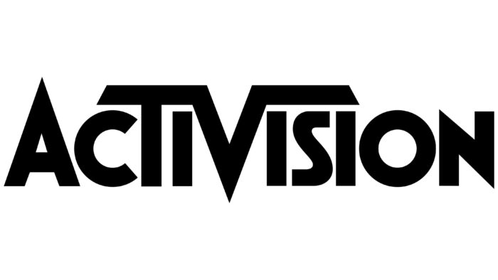
After returning the name, the emblem was returned to its previous form, but the colored stripes were removed. All modern computers and televisions use the RGB color system. Set-top boxes are almost not popular, and games are developed mainly for computers, so the color scheme of the cords has lost its relevance. Along with the return of the logo, the company decided to keep only one line of business – games.
Microsoft bought the company in January 2022.
Font and Colors
The bright colors for the first two versions of the emblem indicated a flight of fancy, a lot of interesting ideas, and different game plots. An impressive staff of programmers worked together on the games. The main color of the modern emblem is black. It shows the power of the company, its high position.
The logo font is a modified version of Futura.
Activisio Logo Color Codes:
- Black: Hex color:#000000; RGB:0 0 0; CMYK:0 0 0 100; Pantone:PMS Process Black C


