The Sesame Street logo is known to millions of viewers, as broadcasters worldwide have become interested in this project, including countries such as Kosovo, Afghanistan, and South Africa. They began to buy rights to film and broadcast adapted international versions of the program.
Sesame Street: Brand overview
| Founded: | November 10, 1969 – present |
| Founder: | Joan Ganz Cooney, Lloyd Morrisett, Jim Henson |
| Headquarters: | United States |
Sesame Street is considered one of the longest-running TV series for a reason. He made his debut in 1969 in the US and has been on television ever since, instilling in children basic life skills and a love of learning. And parodies of pop culture and humor elements attract an older audience’s attention. This is probably why the show has remained viable despite the changes in the media landscape that have taken place over the past 50 years.
Lloyd Morrisett and Joan Ganz Cooney created Sesame Street. Once at dinner, they discussed the problems of preschool education caused by the poverty of many American families – primarily blacks. It was 1966, a time of social inequality when not all parents could prepare their children for school. But against the background of the struggle for social rights, it was important to give every child the opportunity to learn, even if he lived in a disadvantaged area.
To make up for the educational deficit, Morrisett and Cooney decided to produce a show combining play and learning elements. They involved a wide variety of specialists in this process and created the Children’s Television Workshop, later renamed Sesame Workshop. Speaking against racism, poverty, and inequality, the co-authors of the program showed an example of a harmonious society where white and black people became friendly neighbors. Almost for the first time in the history of American television, African Americans were presented not as marginal but as positive characters.
All this was aimed at boosting the self-esteem of black children who, due to poverty, could not afford to prepare for school. But the show turned out to be so interesting that it attracted the attention of even those who did not live in disadvantaged areas.
Meaning and History
As the show’s popularity grew, Sesame Workshop, owner of the rights to the show, began marketing Sesame Street overseas and licensed the TV show’s logo for use on merchandise and toys.
For more than 50 years, this symbol has hardly changed: on the day of the first episode’s premiere, it contains the inscription “SESAME STREET,” stylized as an address sign. By the way, the name for the educational project was chosen at the very last moment. At first, the co-authors of the show were inclined to another option: 123 Avenue B. But it turned out that such an address exists in a bohemian residential area in Manhattan. However, a reference to him was preserved in the series’s logo: the house number “123” is indicated above the name of Sesame Street.
What is Sesame Street?
Sesame Street is an educational program designed for preschool children. Its creator is the non-profit company Sesame Workshop, which earns money not from advertising but from royalties and the sale of toys. The show combines elements of comedy, puppetry, and animation. Each episode is a sketch where a certain plot is played out with the participation of permanent and temporary characters.
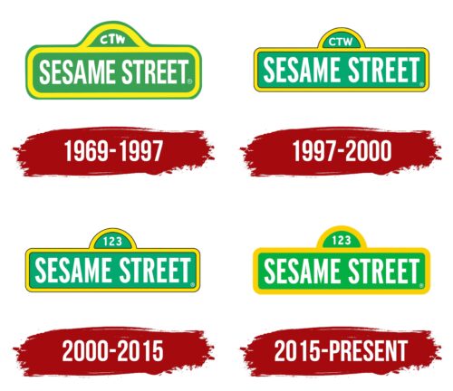
1969 – 1997
The authors of the first logo decided to play with the name of the training show, so they depicted it on a kind of address plate. The phrase “SESAME STREET” consisted of white capital letters and was inside a light green rectangle with rounded sides.
At the top of the quadrangular figure rose a semicircular ledge, centered. It had another white inscription: the abbreviation “CTW,” which the designers arched out. This was the abbreviated name of the Children’s Television Workshop, which produces television content for preschoolers and schoolchildren. It is she who owns the rights to the Sesame Street brand.
The same bold sans-serif was used for all the words, but it was modified in the case of the abbreviation. To dilute the monotonous palette, the designers placed the rectangle in a thick yellow frame and circled the semicircular ledge with a wide stripe of the same color. At the same time, the base had one more contour: an inextricable thin green line.
1997 – 2000
In 1997, the logo underwent changes that did not affect the overall concept. First of all, they touched on the font: instead of the old grotesque with bold letters, a new, more elegant version began to be used. It was Franklin Gothic Bold Condensed. The developers decided not to convert the inscription to lowercase in order to preserve the association with the street sign. The abbreviation “CTW” has been aligned horizontally.
The green color took on a pronounced blue tint and turned into a light turquoise. And the yellow frame has thin black outlines on both sides. The shape of the base has also been slightly corrected: the upper ledge has become an almost perfect semicircle. This logo first appeared on the show in 1998 with episode #3786.
2000 – 2015
Since the production company Children’s Television Workshop was renamed Sesame Workshop, the acronym “CTW” has become obsolete. It was removed from the logo and replaced with a simple combination of numbers “123”. This was a reference to the name “123 Avenue B”, which the authors of Sesame Street originally wanted to give their educational project. The font of the inscriptions has not changed, and the colors have become a little lighter.
2015 – today
In 2015, the main children’s show logo was redesigned again. So the current version appeared with which a slightly different color scheme. Now shades of green and yellow are brighter than before. The thin black lines have disappeared, so for the first time in many years, the design is closer to the original one, where there are no dark outlines.
Font and Colors
The edutainment show uses a wordmark that reads “SESAME STREET.” The name came from Virginia Schone, who works in a kindergarten. She drew an analogy with the famous phrase “Open Sesame” from the Arabian tales One Thousand and One Nights. That is, the television series is compared to a precious cache that is hidden behind a secret door.
To play with the name and show that the street scenes are an important part of the show, the designers stylized the wordmark to look like a classic address sign that can be seen in any city. It was made colorful to attract attention because the television program is designed for viewers of preschool and primary school age. It takes into account the psychology of the target audience.
Since 1997, the Sesame Street logo has been written in Franklin Gothic Bold Condensed. This is a sans-serif typeface that was developed in 1903-1912 by the American typographer Morris Fuller Benton. It has retained its personality and is often found where attention needs to be drawn, such as in advertisements or headlines. The font performs a similar function in the emblem of an educational television show for children.
The colors were also chosen to be noticed. The designers combined bright shades of green and yellow and made the letters white for contrast. The black lines have disappeared since the 2015 logo update.
Sesame Street color codes
| Pigment Green | Hex color: | #03af42 |
|---|---|---|
| RGB: | 3 175 66 | |
| CMYK: | 98 0 62 31 | |
| Pantone: | PMS 354 C |
| Yellow | Hex color: | #fcd000 |
|---|---|---|
| RGB: | 252 208 0 | |
| CMYK: | 0 17 100 1 | |
| Pantone: | PMS 109 C |
