Although the Seven Network logo is made up of simple elements, it has a deep meaning. This is not just a set of figures but one of the main symbols of Australian pop culture because the Seven channel is central to television in Australia. And his identity is partly dedicated to his native country.
Seven Network: Brand overview
| Founded: | 4 November 1956 |
| Founder: | Seven West Media |
| Headquarters: | Australia |
| Website: | 7plus.com.au |
Meaning and History
In terms of viewership, Seven Network ranks second in Australia, behind major networks such as SBS, ABC TV, Network 10, and Nine Network. But before becoming the media market leader, it was a group of separate television stations that operated on different schedules and sometimes broadcast the same content together. This association became famous for being one of the first in the country to start using the Very high frequency seven frequency. Hence the name Network 7, adopted in 1970, came from. And in 1991, the brand was officially renamed Seven Network.
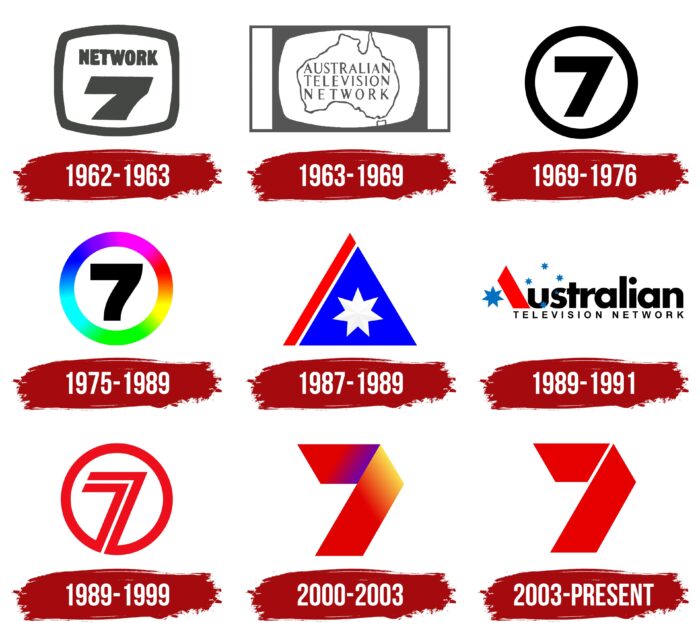
The television network has changed its name many times. It has gone through at least four major rebrands that have affected its visual identity over several decades. The change of logos occurred even more often because the brand tried to keep up with the times to expand the audience. The modern symbol combines a red stripe, like on the flag of Australia, and the number 7. It all started with the same seven, but it was black and was inside a figure in the shape of a television screen.
What is Seven Network?
Seven Network is a brand of the Australian company Seven West Media Limited. It represents the television network that emerged from the consolidation of independent stations in the second half of the 20th century. The main broadcast language is English.
1962 – 1963
In the early 1960s, TV stations in Melbourne and Sydney started sharing content. It was this group that would eventually form Network 7. One of the early logos contained the word “NETWORK” written in capital letters. Below it was a huge number 7. Both elements were enclosed in a square frame with rounded corners, stylized as a TV screen. The background behind the network name was white.
1963 – 1969
In 1963, two networks merged – HSV-7 and ATN-7. They formed the Australian Television Network, which has a new logo. The brand name was written in a column and centered. Each line used a different letter spacing to keep the words the same length. The background for the text was the Australian continent in white, surrounded by a dark line around the edge. The schematic image of the map was inside a white rectangle with rounded sides, imitating a television screen. And that, in turn, was placed in a gray horizontal quadrangle with two white vertical stripes on the right and left.
1969 – 1976
In 1970, the network was officially renamed Network 7. Its logo looked like a black number 7 located inside a white circle with a dark annular border. ADS-7 Adelaide and BTQ-7 Brisbane used this symbol until mid-summer 1976.
1975 – 1989
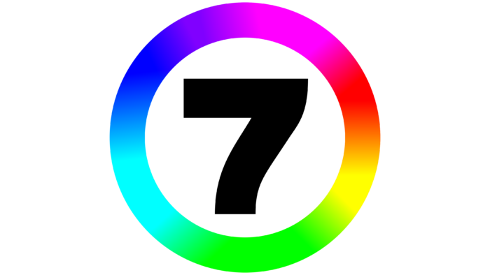
The designers updated the logo in 1975 when the network got color television. First of all, they changed the shape of the seven, adding a smooth curve to the figure. The second change was made to the color scheme: the ring became bright and iridescent. The developers used RGB colors (red, green, blue) and the palette obtained by mixing them (yellow, cyan, purple). To do this, they made a smooth gradient transition between shades.
1987 – 1989
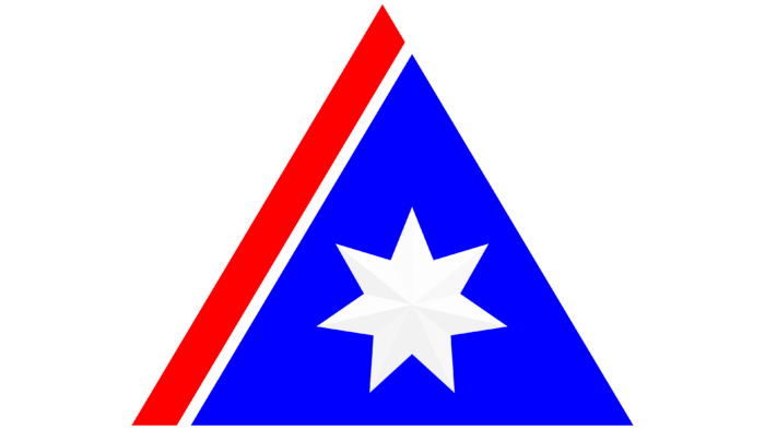
In 1987, the television network began using the Australian Television Network name for selected products. Then she got a logo stylized as the Australian flag. Designers created a combination of several geometric shapes of different colors. They chose a blue isosceles triangle as a basis, and to the left of it, they placed a red stripe parallel to the nearest face of this triangle. In the center was a white seven-pointed star with light gray highlights.
1989 – 1991
In the late 1980s, the logo was changed. Its authors presented the black inscription “Australian TELEVISION NETWORK,” divided into two lines: the first word was at the top and the rest – at the bottom. Moreover, the developers replaced the capital letter “A” with an abstract drawing, which was supposed to be associated with the Australian flag. To the left was a large blue star with seven rays. A red trapezoid, depicted a little to the right, relied on it. And the next glyphs, “u” and “s,” served as the background for a whole constellation of five small seven-pointed stars lined up in a ring.
1989 – 1999
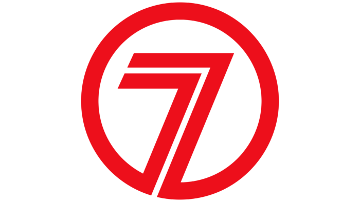
In 1991, the television network officially became known as the Seven Network. Shortly before that, she had a red emblem with the number 7, which consisted of two red lines bent at an acute angle and nested one inside the other. At the bottom, the stripes merged with the surrounding red ring. The inner space, like the gap between the lines, was white.
2000 – 2003
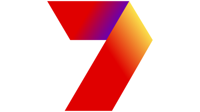
In the early 2000s, there have been new changes in the structure of the logo. Its creators removed the ring and generally any hint of a round base. They retained only the seven but completely transformed their style. As a result, the figure resembled a wide tape bent down. To maximize the similarity, the designers highlighted the fold line. They got “7” from two trapezoids, located horizontally (upper) and diagonally (lower). Their edges were painted a deep red. Closer to the middle of the ribbon, a gradient was used: on the one hand, with a transition to purple, and on the other, to yellow.
2003 – today
On September 14, 2003, the Seven Network television studio unveiled a simplified version of the previous logo. First of all, the changes affected the shape: the designers separated the two trapeziums, getting rid of associations with a bent ribbon. Second, they changed the color scheme. The gradient disappeared, giving way to a uniform red color without transition to other shades.
Font and Colors
The number 7, stylized as a red ribbon, is the most important symbol of the Seven Network. She represents this brand in the media market and connects its modern identity with cultural heritage. At the same time, the network sees a threat to its visual identity in the 7-Eleven trademarks. She demanded that the international franchise cancel several marks registered in Australia not to mislead the public. The fact is that convenience stores 7-Eleven and the Australian television network have similar emblems.
Seven Network’s main font is HeyWow, designed by Daniel Freytag and Alfredo Marco Pradil. However, the brand logo does not contain any inscriptions. It consists of only two geometric figures – trapezoids folded at an angle. In the current version, they are completely red, unlike the previous version, when a multi-colored gradient was additionally used with yellow and purple hues of different intensities.
Seven Network color codes
| Lust | Hex color: | #e60000 |
|---|---|---|
| RGB: | 167 30 49 | |
| CMYK: | 5 100 71 22 | |
| Pantone: | PMS Bright Red C |
