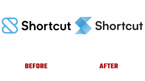
At a time when adaptability and innovation are the currencies of the tech world, Shortcut, formerly known as Clubhouse, is leaving no stone unturned. The project management platform recently announced a comprehensive refresh of its brand, replete with a redesigned logo that aims to resonate with its ever-evolving services and features. The redesign is pivotal to asserting the brand’s philosophy and more closely aligning its aesthetics with the pulse of contemporary product development.
The prior Shortcut logo had faced mounting critiques for appearing “dated” and “excessively bubbly,” adjectives hardly befitting a company that aims to be on the cutting edge. Taking heed of this feedback, the new Shortcut logo embodies the company’s aspirations with a sleek, modern design. Far from being a mere superficial facelift, reimagining the Shortcut logo is a tangible demonstration of a brand steeped in the ethos of today’s rapid product development cycle.
However, the company’s visual rebranding is not confined solely to the Shortcut logo. The redesign is all-encompassing, covering every visual touchpoint across its marketing materials. Iconography and typeface have been meticulously fine-tuned to what the company cheekily calls a “gleaming finish so crisp it’s almost hazardous.” The aim is to present a cohesive and compelling user interface that meshes perfectly with the platform’s functional facets.
Unlike many companies where ‘consistency’ often turns into an overused buzzword, for Shortcut, it is an operational cornerstone. This unifying thread runs deeply through the brand’s new face and extends into the product features and engineering solutions they continually roll out. All these elements combine in the pursuit of the brand’s ultimate objective: becoming the go-to tool for modern product development, offering unparalleled speed and efficiency.
This sweeping rebranding seems timed as it dovetails with a year of significant feature updates, emphasizing the company’s relentless commitment to innovation. The new look is a palpable promise: Shortcut is not merely keeping pace with changing trends but aims to set them.
While assessing these changes’ ultimate impact is still early, the implications for user engagement and satisfaction will be eagerly watched. However, for now, the brand’s bold visual transition, encapsulated by the fresh new Shortcut logo, serves as a rallying flag for a brand not just on the move but on the rise. With the company promising this is the beginning of a future filled with continual advancements, all eyes will undoubtedly remain on Shortcut, keenly anticipating its next big move.


