Shortcut’s logo embodies a combination of modernity and efficiency, signaling the company’s commitment to technological innovation. To potential users, it lets them know that the software solutions are cutting-edge and user-centered. It echoes the company’s core mission of simplifying complex tasks by being a visual signifier of streamlined management and intuitive interface design.
Shortcut: Brand overview
Founded in 2014 as Clubhouse Software, Shortcut was the brainchild of ambitious innovators looking to bring transparency and predictive tools to software development. Two years later, the company released its first offering, a project management tool called Clubhouse.
2017 was a watershed year for Shortcut. The Battery Ventures-led company raised $10 million in Series A funding, building on an earlier seed round of $4 million. The funds allowed for enhancements to the Clubhouse tool and expansion of its staff.
In 2020, the company added another $25 million to its coffers with a Series B round, spurring further expansion. However, as recognition grew, there was also some confusion surrounding Clubhouse’s social audio app. In 2021, the decision was made to rename the company to Shortcut. By September of that year, the rebranding process had reached its culmination.
From bug monitoring within agile methodologies to robust integration capabilities, Shortcut is the top choice for development teams looking for top-notch project management and operations tools. With more than 80 employees, the company, based in New York City, has carved out a strong niche in project management. Its journey from its founding in 2014 to the present is a testament to its rapid ascent and significant support.
Meaning and History
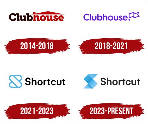
2014 – 2018
2018 – 2021
2021 – 2023
2023 – today
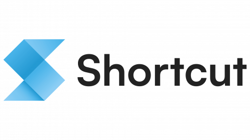
The logo of Shortcut, a software company, is unusual. It is a set of squares and triangles combined to form the initial letter of the brand name. Due to gradients and shadows, the letter “S” resembles origami with pointed ends and a wide middle. A single glyph is colored in different shades of blue. In contrast, the adjacent text is in black, giving it a professional look. The text is typed in a grotesque font with balanced angles and curves. The two letters “t” are the most innovative, which lack the lower curved part.
The absence of a lower curve in the two “t’s” signifies the company’s tendency to break traditional norms, which fits well with the technology industry’s emphasis on innovation. The origami-like letter “S” is a visual metaphor for the complexity and craftsmanship associated with software development. The blue gradient adds depth, making the letter “S” the center of attention and enhancing its visual appeal.
