


![]() Shrek Logo PNG
Shrek Logo PNG
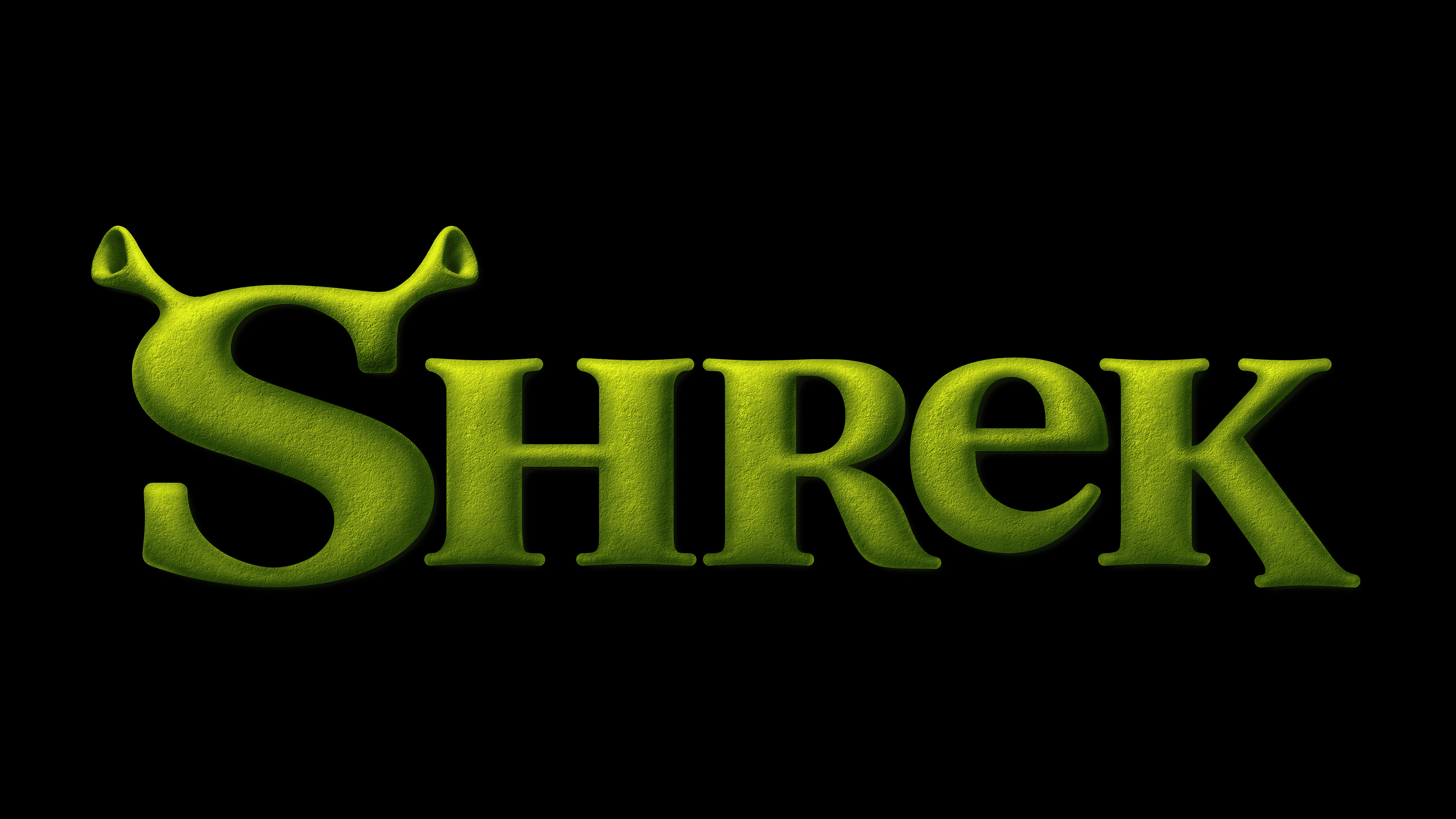
The Shrek logo is animated and lively. Each emblem element seems like a part of a moving caterpillar, hinting at the theme of magical transformations of the unrefined and sloppy hero with green skin.
In 1990, William Steig introduced the world to “Shrek,” a children’s book about an unsightly yet endearing ogre whose quest for solitude leads him on a journey after his swamp becomes a haven for displaced fairytale beings. This unique story laid the groundwork for a major cinematic endeavor when DreamWorks Animation, seeing the potential in Steig’s creation, secured the rights to bring Shrek to the big screen in the mid-1990s.
With Jeffrey Katzenberg at the helm of DreamWorks SKG, the studio enlisted the expertise of Pacific Data Images (PDI) to pioneer the ambitious project. The result was the groundbreaking “Shrek,” released in May 2001. Under the direction of Andrew Adamson and Vicky Jenson, this film featured the vocal talents of Mike Myers, Eddie Murphy, and Cameron Diaz. It brought to life the vivid universe of Steig’s book with a fresh, comedic twist on classic fairy tales, blending wit, humor, and warmth to critical and commercial acclaim.
“Shrek” revolutionized animated films with its all-computer animation and set a new standard for storytelling, merging humor with a touching narrative. Its overwhelming box-office success led to a franchise, including three more animated sequels: “Shrek 2” in 2004, “Shrek the Third” in 2007, and “Shrek Forever After” in 2010, each contributing to the saga of the beloved ogre and his fairytale companions.
Over the years, “Shrek” has expanded beyond the silver screen, with spinoffs and theme park attractions, cementing its status as a cultural phenomenon. The franchise’s enduring popularity underscores the timeless appeal of its characters and the innovative spirit of its creators, who transformed a simple picture book into an entertainment legacy.
Meaning and History
![]()
Beloved by children, Shrek did not appear on screens immediately. A 4-year preparation preceded this. However, logos for prototypes and subsequent series always consisted of the name of the animated film. Unique details of the main character’s image, added to the letters, make the inscription special.
What is Shrek?
A series of animated films shot by DreamWorks Animation based on the fairy tale by William Steig. To date, there have been four feature films, two spin-offs, and six short films between 2001 and 2022. Many franchise products are sold, including toys and video games.
1996 (prototype)
![]()
Initially, the logo was intended to be a standard serif inscription. The only fairy-tale element was a gradient from green to yellow, meant to reflect the transformation from a beautiful princess to a green ogre.
The lengthy work on the project led to reconsidering the approach to the character’s image and emblem. Disagreements and disputes were so serious that the first team of animators resigned. Today, we know a completely different Shrek than the one initially planned. Therefore, more unique details were added to the logo.
2000 (prototype)
![]()
The green letters of the inscription gained volume to emphasize the hero’s rounded shapes. Cute ears were added to the first capital letter S, precisely replicating Shrek’s image. The inscription seems to be bathed in golden sunlight from above, and each symbol glows. The idea indicated:
- The elements of fairy tale and magic are present in the story. Even an ogre can experience love and find happiness.
- The peculiarity of the princess, whose life and appearance depended on the sunrise and sunset.
- The finale is when Fiona chooses to remain green and large, even in the sunlight, for love.
The angular letters of the inscription show Shrek’s rough character and his unpleasant manners. Interestingly, the character’s image was based on a real person, American wrestler Maurice Tillet, who suffered from acromegaly and looked like a real monster but remained very shy and kind.
2000 – 2001
![]()
The final logo viewers saw changed slightly. The letters of the inscription stretched upwards more to convey the imposing size of the ogres compared to ordinary people.
Serifs were returned to the inscription to highlight the sharp, prickly nature of the character he showed to the world. Lighter tones added appeal to the sign, hinting at the main character’s shyness and hidden kindness.
2010
![]()
In the fourth part of the story, Shrek Forever After, released in 2010, a new emblem appeared. It received darker colors and a shortened leg of the letter K. Otherwise, the sign differed slightly from the previous one.
Font and Colors
The green shades of the logo evoke associations with the swamp where the main character lived, his fondness for bathing in mud, and brushing his teeth with green caterpillars. Interestingly, the prototype for Shrek’s dwelling was the real Audubon Swamp, with its many shades of green, which the film’s artistic director visited.
The palette was also chosen in tune with the color of the ogre’s skin and that of his beloved. The dark green colors are not about a romantic fairy tale of princesses. They present a completely new fairy-tale world to viewers, where familiar characters are shown in entirely new forms. The entire animated film is a subtle parody of Walt Disney’s animation.
Adding a yellow gradient to almost every emblem version makes the story warmer and more lively.
The logo’s font is distinctive because of the ears on the letter S and the lowercase ‘e’ among the uppercase letters. The small letter, hidden in the middle of the inscription, hints at Shrek’s kind heart, which he diligently hides behind roughness and feigned indifference.