A library is a place that connects users and provides great content. The idea of communication can be traced in the site’s visual sign. The Shutterstock logo represents the best favorite songs, videos, and photos available to subscribers.
Shutterstock: Brand overview
Meaning and History
Shutterstock’s online platform is used only to have photographs. But as it expanded, it became a global media content marketplace where you can find artistic images and various graphics, music, videos, and more. All this was reflected in the emblem, which, over time, became more abstract and universal.
What is Shutterstock?
Internet service from the United States provides access to stock photos, music tracks, and materials. It has been operating since 2003 with its headquarters in New York, has six subsidiaries, and brings together users from 150 countries.
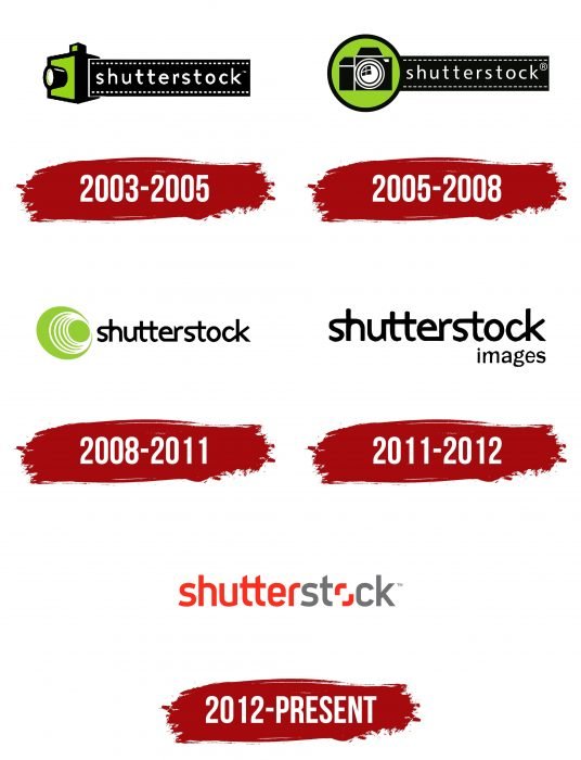
2003 – 2005
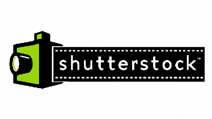
Since the service was initially associated only with photography, its first logo featured a green camera with a three-dimensional lens. The white word Shutterstock ran along with the long black film.
2005 – 2008
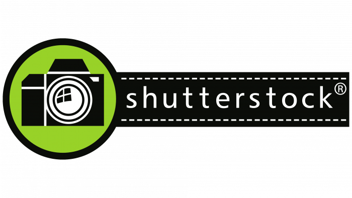
The designers made the camera black and 2D to fit inside the green circle. The second part of the emblem remains the same, except for a slight change in size.
2008 – 2011
In 2008, the company introduced its first logo without a camera. The green circle has turned into a multi-part image, resembling a large eye with a pupil. The dark tape disappeared, so the inscription appeared on a white background and turned black. All letters except “o” have been combined in pairs. The word “images” appeared in the right corner under the name of the service, denoting the main focus of Shutterstock.
2011 – 2012
The updated emblem has lost the green elements, which allowed the inscription to be enlarged slightly. Black has taken on a gray tint, and the word “images” uses a font that didn’t exist before.
2012 – today
The latest redesign completely redesigned the logo, focusing on the service’s name. Lippincott designed the branding identity, and Matt Angorn, the creative director at Shutterstock, led the process. Their collaboration resulted in red and gray lettering with a viewfinder instead of “o.” The font has changed, but the two ts are connected as before. The new visual identification system debuted in 2012.
Shutterstock: Interesting Facts
Shutterstock is a pivotal digital marketplace, offering an expansive array of stock photos, vectors, illustrations, and videos. Since its establishment, Shutterstock has revolutionized how individuals and businesses access and utilize digital media.
- Origins from a Photographer’s Vision: In 2003, Jon Oringer, a photographer and programmer, launched Shutterstock to market his stock photos. Starting with 30,000 images from his archives, he pioneered one of the initial subscription-based stock photo platforms.
- Extensive Collection: Shutterstock’s repository, boasting hundreds of millions of images and videos, ranks among the largest globally. It continuously updates its collection with thousands of new assets daily.
- Cutting-edge Search Tools: The platform employs sophisticated search technologies, such as visual search and machine learning, enabling users to locate the ideal image or video effortlessly. Features like photo-based search enhance the efficiency and intuitiveness of finding media.
- Diverse Contributor Community: Shutterstock collaborates with an extensive global network of creators, including photographers, videographers, and artists, ensuring a broad spectrum of content that meets various needs.
- Varied Clientele: Shutterstock serves a diverse clientele, from solo bloggers and designers to large corporations and media entities, offering flexible pricing and licensing tailored to various requirements and budgets.
- Beyond Stock Imagery: Shutterstock has broadened its offerings to include tools and platforms for image editing, music licensing, and custom content creation, enhancing its service portfolio.
- AI-Enhanced Features: The company’s investment in AI and machine learning has yielded tools that streamline image editing, including background removal and smart resizing, simplifying users’ creative process.
- Commitment to Sustainability: Shutterstock’s initiatives to foster sustainability include a specialized image collection spotlighting environmental themes and support for sustainability-focused projects and organizations.
- Worldwide Presence: Shutterstock’s global footprint, with its website in multiple languages and customers in over 150 countries, mirrors the universal appeal for quality digital media.
- Public Company Milestone: Shutterstock’s IPO and listing on the New York Stock Exchange (ticker: SSTK) in 2012 highlighted a significant phase in its growth and market position.
- Educational Offerings: The platform provides extensive educational resources, including tutorials, tips, and insights on photography, design, and video production, aimed at skill enhancement for its user community.
- Licensing Innovations: Shutterstock has evolved its licensing options to offer more adaptable and comprehensive solutions, accommodating the changing needs of digital content consumers.
From a modest startup to a dominant force in the global creative market, Shutterstock’s trajectory illustrates its profound effect on the creative industry. It offers seamless access to an extensive selection of digital assets and tools for a vast audience worldwide.
Font and Colors
The two angle brackets in place of the “o” should be interpreted as a “Viewfinder” function. This demonstrates the constantly growing media content database, an element of visual communication. The icon symbolizes that the authors of digital images, videos, and audio materials keep all the most important and interesting in focus. Here, you can see a reference to past Shutterstock emblems: the viewfinder is meaningfully linked to the camera lens.
Lippincott designed the modern logo font. They used Uni Sans SemiBold as a base and slightly changed the shape of the letters. The most noticeable differences are in “s” and “t.” The lowercase “o” is replaced by two corners opposite one another.
The choice of color was driven by the desire to show a vivid love of creativity. According to the designers, red (# DA291C), a symbol of passion, did the best with this role. But he made only the first half of the inscription. The second part is painted gray to balance the scale visually. This contrasting combination contradicts the classic Shutterstock black and green color scheme used in the early emblems.
FAQ
Is it OK to use Shutterstock images?
You can use images on websites without any restrictions on the number of visitors to your site. The brand is popular among web designers, bloggers, and businesses for its reliable, high-quality images.
Make sure you have the correct license for the images you use. The brand offers standard and extended licenses. The Standard license suits most web needs, such as advertising, social media, and websites. However, it does not allow you to sell products where the image is the main feature.
You may need an Extended License to reproduce the images widely or use them in items for sale, such as physical products or templates. Always check the license terms for each image to ensure you follow brand guidelines.
Please remember that you can edit the images to suit your needs but should not use them for harmful or illegal purposes. Follow the ethical guidelines set by the brand. These guidelines will help you use images to enhance your website and attract your audience.
What format are Shutterstock images?
When downloading images, you can choose different formats depending on your needs. Photos and illustrations are available in JPEG format, a common format that works well with almost all programs and platforms, making it a good choice for projects, websites, and presentations.
The brand provides EPS files for vector graphics, which are ideal for high-quality printed materials or projects requiring scaling. These files are also perfect for creating logos, detailed illustrations, and other designs that need to be adjusted in size.
If you want a rasterized version of a vector image, you can download it in JPEG format by selecting the “Large” option from the “Image Size and Format” drop-down list in the download area.
Can I use Shutterstock for the logo?
You may not use the content directly as a logo or standalone trademark. This rule applies to all types of content on the platform, such as photographs, vector graphics, and illustrations. This restriction helps avoid copyright and trademark issues because images are accessible to many users and can cause legal issues if used as unique business identifiers.
Be careful if you plan to use these images as inspiration or incorporate them into a larger original design. Ensure your final design is different and does not infringe on the copyright of the original artwork. It’s best to use these images for concept ideas or as minor parts of a more complex logo design rather than as the main element of the logo.
Can a logo include an image?
A logo can include an image and text written in a custom font. Its main goal is to reflect the brand’s essence and make it easily recognizable. When designing a logo, whether you choose a graphic-only or text-only style, the most important thing is to choose an image that conveys the brand’s personality. Selecting the right image for your logo is vital for successful brand recognition and marketing.
Is the logo a stock?
Standard logos are pre-designed vector graphics that can be purchased from various websites. While anyone can buy and use these logos, it is not recommended for your brand. Since they are available to everyone, other companies may already use the same or similar logos. This can make your brand less distinctive and weaken its ability to stand out. Designing your logo is better for a brand looking to create a strong and unique identity.
What is Shutterstock’s image?
The platform offers a wide selection of stock photos, pictures, graphics, and illustrations. These images are ideal for editing and enhancing various media types, making them a valuable resource for designers, marketers, and content creators who require high-quality visuals.
