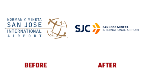
In 2023, the work of the famous Silicon Valley airport began with a renaming and, as a result, with a redesign of the logo. In late January, it received the expanded name San Jose Mineta International Airport (SJC) and a more conceptual graphic sign. The reason is to eliminate confusion around the name. As a result, the management chose a new name, emblem, slogan, color, and marketing promotion tools.
The airport’s geographic location is now brought to the forefront – proximity to the San Jose Bay area, which was not perceived by customers before. In second place is a tribute to former Transportation Secretary and Congressman Norman Mineta, who passed away last year. According to SJC aviation chief John Aitken, this reshuffling is crucial for the corporate identity, as it entailed changing the logo and slogan.
The basis of the visual identity is an abbreviation and four curved elements, simultaneously reminiscent of:
- feathers;
- leaves;
- a bird;
- airplane;
- signs on the runway.
Together they provide recognition on all lines of intersection with customers. The elements on the right are larger than those on the left since they represent the aircraft’s wings, and the rear elements represent the tail section. Bright, aesthetically appealing, and at the same time, simple, intuitive details directly convey the concept of moving forward. And also – the consistency and availability of services.
In front of them is an abbreviation consisting of three bold sans-serif letters. There are also no serifs in the expanded inscription, which is located after the geometric sign and is divided into two lines. Smooth, even glyphs with semi-rounded edges ensure perfect readability and good character recognition in any weather.
The corporate palette did not stand aside either. She got saturation and contrast. The image of the symbolic aircraft (top view) is colored in yellow and orange, and the inscriptions are in blue. The background is light gray. They are inspired by local culture and nature: ocean, sky, sand, sun, and warmth. Key color – Midnight, additional – Cloud, Sky, Dusk, Dawn. San Jose Mineta International Airport’s new slogan is “Fly Simple.”


