![]() Skate Logo PNG
Skate Logo PNG
For the series of extreme sports games, the Skate logo has been chosen to be serious because that is their theme. This was done to ensure the players’ focus and heightened attention without distracting them from the process. As a result, the emblem turned out to be monochrome and textual.
Skate began with EA Black Box, founded in 1998 in Burnaby, British Columbia, as Black Box Games by former Radical Entertainment employees. The studio worked on sports games and partnered with several publishers. In 2002, while developing Need for Speed: Hot Pursuit 2, EA acquired Black Box Games.
By the mid-2000s, skateboarding games were dominated by Activision’s Tony Hawk’s Pro Skater series, which had been active since 1999. EA Black Box built Skate around a different control system called Flick-It, using analog stick movements instead of button commands. The aim was to make tricks feel closer to real skateboarding.
Skate launched on mobile on September 13, 2007, on Xbox 360 on September 14, and on PlayStation 3 on September 24. Set in the fictional city of San Vanelona, it won Best Sports Game at the 2007 Spike Video Game Awards. It outsold Tony Hawk’s Proving Ground by nearly two-to-one on seventh-generation consoles. Skate It followed in November 2008 for Wii and Nintendo DS, developed by EA Montreal and Exient Entertainment, while Skate 2 arrived in January 2009.
Skate 3 came out in May 2010, moving the action to Port Carverton and emphasizing online team play. EA Black Box closed in April 2013, leaving the series inactive. On June 18, 2020, EA confirmed a new Skate project, later assigned to Full Circle in Vancouver under Deran Chung and Cuz Parry. A PC version was confirmed in August 2021. The new Skate entered early access on September 16, 2025, for PlayStation, Xbox, and PC, as a free-to-play, cross-platform game set in San Vansterdam.
Meaning and History
![]()
The Skate series began with three base parts for the seventh-generation consoles, intended for PlayStation 3 and Xbox 360. An additional version was also released for the Nintendo console. A total of four games were released annually. In 2022, the developers announced another original game that will be free of charge.
The name of the game series is directly related to the plot and the theme of skating. Despite the expansion of extreme sports in the gaming industry, it remains unchanged, as it relates not only to skateboarding. The creators used business logos (two in total) to emphasize the seriousness of the challenges.
What is Skate?
Skate is a series of games developed by EA Black Box as part of a project launched by Electronic Arts. The first release appeared in 2007, followed by two more main releases and one additional release. In 2022, the fourth base part was published. The games are designed for several platforms, including iOS, Nintendo DS, Wii, Xbox 360, PlayStation 3, and mobile phone operating systems.
2007 – 2022
![]()
The earliest Skate logo consists of two parts: textual and graphical. On the left is an orange icon with a white arrow in negative space. The icon contains four colored geometric shapes arranged on the sides: two truncated rectangles and as many triangles. They are mirror-imaged and repeat each other. Thanks to an interesting design technique, the arrow points downward. This direction is not chosen at random, as it conveys the direction of motion. On the right is the name of the game.
The inscription was originally set in a custom font. Some letters have an even base reminiscent of sled runners, ice skates, snowboards, or skateboards. The even line is only absent in the “s,” which is rounded and perfectly conveys the shape of a skating ramp. Overall, the developers have turned each glyph in the name into an element of sports gear. The inscription is black.
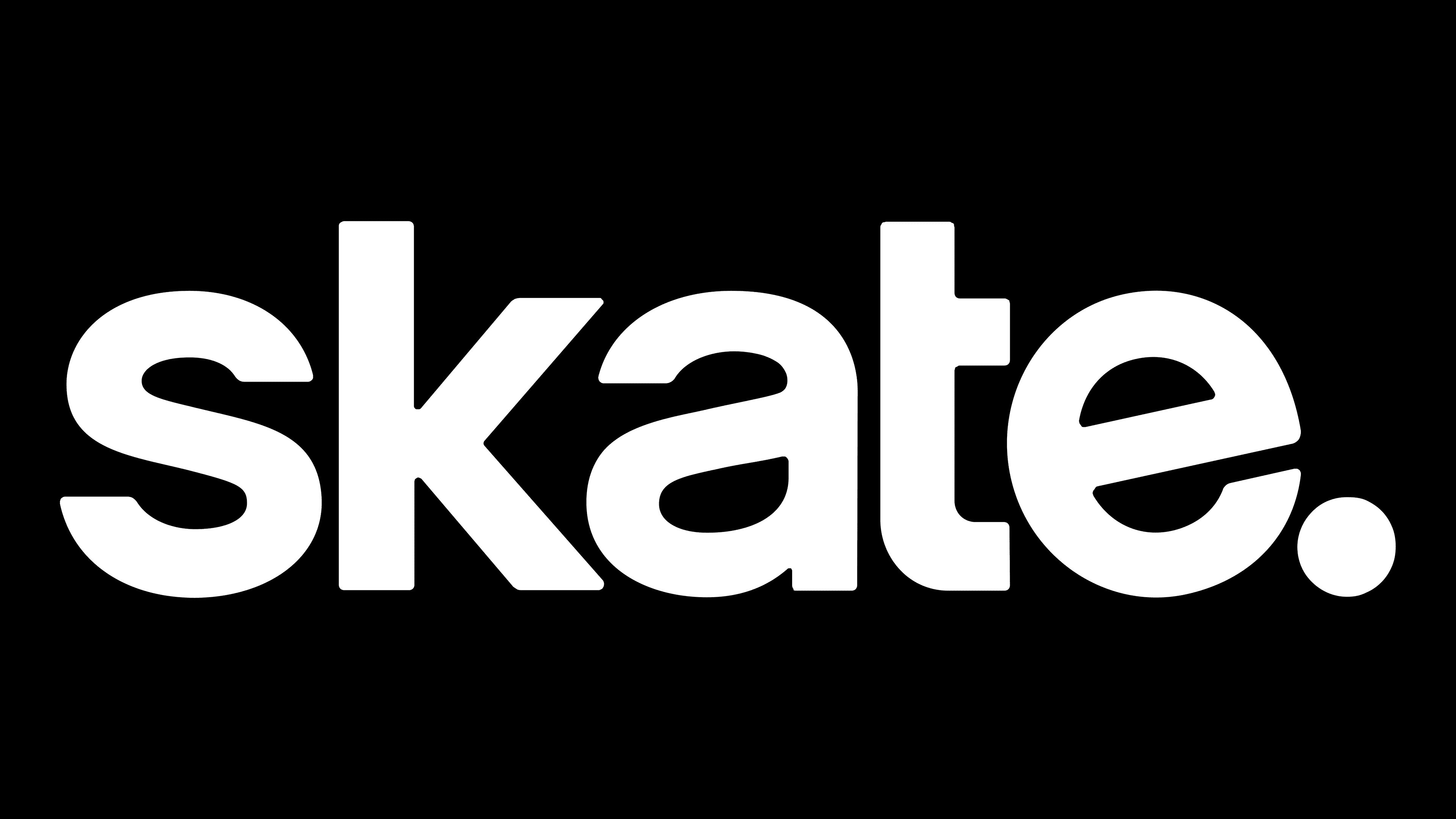
2022 – today
![]()
Currently, a textual Skate emblem is used, with the arrow icon removed. The designers revised the inscription’s style and chose a different font. The update made the logo clearer and more readable. The letters are printed, expressive, smooth, and classic. The only exception is the “e,” which, judging by the inner crossbar, is slightly tilted diagonally. This inclination symbolizes a hill for riding or a ramp and, essentially, replaces the arrow. Instead of the copyright symbol at the end of the word, there is a large, bold dot.
The evolution of the Skate logo culminated in a combined symbol, with designers integrating graphics and text into the modern version. They removed the downward-pointing arrow and turned the “e” sideways so its crossbar began to resemble a slope people usually ride on sleds, skis, snowboards, and skateboards.
Font and Colors

Thanks to the diagonal cuts at the ends of the “s” and “e,” the font in the modern game emblem looks distinctive, even though the letter shapes are quite common. It is a bold sans-serif in lowercase with a flipped-back “e.” It is tilted to resemble a ramp-like structure for skateboarding or a gentle slope. The early logo contains a unique inscription designed in an individual style. The emblem’s color palette is monochrome, consisting of black and white.