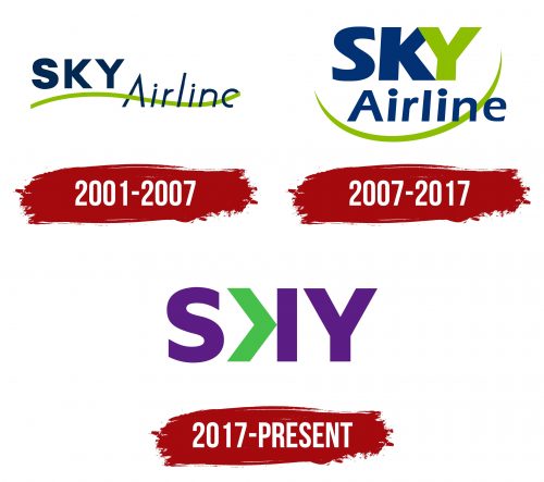
The Sky Airline logo is like a fresh perspective that allows one to see the world differently. The carrier is always ready to offer passengers exciting destinations. The emblem looks modern and original.
Sky Airline: Brand overview
Sky Airlines was founded in 2001 by German-Chilean entrepreneur Jürgen Paulmann. Inspired by the success of European low-cost carriers, Paulmann aimed to provide more affordable air travel in the Chilean market. With a background in retail, he envisioned bringing the model of low prices and high efficiency to Chile’s aviation sector.
Operations commenced in June 2002, with the first flight from Santiago to Antofagasta. Initially, the fleet comprised two leased Boeing 737-200s. The primary focus was domestic routes, with lower fares than traditional carriers.
Between 2003 and 2005, the airline expanded its domestic network significantly, adding routes to key cities such as Iquique, Calama, La Serena, and Punta Arenas. This expansion solidified its presence in the domestic market, attracting more passengers.
In 2006, a pivotal move was made by initiating international flights, with Arequipa in Peru being the first international destination. This marked the beginning of regional expansion.
From 2008 to 2010, the company began modernizing its fleet, gradually replacing the older Boeing 737-200s with more modern and efficient Airbus A320s. This transition improved operational efficiency and enhanced passenger service quality.
Celebrating its 10th anniversary in 2011, the airline continued to expand its route network, adding new international destinations such as Buenos Aires and La Paz. These additions bolstered its status as a regional carrier.
After Jürgen Paulmann’s passing in 2015, his son Holger Paulmann assumed leadership. Under Holger’s direction, the company shifted towards an ultra-low-cost carrier model inspired by successful low-cost airlines worldwide.
Between 2016 and 2017, the airline underwent a major restructuring of its business model, introducing unbundled fares. Passengers could now pay separately for additional services like baggage and seat selection, allowing the airline to lower base fares and attract new customers.
In 2018, the airline announced plans to completely renew its fleet by ordering new Airbus A320neo aircraft. This initiative aimed to improve operational efficiency further and reduce fuel costs.
2019 saw continued international expansion, with new routes to Brazil and Colombia. Additionally, the company announced the establishment of a subsidiary, targeting the Peruvian market.
Despite the global challenges faced by the aviation industry in 2020, the airline focused on optimizing operations and adapting to new safety and hygiene requirements, ensuring continued development and service excellence.
Meaning and History
What is Sky Airline?
This is a Chilean low-cost airline based in Santiago, known for pioneering the low-cost model in South America. The company operates a modern fleet of Airbus A320neo aircraft, ensuring high fuel efficiency and environmental friendliness. Its uniqueness lies in the Sky Up program, allowing passengers to earn points even on the cheapest tickets, which is uncommon for low-cost carriers. The airline is notable for its social program, “Sky Solidario,” which supports educational projects in remote regions of Chile.
2001 – 2007
From 2001 to 2007, Sky Airlines used a unique two-tiered logo as its first emblem, which was richly designed and thoughtfully conceived. The word “Sky,” rendered in dark blue, employed a bold, confident font. This design symbolized the firmness of the skies, reflecting the airline’s stability and professionalism.
Beneath the word “Sky” was the word “Airline,” across which a light green ribbon stretched, resembling the trail of an airplane in the sky. This ribbon is stylishly integrated into parts of the “Airline” glyphs, making it appear airy and giving it a sense of flight. The thin lines of the ribbon, much finer than the bolder “Sky” font, emphasized the lightness and dynamism associated with the company’s airplanes.
The logo’s color choice was deliberate: dark blue represented depth and reliability, while light green symbolized growth and development. Combining these elements created a powerful impression and visually linked the company’s name with its activities. The sky served as the backdrop for the word “Sky,” and the line representing “Airline” effectively demonstrated how the brand’s liners leave a mark in this eternal blue expanse.
2007 – 2017
After joining the International Air Transport Association (IATA), Sky Airline had to update its corporate identity to meet new standards and strengthen its image on the international stage. The company decided to modernize its logo in response to these requirements, making it more solid and expressive.
The new logo design retained the traditional green and blue colors associated with the brand. Still, the image was significantly more compact and robust, symbolizing the company’s achievements and market stability. The logo prominently featured a large blue “Sky” letter, complemented by a green “Y.” This “Y,” stylized as an airplane, conveyed the calmness and confidence that the company provides in its flights.
The new logo presented the green ribbon as a semicircle, reminiscent of the planet’s outline. This design element symbolizes the company’s global ambitions and readiness to expand international routes. Such imagery emphasized Sky Airlines’s strategic focus on the international market and its aspiration to become a leading player in the aviation industry.
2017 – today
Sky Airline is commonly recognized as SꞰY, and its logo prominently features a turned ‘K.’ The designers highlighted the middle letter with two distinct colors: the connected diagonals are green, and the vertical stroke is purple. The letters “S” and “Y” are purple and maintain a standard shape. The text is rendered in a simple, bold sans-serif font, ensuring readability despite the unique design of the “K.”
Using two colors for the middle letter creates a focal point, contributing to a dynamic and contemporary look. The bold sans-serif font enhances clarity, reflecting the airline’s emphasis on clear and effective communication. The logo’s design elements create a cohesive and engaging visual identity.
The turned ‘K’ in the logo introduces a unique and memorable element. The middle letter’s choice of green and purple adds vibrancy and visual interest. The letters “S” and “Y” in purple provide consistency and balance. The simple, bold sans-serif font supports the overall design, making the logo easily readable and impactful.
Font and Colors
Sky Airline’s logo establishes a strong brand identity through its unique turned ‘K’ and the strategic use of colors. The bold sans-serif font ensures clarity and readability. Combining these design elements results in a striking and representative logo of the airline’s commitment to modernity and clarity. The dynamic look of the logo, achieved through the innovative use of color and font, sets Sky Airline apart in the aviation industry. The overall effect of modernity, vibrancy, and clear communication perfectly encapsulates the airline’s branding objectives.


