


![]()
SLATHER, a bold new player in the sunscreen market, has launched with a standout visual identity and packaging designed by Melbourne-based creative agency SICKDOGWOLFMAN. Positioned as a high-protection, broad-spectrum SPF50+ sunscreen, and moisturizer, SLATHER challenges sterile or overly cheerful vibes common in sun care branding. The goal is to shake things up—not just visually, but in how people think about sun safety, especially in Australia, where skin cancer rates remain alarmingly high.
At the heart of the brand is its name—short, punchy, and refreshingly blunt. “Slather” brings to mind the very action of generously applying sunscreen, making its purpose clear without any extra fluff. That bold energy carries straight into the logo, featuring thick, condensed, sharp-angled letters. The heavy black typography has an edgy, almost metallic feel, more like something you’d see on a rock band poster than a skincare product. The unexpected design choice helps the product stand out from the softer, more delicate look typical of wellness brands.
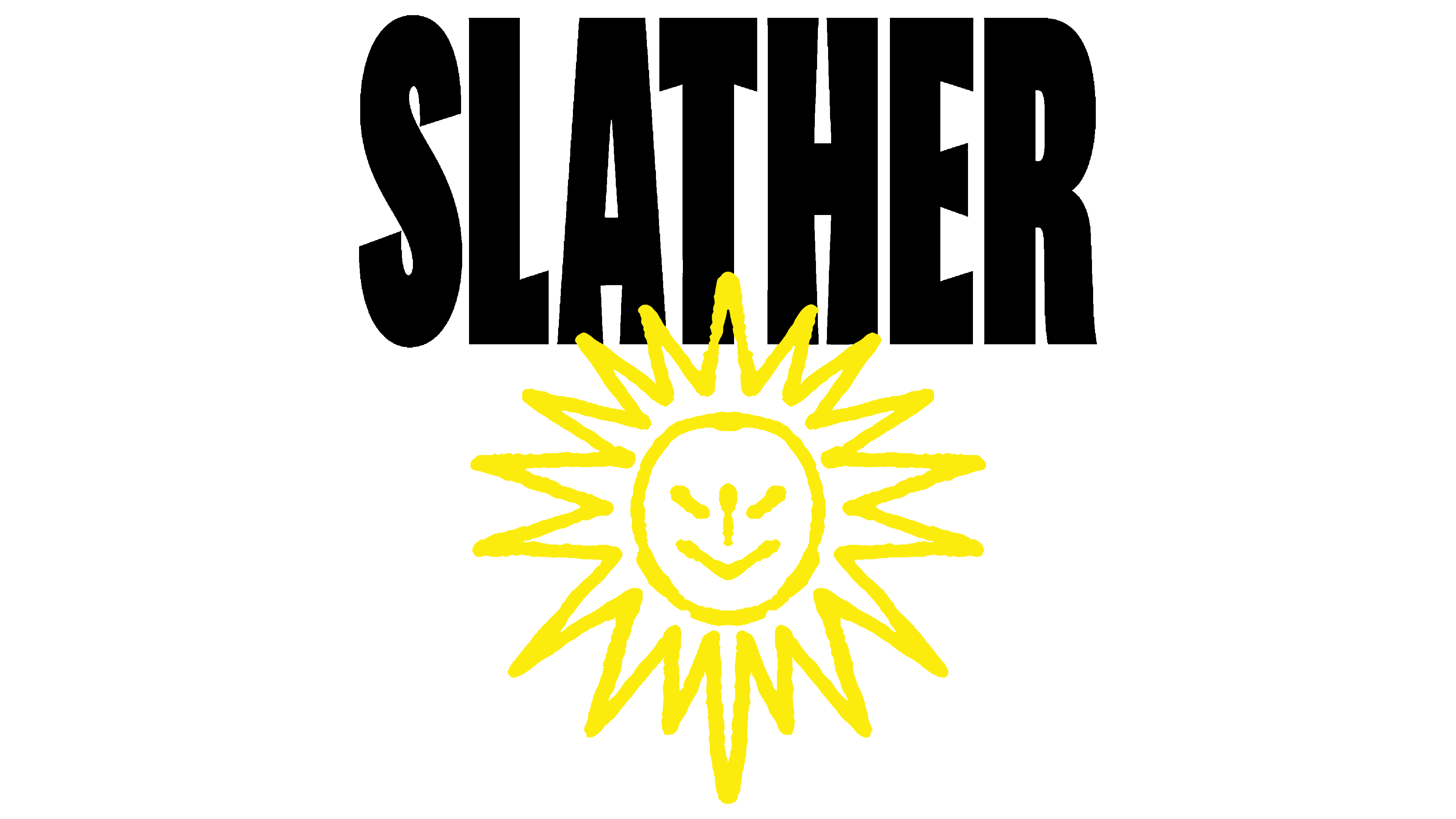
The logo’s lettering uses strong vertical strokes and tight spacing, creating an intense, urgent feel. A subtle detail—the slightly tilted “S”—adds enough tension to keep things interesting. The small but intentional design move hints at the brand’s rebellious streak, flipping the script on how sunscreen is usually presented.
Beneath the bold text, a simple sun icon in stark yellow sits. But this isn’t your typical warm, happy Sun. The jagged, uneven rays look almost chaotic, contrasting with the structured typography above. Right in the center, there’s a minimal smiley face—almost childlike—which adds a dose of irony. It’s playful but with an edge, flipping the usual “sun as a friend” narrative. Here, the sun feels more like the villain, and the sunscreen is the hero protecting your skin.
The color scheme is simple yet loud: black and bright yellow. The black letters pop against the vivid yellow, making the design hard to miss. The yellow sun icon adds a clean, sharp contrast, giving the layout a sense of balance despite its boldness. Yellow ties back to the sun but also brings in a burst of energy—a visual reminder of why sun protection matters.

The packaging keeps the same disruptive vibe. The all-yellow squeeze bottles showcase the bold logo front and center, with barely any extra text. The font choice for product info stays consistent with the logo’s bold style, using National 2 Condensed in all caps. The messaging is as direct as the visuals, with punchy lines like “THE SUN IS NOT YOUR FRIEND.” It’s sunscreen marketing with a sharp edge, flipping the script on the usual carefree, beachy tone.
What sets the brand apart is its unconventional approach to sun care messaging. Instead of glamorizing sun exposure, the company embraces raw honesty about the risks of UV damage. It’s unapologetic and blunt, treating sunscreen not as an optional summer accessory but as daily armor against a real threat.
Aggressive typography, playful yet edgy icons, and a fearless color palette create something fresh in the crowded skincare space. The brand isn’t trying to be polite or subtle. It’s loud, defiant, and confident—offering sun protection with a side of attitude.