Snapfish: Brand overview
Snapfish was founded in 1999 in San Francisco, California, a technology-driven city, and was the innovative brainchild of digital photography giant Shutterfly. Aiming to revolutionize digital photography, Snapfish sought to offer a simple digital environment where users could archive, share, and print their cherished memories.
In 2000, Snapfish launched its website, which, within a year, allowed users to seamlessly upload and store their photos online and share them with loved ones. Some of Snapfish’s distinguishing features include unlimited photo storage space and the ability to purchase premium prints and unique photography gifts.
With the advent of the digital age, Snapfish has partnered with well-known brands such as Kodak, among others. This alliance simplified the process of uploading pictures directly from digital cameras. By 2004, the Snapfish platform had become one of the most popular services, with over 10 million photo enthusiasts producing 30-40 million photo prints per month.
2005 was a watershed year for Snapfish when it became part of the portfolio of District Photo, which later took over the Shutterfly brand. With the winds of change, Snapfish further diversified its offerings into custom photo books and personalized greeting cards.
As one of the leaders in photo printing services in the U.S., the company independently serves a vast customer base, touching the lives of more than 50 million people around the world. In a tribute to its roots, its base of operations remains in San Francisco, California.
Meaning and History
What is Snapfish?
Snapfish, a revolutionary online photo-sharing and printing service, was founded in 1999 by Rajil Kapoor, Bala Parthasarathi, Suneet Wadhwa, and Sripati Acharya. Originally called “Project Skytalk,” Snapfish was designed to change the way people communicate by allowing them to turn everyday photos into treasured keepsakes.
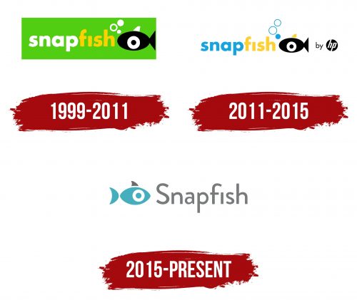
1999 – 2011
2011 – 2015
2015 – today
The photo manipulation platform creatively incorporated its name into the logo, depicting a small fish. The fish has a simple shape consisting of several geometric figures: triangle, arc, circle, and ellipse. On the right side, the name of the site is typed in a smooth sans-serif font. Successfully selected angles and curves create a pleasant impression, and the optimal distance between the characters provides good readability. The glyphs are bold, gray, and mostly lowercase.
The fish on the logo looks very cute and suggests that this platform is interesting. The simple shapes make it easy to recognize the fish, even at a cursory glance. The gray letters look modern but not too flashy, allowing you to focus on the fish and the site name. Overall, everything looks balanced and easy to read.
Snapfish color codes
| Maximum Blue | Hex color: | #45afbe |
|---|---|---|
| RGB: | 69 175 190 | |
| CMYK: | 64 8 0 25 | |
| Pantone: | PMS 7466 C |
| Gray | Hex color: | #787a7b |
|---|---|---|
| RGB: | 120 122 123 | |
| CMYK: | 2 1 0 52 | |
| Pantone: | PMS Cool Gray 9 C |


