The Snickers logo captures the unique and recognizable essence of the chocolate bar brand, which, over the years, has become a symbol of quick energy and satisfying hunger. It represents the promise of instant nourishment and enjoyment each bar offers consumers. The logo highlights the strength and richness of the product, making Snickers the perfect choice for those seeking a sweet treat and a fulfilling and hearty snack.
Snickers: Brand overview
Snickers, first introduced in 1930, quickly captured the hearts of candy lovers everywhere. Named after the favorite horse of the Mars family, its creators, Frank Mars and his son Forrest, concocted a filling blend of nougat, caramel, and peanuts coated in milk chocolate. This combination proved to be an irresistible hit.
In its early years, particularly during the 1930s and 1940s, Snickers found its place in American culture. Its rich blend of textures and nutrients gained fame. Including Snickers in military rations during World War II broadened its recognition significantly. The following decades, especially the 1950s and 1960s, marked Snickers’ expansion beyond the US, introducing it to markets in the UK, Canada, and more. Memorable advertising campaigns branded Snickers as a nutritious, satisfying snack.
The 1970s and 1980s saw the introduction of new Snickers variations. Marketing efforts during the 1990s and 2000s became more targeted, focusing on demographic groups such as athletes and busy professionals. Slogans from these campaigns positioned Snickers as a quick, mood-boosting solution to hunger.
Innovative advertising in the 2000s, including the notable “You’re not you when you’re hungry” campaign, highlighted the transformative effects of hunger satisfied by Snickers. New flavors and formats, such as Snickers Almond and Peanut Butter Squares, have recently been introduced to the Snickers family. Recognizing changing consumer preferences, Snickers adapted by offering smaller portions and improved nutritional profiles while maintaining its identity as a fulfilling, delicious treat.
Meaning and History
What is Snickers?
Snickers is a globally recognized brand of chocolate bars owned by Mars, Incorporated. It is famous for its unique formula that blends soft caramel, nuts, and pieces of coated chocolate. Snickers offers various flavors and sizes of bars, including the classic version with nuts and caramel, special limited editions, and seasonal flavors. As one of the world’s most popular and well-known chocolate bar brands, Snickers continues to delight consumers with its rich taste and satisfying texture.
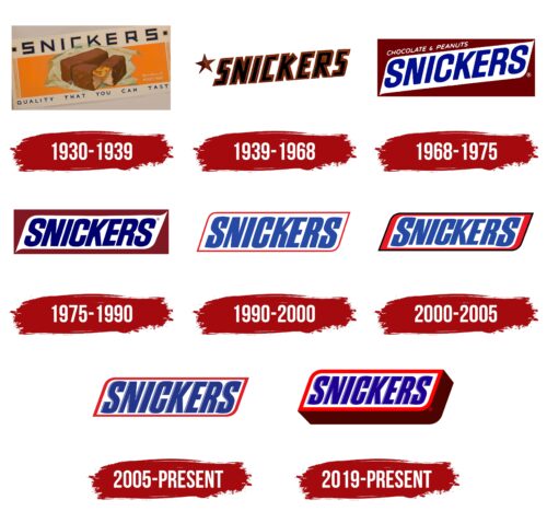
1930 – 1939
Snickers, a popular chocolate bar brand, began in the 1930s. Its early marketing focused on the quality and make-up of its bars. The first Snickers logo featured a clear image of the candy. This picture was key as it showcased the natural, tasty look of the bar, broken in half to reveal its nougat and nuts inside. It allowed people to see and almost taste the Snickers before trying it.
The logo conveyed the “quality you can taste,” which promised good flavor and highlighted the brand’s high standards. This helped establish Snickers as a top choice in the chocolate market, making it more attractive to buyers.
The logo referred to the Milky Way bar, another product from the same company, which was already well-liked and trusted. This association boosted Snickers’ image by connecting it to the quality and reliability of the Milky Way, increasing consumer trust and aiding its rise in popularity.
1939 – 1968
During World War II, candy packaging designs mirrored the era’s mood, promoting unity and support through visual elements like a military star and red-and-black lettering. These designs were not merely aesthetic but carried deeper meanings. The military star symbolized the courage and heroism of Soviet soldiers, while the color red stood for strength and passion, and black represented determination amidst the war’s tragedies.
These candy bars were extremely popular, and their distinctive wrappers symbolized national unity. People saw them as sweets, a small joy, and a sign of solidarity in hard times.
1968 – 1975
In the 1960s, a brand updated its logo to reflect modern views better. They chose an oval shape to represent the white base of their candy bar, set against a dark chocolate background to show off its rich taste. This made the product eye-catching on store shelves and clearly showed its main features to customers.
The brand name was placed diagonally across the logo to show the brand’s growth and increasing popularity. This tilt suggested movement and progress, fitting well with the era and the company’s goals.
An important part of the design was showing the main ingredients—chocolate and peanuts—right on the logo. The font was thin and elegant, focusing on the product’s quality and natural ingredients without disrupting the logo. This helped portray the candy bar as simple and pure, letting customers know what to expect in taste and emphasizing the company’s commitment to quality.
1975 – 1990
The new emblem design makes noticeable improvements, making the logo stand out more. The emblem is now smaller, which gives it a neat, balanced look. It mirrors the candy bar’s shape, linking it closely with the product.
The logo now shows key features of the candy bar—the soft white filling and the nuts covered in thick chocolate—making the candy look more appealing and tasty. The letters in the name are closer together, suggesting the stretchiness of caramel, adding a lively touch to the brand’s image. This effect also makes the logo’s texture more real and highlights the candy’s distinctive taste.
Using white for the logo’s background was a deliberate choice. White represents purity and freshness and is associated with sugar and sweetness. This enhances the product’s deliciousness and temptingness, drawing attention to its sweet filling and flavor.
1990 – 2000
Snickers updated its logo to align with the growing interest in healthier lifestyles and low-calorie diets. The new design is sleeker and appears lighter, showing the brand’s effort to keep up with changing consumer preferences with a focus on health.
The previous chocolate background was removed, making the logo cleaner and more attractive to those looking for lighter food options. A thin red outline simplifies the design and emphasizes the product’s distinctive taste.
The logo’s white base suggests the lightness of the bar’s filling, appealing to those watching their calorie intake.
The letters in the Snickers name are styled to look like whole, nutritious nuts, enhancing the logo’s appeal and highlighting the product’s nutritional value, underscoring its natural and healthy ingredients.
2000 – 2005
The new logo effectively showcases the candy bar’s structure and flavor. It features layers representing the chocolate bar’s internal components, making it look appealing and authentic. A black outline around the emblem mimics the thin chocolate layer that coats the bar, adding a touch of luxury.
A red stripe in the logo symbolizes the caramel layer, brightening the design and drawing attention. This highlights the sweet, gooey caramel that many enjoy. The white core of the logo with letters stands for the nougat and nuts, which are key ingredients in the bar. The white contrasts with other elements, suggesting the softness of nougat, and the nut images in the letters underscore the bar’s nutritious and rich flavor.
The red in the logo enhances visibility on shelves and gives the chocolate bar a festive appearance, emphasizing the candy’s unique flavor and association with joy and celebration.
2005 – today
In 2005, the candy bar’s image was redesigned to embrace a minimalist style, emphasizing essential elements like the product’s name and a distinctive red outline. This new design aimed to attract health-conscious consumers and a slim figure.
The red outline around the product name helps catch consumer attention and highlights the candy bar’s premium taste. Red is linked with passion and high quality, which suits the product’s unique flavor and status in the market.
The name’s stretched lettering resembles the candy bar’s shape, making the brand more recognizable and memorable. This design choice helps draw visual attention and aids in brand recall.
2019 – today
The 2019 emblem for the candy bar was meticulously crafted to attract true chocolate lovers. It showcases the thick chocolate layer that covers the bar, emphasizing the generous use of high-quality chocolate.
The design uses an angled view to add energy and helps people better appreciate the bar’s volume. This perspective shows the candy’s layers, including the thick, tender soufflé within a chocolate shell, suggesting a rich and satisfying experience with every bite.
The name’s lettering is in shades of blue, adding liveliness to the design and evoking images of crunchy nuts embedded in nougat. This color choice makes the logo stand out and emphasizes the bar’s variety of textures and flavors, enhancing its appeal.
The emblem highlights the candy’s density and size, promising a lengthy and luxurious tasting experience. It ensures that each bar provides deep flavor and satisfaction, catering to the tastes of discerning chocolate lovers.
Font and Colors
The Snickers logo features bold, capitalized letters similar to the Lunch Time Normal font style, known for its clean and modern appearance. The font, seemingly customized for the brand, enhances its strong commercial appeal. The large font boosts the logo’s visibility, making it stand out on packaging and advertisements.
This font style is chosen to increase brand recognition. Its unique look and smart use of color ensure it remains memorable and easily spotted in a competitive market. The all-caps font reflects confidence and modernity, aligning with the snack’s image as a satisfying treat.
The deep blue letters, with white shadows, create a vivid contrast. Red and blue evoke excitement and trust, drawing consumer attention and highlighting the brand’s prominence in the snack market.
The logo’s design is simple, avoiding multiple text lines to concentrate on the brand name. The tight kerning between letters emphasizes unity and strength.
Using font and color in the Snickers logo establishes a strong brand identity. This design attracts attention and represents the satisfying quality of Snickers bars, ensuring instant recognition worldwide.
FAQ
What is the slogan of Snickers?
The Snickers slogan, “You’re not you when you’re hungry,” has become famous for its clever way of showing how hunger affects us. Mars, Incorporated launched this campaign to show that being hungry can make people act out of character. Snickers claims to fix this by being the perfect snack to satisfy hunger. Everyone knows the feeling of being grumpy or not feeling like themselves when hungry. The ads, often featuring celebrities, show people acting strangely because they’re hungry. Eating Snickers brings them back to normal, driving home the point of the slogan.
This campaign has been a huge hit, earning praise for its creativity and humor. It’s helped make Snickers a go-to snack for people everywhere, boosting the brand’s sales and recognition worldwide. The success of “You’re not you when you’re hungry” shows the impact of a great slogan that connects with people in a fun and meaningful way.
What do Snickers represent?
Since Mars introduced Snickers in 1930, this chocolate bar has become more than a treat. It’s named after the Mars family’s favorite horse and packs a mix of nougat, peanuts, caramel, and chocolate. This blend tastes great and gives a quick energy boost, making Snickers a go-to snack for anyone needing a fill-me-up.
Snickers turn hunger into happiness. Its mix of sweet and salty, along with its filling ingredients, offers a satisfying snack option. It’s seen as a quick energy source for anyone from students pulling all-nighters to athletes needing a boost.
Snickers also stands out because of its catchy marketing, like the “You’re not you when you’re hungry” campaign. These ads connect with everyone’s experience of hunger, changing their mood or abilities and emphasizing Snickers as a solution.
Who makes Snickers candy?
Mars, Incorporated is known for making Snickers, one of the favorite chocolate bars worldwide. Since its start in 1911, Mars has become a leading name in sweets, offering a variety of candies like Mars bars, 3 Musketeers, Milky Way, M&Ms, Skittles, Twix, and Bounty.
Snickers, launched in 1930, won over fans with its mix of nougat, caramel, peanuts, and chocolate. Mars’ focus on quality and innovation has kept Snickers and its other candies popular across the globe. The company offers something for everyone, with each brand standing out. Mars knows how to please candy lovers, whether the bright Skittles or the smooth Milky Way.
What is Snickers brand personality?
Snickers stands out in the candy world with its unique personality, combining strength, effectiveness, a masculine vibe, boldness, and fun. These traits are key to Snickers, influencing everything from its ads to the chocolate bar.
Snickers is a filling, energy-boosting, delicious snack that effectively combats hunger. This is captured in its well-known slogan, “You’re not you when you’re hungry,” which presents Snickers as the go-to snack for returning to your normal self.
Targeting mostly a male audience, Snickers ads often play up the chocolate bar’s ability to overcome moments of hunger-induced weakness, emphasizing strength and decisiveness. The brand is fearless in its marketing, often using humor and creativity to make a lasting impression and emphasize its bold nature. Snickers never loses its sense of fun. Its advertisements are filled with wit, making the brand relatable and enjoyable. This ensures Snickers is seen as more than a snack—a joyful experience.
