


![]() Sonic The Hedgehog Logo PNG
Sonic The Hedgehog Logo PNG
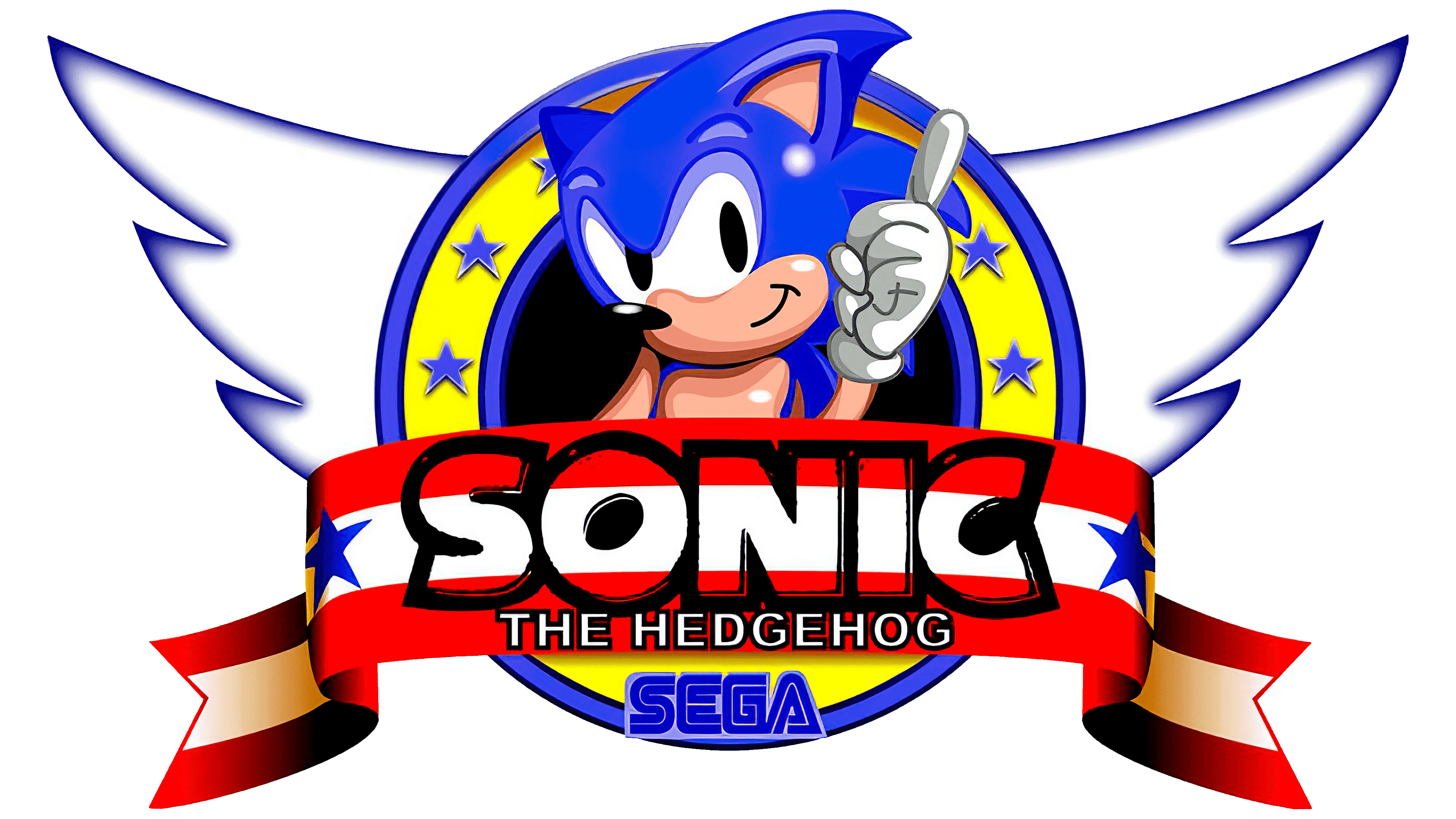
A bright and cheerful character hides behind the colorful Sonic The Hedgehog logo. The emblem indicates the unusual coloring of the hero, conveys the ingenuity and speed that the hedgehog possesses, and hints at his friendliness and good disposition.
In the late 1980s, Sega president Hayao Nakayama decided the company needed a flagship hero who could rival Mario. Nintendo had just released Super Mario Bros. 3, which was the best-selling video game in history. In April 1990, Sega began official development and conducted an internal search, focusing partly on the U.S. market.
The core team included artist Naoto Ohshima, programmer Yuji Naka, and level designer Hirokazu Yasuhara. Early concepts included a rabbit that attacked with its ears stretched, but the idea was too difficult for the hardware to handle. The team moved to animals that could roll into a ball. Ohshima tested sketches with people in New York’s Central Park, and the hedgehog became the clear favorite.
Sonic’s blue color matched Sega’s cobalt logo. Michael Jackson’s Bad album cover inspired his red-and-white shoes, while his attitude drew on Bill Clinton’s public image. Sonic first appeared in Rad Mobile in 1991 as a small mirror ornament, five months before Sonic the Hedgehog launched in the U.K. and North America in June 1991. Sega of America head Tom Kalinske bundled Sonic with the Genesis, helping the game sell over 15 million copies.
Sonic the Hedgehog 2 began development in November 1991 at Sega Technical Institute, where Yasushi Yamaguchi created Tails. In 1993, Sonic matched Mario as one of the year’s top-earning entertainment characters. Sonic Adventure brought the series into 3D on Dreamcast in 1998, but Sega left the console market in 2001. After the troubled 2006 Sonic the Hedgehog, Sonic Mania restored the classic 2D formula in 2017. The film series began in 2020, followed by sequels in 2022 and 2024.
Meaning and History
![]()
When Sega executives decided to bring Sonic The Hedgehog to life, they didn’t even know what the character was supposed to look like. A huge team of specialists worked on its appearance, tasked with developing a concept. The artists came up with many ideas, and if they liked the management, then Sonic could become the double of Theodore Roosevelt, an armadillo, a rabbit, or a flying squirrel. But Naoto Oshima, a look inspired by Felix the Cat and Mickey Mouse, won. The designer depicted a bipedal hedgehog with arms and legs, and made it blue to match the Sega logo’s color. The red elements were meant to evoke Santa Claus’ clothes, and the shape of the shoes was meant to remind one of Michael Jackson’s boots.
Game designer Hirokazu Yasuhara is considered the second “father” of Sonic The Hedgehog. He and Naoto Oshima once shared their legend of this character’s origin. They came up with a whole story inside another story. According to them, even in the fictional universe, Sonic was never real. Instead, there was a talented pilot who flew an airplane with a painted hedgehog on the nose, for which he received the corresponding nickname. Then his new wife wrote a story about Sonic the Hedgehog because she was a children’s book author with an unlimited imagination.
Sega has never highlighted the unusual concept, but Naoto Oshima and Hirokazu Yasuhara don’t back down. This is how they explain the extravagant emblem used in the game, which resembles the patch on the pilot’s trigger and features a three-color ribbon, ring, stars, and wings. However, the franchise’s official logo looks different. It contains the series name, set in a unique font. It is a two-level text with a colorful color scheme. It has been changed several times. The modifications coincided with the moments when new parts of the video game appeared.
1991 – 1999
![]()
The debut international version of the logo was created in the early 1990s. Its alleged author is Michael Patrick Partners, a creative agency that markets itself as a video game packaging developer. The employees of the same company were responsible for character development, so Sonic’s final appearance is partly due to them. The original cover of Sonic The Hedgehog features a colorful wordmark.
At the top was the first word, blue, with a slight white gradient and raised orange outlines. The second half of the inscription was at the bottom and occupied two lines: “THE” on the left, “HEDGEHOG” on the right. The designers positioned it as an uneven arch, or rather, a wavy strip. The size of the letters varied: at first they were small, and by the end they were 1.5 times larger. This effect gave the impression that the text was hanging in three-dimensional space. The pink color, with blue shadows added, gave it a visual dimension.
1999 – today
![]()
The brand’s current wordmark emerged in 1999, a year after the successful debut of Sonic Adventure. Around the same time, game designer Takashi Iizuka and 11 colleagues founded the Sonic Team USA division. Expansion into the US market prompted the owners of the video game cycle to adopt a new English version of the logo.
It contains the same inscription, “SONIC THE HEDGEHOG,” but in a more modern form. The developers changed the colors in places, making the first word yellow and recoloring its outline in a dark shade of blue. The gradient has become more pronounced, and the white highlights have been removed. As for the phrase “THE HEDGEHOG,” it now fits completely on the second line. Unlike the previous version, its font is unified: all letters are the same size. Moreover, they are white and are located inside a horizontally elongated red rectangle.
2006
![]()
In 2006, Sega introduced the new 3D platformer, Sonic Next-Gen, for seventh-generation consoles. Its full official name is the same as the franchise’s Sonic The Hedgehog. It was what his designers used to create the game’s logo. They retained the unusual font of the first word: an asymmetrical “S,” an inverted “O,” and a beveled “C.” The letters remained large, bold, with rounded edges. The blue has darkened, and a light-blue gradient has been added at the bottom. Each character had a thin, silvery outline that appeared three-dimensional due to the gray shadows.
The phrase “THE HEDGEHOG” appeared at the bottom. It was styled the same way as the word “SONIC,” but the logo designers flipped the gradient to raise the light bar. They also shrank this part of the lettering and created a bold italic serif font for it in the upper-left corner of most letters.
Font and Colors
The franchise’s logo has a simple structure, but it conveys the meaning behind Sonic The Hedgehog. The original character can gain record speed, so the word “Sonic” also looks dynamic. First of all, we are talking about “O” and “C,” the in-letter gaps of which are in the form of diagonally inverted ovals. The elongated red rectangle at the bottom resembles a speedline, a line that emphasizes the energy of movement. So even though the video game series’ emblem contains only text, it is highly symbolic.
The first word in the franchise’s title is written using custom glyphs inspired by Syntax UltraBlack. This style served as the basis for the similar typeface Nise Sega Sonic, a free bold sans serif with an asymmetrical design. The font on the bottom of the logo is similar to the modified Compacta Bold BT.
The color scheme immediately grabs attention because the designers combined white, blue, red, and several shades of yellow. Moreover, blue shares a commonality with Sonic the Hedgehog’s color.