A staircase to fame – that’s what the Sony Pictures logo is. It testifies to high aspirations for success and popularity, so its owner could reach the level of the parent company. A half-baked success doesn’t satisfy the film studio: it longs to get everything that the rays of its bright personality can reach. We observe an example of this aspiration in its visual identity.
Sony Pictures: Brand overview
| Founded: | December 21, 1987 |
| Founder: | Sony |
| Headquarters: | Culver City, California, United States |
| Website: | sonypictures.com |
Sony Pictures is an American film studio that conducts shooting and distribution of films of most genres. It appeared as a result of The Coca-Cola Company’s decision to separate its own entertainment industry assets, which it has owned since 1982. The studio was founded in late 1987 when it began operating as Columbia Pictures Entertainment. In 1991, it was renamed Sony Pictures Entertainment and later shortened to SPE. The main office is located in Culver City, California.
Meaning and History
The visual identity of Sony Pictures reflects its origins, rebranding, and connection to the television entertainment industry. The logo vividly conveys the key stages of the studio’s development and its approach to screen adaptation of everything happening in the world of people. No wonder it is one of the leaders of the film industry, offering diverse content of a worthy level – from feature films to game shows.
For a long time, its emblem boasted a symbolic character representing the United States – a girl named Columbia. She debuted in the screensaver in 1924. The prototype of the image was actress Evelyn Venable, drawn with an olive branch and a shield. The torch in a highly raised hand appeared in the logo in 1928. This was followed by a series of experiments with the identity, ending with a concise image of the famous Torch Lady. The modernized version was launched in 1981. Later, the picture was digitized. Then Columbia Pictures’ graphic editor, Jenny Joseph, posed as the cinema goddess.
What is Sony Pictures?
Sony Pictures (also known as Sony Pictures Entertainment or SPE) is a globally renowned film company, forming the top 5 legendary producers and distributors of films, shows, television programs, and online games. It is part of the Sony Group Corporation – a global technological giant and media conglomerate. Its inception was in 1987 when the Coca-Cola brand decided to separate its entertainment industry assets. The studio was initially called Columbia Pictures Entertainment, and it got its current name in 1991. Its headquarters is located in the Californian city of Culver.
1987 – 1989
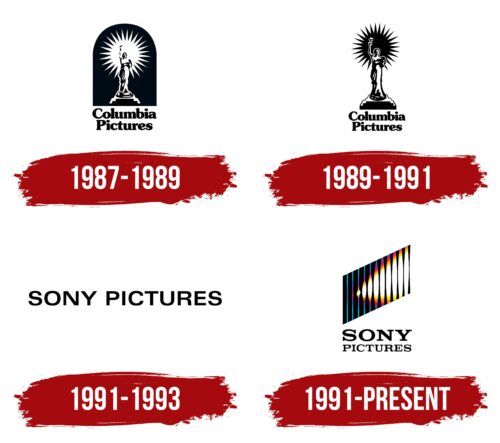
The logo depicts a slender young girl standing on a high pedestal with a torch in her right hand. She wears a flowing tunic; behind her, light is seen in the form of the sun with many sharp rays. The flame from the torch illuminates the figure and everything around her. The background for Columbia (the name of this character) is a half-cut oval that looks like an entrance. Below it is the name of the film studio, executed in bold letters with miniature serifs. The font is lowercase, except for the first glyphs, which are in uppercase. The inscription is centered.
1989 – 1991
After several years of experimenting with visual identity, the film company got a “negative” logo. In this case, the concept is not associated with negative impressions but with the effect of a photonegative, where on the film, all light objects are visible in black and dark ones – in white. Therefore, on the emblem, the girl with a torch, the fire, and part of the clothes became black. Designers completely removed the background but kept the two-level name.
1991 – 1993
After rebranding, the film company got a different name and a refreshed logo. This is a text sign in which there is nothing superfluous. The inscription takes up one line and is characterized by narrow inter-character space. All letters are in uppercase, grotesque, wide, and flattened.
1991 – today
This logo symbolizes the progress and development of Sony Pictures. It’s like a staircase leading upwards because it is associated with the evolution of the film company. This is evidenced by a series of vertical lines that are parallel to each other. Each of them has its individual thickness. But this is not the only interpretation of the emblem. It also has another concept, inspired by creative flight, professionalism, and even the torch in the hands of the girl depicted in the screensaver of the ancestor company – Columbia Pictures.
The fact is that in the center of the third vertical line is drawn a bright light, as from a flame, a movie projector, or a film camera. It actively grows to the right, capturing more and more space until it acquires a global scale. The beam of light is powerful and cone-shaped. Its middle is white, and the edges are yellow-red, like a real flame. The black-blue stripes are diagonally positioned: the lower left corner is lowered, and the upper right is raised. Under the rhomboid figure is the name of the studio. It is divided into two lines and typed in capital Roman font.
Font and Colors
Depending on the time of appearance of the Sony Pictures logos, different styles of writing are used in them. If, in the early versions, the bold font prevails, then later, a semi-bold and even thin font appear, demonstrating the sophisticated taste of the film studio. In particular, the serif typeface is Clarendon Bold Expanded, designed by Robert Besley. The humanistic sans-serif font is called SST.
The palette of the sign constantly varied, each time gaining more and more color. Therefore, it has grown from monochrome to a combination of several colors: black, white, blue, red, and yellow.
Sony Pictures color codes
| Bright Cerulean | Hex color: | #05afdb |
|---|---|---|
| RGB: | 5 175 219 | |
| CMYK: | 98 20 0 14 | |
| Pantone: | PMS 312 C |
| YInMn Blue | Hex color: | #3768b5 |
|---|---|---|
| RGB: | 55 104 181 | |
| CMYK: | 70 43 0 29 | |
| Pantone: | PMS 285 C |
| Purple Wine | Hex color: | #9e2f8e |
|---|---|---|
| RGB: | 158 47 142 | |
| CMYK: | 0 70 10 38 | |
| Pantone: | PMS 241 C |
| Outrageous Orange | Hex color: | #ee653b |
|---|---|---|
| RGB: | 238 101 59 | |
| CMYK: | 0 58 75 7 | |
| Pantone: | PMS 171 C |
| Orange Yellow | Hex color: | #fcda6d |
|---|---|---|
| RGB: | 252 218 109 | |
| CMYK: | 0 13 57 1 | |
| Pantone: | PMS 120 C |
| Black | Hex color: | #000000 |
|---|---|---|
| RGB: | 0 0 0 | |
| CMYK: | 0 0 0 100 | |
| Pantone: | PMS Process Black C |


