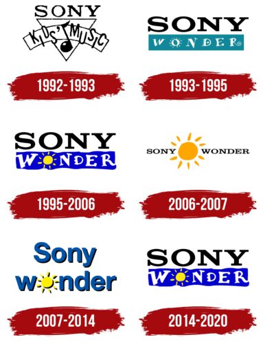
The joyful and positive Sony Wonder logo perfectly fulfills its function: it attracts a child audience, which the channel is intended for. The uplifted mood is felt not only in the drawing but also in the accompanying text.
Sony Wonder: Brand overview
| Founded: | 1992 |
| Founder: | Linda Morgenstern |
| Headquarters: | New York, United states |
| Website: | sonywonder.com |
Meaning and History

At the time of its appearance, Sony Wonder immediately acquired a personal logo. This happened in 1993. Before that, it used the emblem of the Sony Kids’ Music channel, which after merging with Sony Kids’ Video, gave a start to a new label. The emerging television service was supposed to be akin to Nickelodeon, so its visual identity received a similar style.
First, the brand adopted a text-based logo, where the presence of drawn elements was barely noticeable. Nevertheless, they were there, although in minimal volume. Then, it operated under a word-picture logo with a perfect balance of picture and text. Moreover, the designers beautifully played out the channel’s name, its specialization, and its child theme. They managed to fit the most important thing related to a positive perception of the world – the sun – into the concise design. It became the basis of the brand identity for many years, up to the abolition of the label as an independent broadcasting unit.
What is Sony Wonder?
Sony Wonder was an entertainment channel based on Sony Kids’ Music and Sony Kids’ Video. It was involved in the distribution of audio and video content for children and family themes. The label appeared in 1993 and was managed by Sony Music. In 2007, Sony Pictures Home Entertainment became its owner. In 2015, it turned it into a division of Sony Pictures Family Fun, and five years later, it merged it with Sony Pictures Kids Zone. Since 2020, it no longer exists as an independent channel.
1992 – 1993

The logo primarily features a music note placed between the words “Kids” and “Music.” They are positioned in the second row and are rendered in a thin, sans-serif font. Interestingly, the letters appear to jump as they are placed at different heights: one low, the next high. This alternation continues to the end of the line. The first level is allocated to the solid inscription “Sony.” It’s large, semi-bold, done in a corporate style, and occupies an honorable place on the edge of a downward-pointing triangle. The emblem’s palette is monochrome.
1993 – 1995
Upon its launch, the Sony Wonder brand received a personal mark. The developers retained the design of the previous emblem: two levels, one decorated in a serious style, the other – in a cheerful one. The top line is still occupied by the single word “Sony,” typed in a large Roman font. It has become even more bold and expressive. The second part of the name has modestly nestled in the second row. The inscription is executed in white letters with an individual character:
- The connecting stroke of “W” is curved;
- “O” is surrounded by short lines; hence it resembles the sun;
- The right edge of “N” is lowered, making it appear limping;
- “D” is supplemented with a bold dot in the center and speed lines on the left;
- The upper crossbar of “E” ends with a dot, and the lower one – with a square;
- The right leg of “R” is curled into a spiral.
The second part of the name is completely isolated: it is placed in an individual turquoise rectangle.
1995 – 2006

The emblem features a two-level brand name. The first word is in the corporate style of the parent company, and the second is playful and carefree. To achieve this effect, designers replaced the turquoise color with the bright blue of the neon spectrum, made the edges of the rectangle “democratic” by adding uneven, wavy lines, and used a yellow sun instead of “O.” They maintained the relaxed design of the letters – carefree, cheerful, childlike. However, the glyphs became thicker and bulkier.
2006 – 2007

For a brief time, there appeared a logo in which the sun took on a key role. It overshadowed the inscription, executed in a uniform design – stern and businesslike. To the left of the warm solar disk is the first part of the label’s name, and to the right – is the second.
2007 – 2014

This time the emblem became the opposite of the previous one. Graphics and text switched roles: now the word began to dominate, not the picture. To achieve this effect, the logo designers reduced the sun, returning it to the size of the original letter “O.” In addition, the glyphs were transformed into lowercase and adorned with right-sided shadows, adding a three-dimensional effect to the inscription. The palette also changed: preference was now given to restrained blue, black, and lemon-yellow.
2014 – 2020
The Sony Wonder logo is friendly and pleasant. The second part of the name is placed in a separate rectangle with uneven edges: they are wavy, which helps maintain an informal atmosphere. The letters are diverse, with individual designs, so they do not resemble real counterparts. Each has its style and mood. However, the first half of the inscription is a complete contrast to the second. The contrasting design is formed due to the restrained antiqua. In this case, the font is bold, capitalized, and printed.
Font and Colors
For the inscription in the Sony Wonder logo, a stylized version of Hermann was used, reminiscent of the Improv ICG font. They both have a similarly unserious design that fits perfectly into the context of a children’s channel.
The emblem’s palette is changeable. At different times, it was dominated by monochrome, a blue-yellow combination of white and turquoise colors. The only thing that remained constant was the black used for the inscription with the parent company’s name.
Sony Wonder color codes
| Medium Blue | Hex color: | #0501cd |
|---|---|---|
| RGB: | 5 1 205 | |
| CMYK: | 98 100 0 20 | |
| Pantone: | PMS Blue 072 C |
| Middle Yellow | Hex color: | #ffe811 |
|---|---|---|
| RGB: | 255 232 17 | |
| CMYK: | 0 9 93 0 | |
| Pantone: | PMS 803 C |
| Black | Hex color: | #000000 |
|---|---|---|
| RGB: | 0 0 0 | |
| CMYK: | 0 0 0 100 | |
| Pantone: | PMS Process Black C |


