


 Sound Blaster Studio Logo PNG
The Sound Blaster Studio logo symbolizes the power and purity of sound, which are the brand’s foundation. It immerses users in a world of audio innovation, where every detail is designed for perfect sound quality. The emblem reflects the company’s commitment to cutting-edge technologies that make sound audible and tangible. The brand began with the development of audio solutions that transformed the experience of music, gaming, and multimedia, eventually becoming a symbol of high-quality sound for professionals and enthusiasts. The studio’s symbol embodies its mission to create equipment that merges technology with emotion, enhancing the audio experience for users.
Sound Blaster began in 1987, when Singapore-based Creative Technology, founded by Sim Wong Hoo, entered the PC audio market after producing memory modules and computer accessories. In 1989, Creative released its first Sound Blaster card with Yamaha YM3812 FM synthesis, digital audio, and compatibility with the AdLib Music Card, giving game developers a solid technical foundation.
Sound Blaster Pro added stereo playback in 1991, followed by Sound Blaster 16, which added 16-bit audio and MIDI support in 1992. AWE32 introduced wavetable synthesis and ROM-based instrument samples in 1994, while AWE64 expanded polyphony in 1996. In 1998, Sound Blaster Live! brought the EMU10K1 processor and EAX technology for real-time audio effects in PC games.
Audigy arrived in 2001 with DVD-Audio and 6.1-channel output. Audigy 2 followed in 2003 with 24-bit processing and 7.1 support, while the X-Fi series debuted in 2005 with 192 kHz processing and separate modes for gaming, music and content production. By 2008, Creative had expanded into external USB devices such as X-Fi Go! and Play! as laptops reduced demand for internal cards.
Creative returned to internal sound cards with the Z series in 2012. The AE-5 added RGB lighting and a high-impedance headphone amplifier in 2016, while the AE-9 received professional audio connectors and an external control unit in 2018. External X3 and X4 models followed in 2019 and 2020. By 2023, the Sound Blaster range still included internal cards and external desktop audio devices.
Meaning and History
What is Sound Blaster Studio?
This software suite enhances and personalizes sound across various devices and applications. This powerful audio control hub elevates gaming and entertainment experiences, offering professional-grade features such as virtual surround sound processing, advanced equalizer settings, and acoustic engine management. With a user-friendly interface, the software makes professional audio tuning accessible to casual users and audio enthusiasts. Its features include customizable audio profiles, bass enhancement, dialogue clarity, and specialized gaming modes, providing complete control over the audio experience.
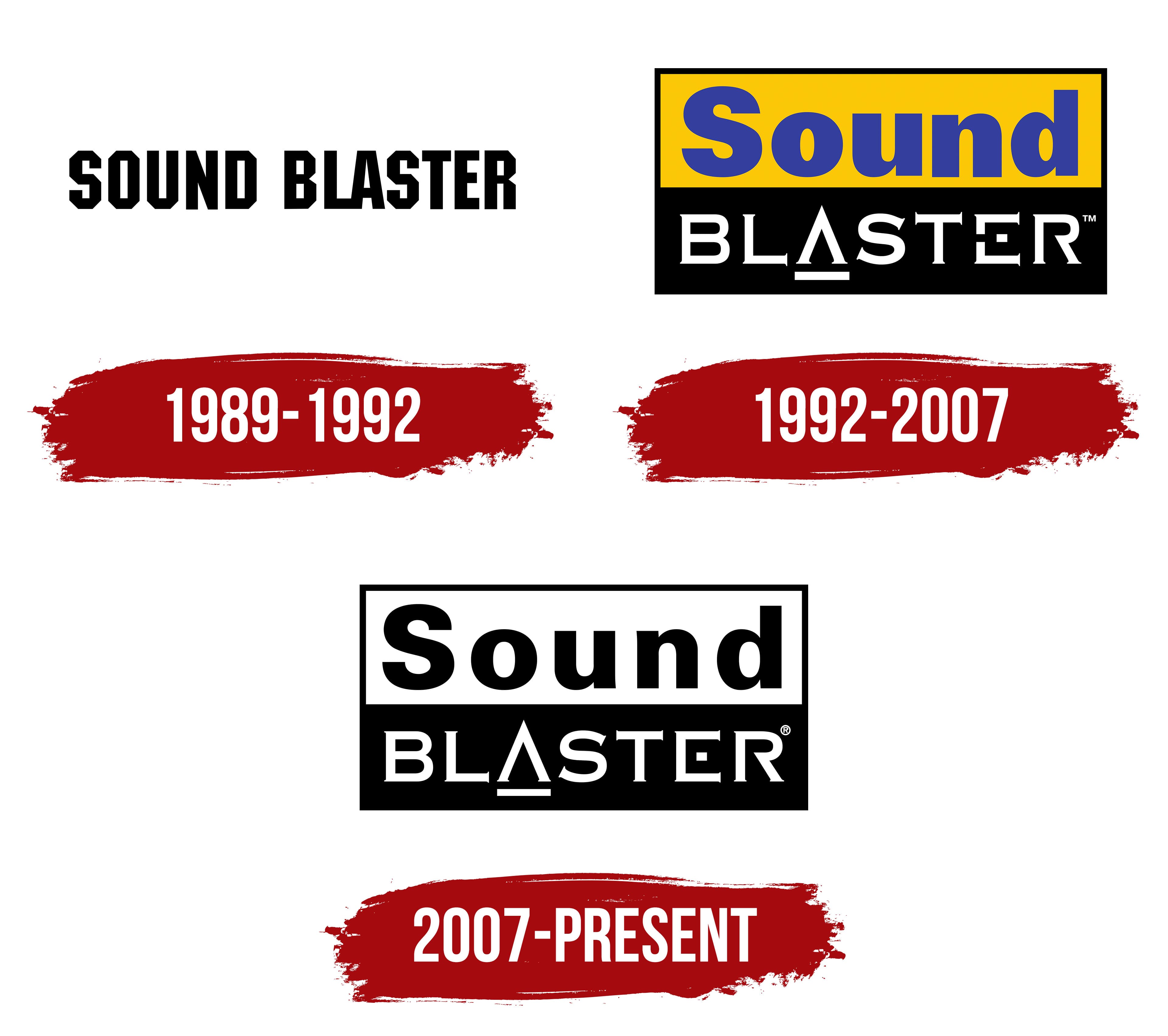
1989 – 1992

From its early years, the Sound Blaster logo reflects the industrial and technocratic style of the late 1980s, when technology was advancing rapidly and every new product felt like a step into the future. This logo conveys power and reliability, perfectly suits sound cards, and revolutionizes the computer world.
The letters in the logo are designed in a large, rigid font with sharp angles and clean lines, emphasizing strength and durability, key traits for a product meant to last for years and deliver high-quality sound. Each letter appears monolithic and slightly rough, symbolizing straightforwardness and confidence. The geometric structure of the font reinforces this impression: every element is built on strict lines, with no softness or roundness.
The palette is free from distracting details, making it clear that the focus is on the device’s functionality and capabilities. The black-and-white style conveys clarity and technical reliability, implying that this product is built for serious performance. During the era of early personal computers, this style inspired confidence in buyers.
The name “Sound Blaster” promises a sound that literally “blasts” through space. At the time, computer audio was limited to primitive capabilities, and the advent of such hardware marked a true breakthrough. The name underscores the brand’s ambition to be the PC’s most powerful and leading sound device.
1992 – 2007

The Sound Blaster Studio emblem stands out with a bright, memorable design that emphasizes the brand’s connection to audio technology and high-quality sound. The composition is divided into two parts, upper and lower, each carrying its meaning and highlighting the brand’s unique features.
The upper part of the logo features the word “Sound” against a yellow background, with the text in deep blue. The contrast is deliberate: blue conveys professionalism and quality, while yellow adds energy and positive dynamism. Creative Technology established the brand in the late 1980s and was among the first manufacturers to offer affordable and high-quality sound cards for personal computers. The vibrant yellow-and-blue design makes the logo stand out, emphasizing the brightness and power of sound, which are key characteristics of Sound Blaster technology devices.
The lower part, with the word “Blaster,” is styled in a black-and-white color scheme, highlighting rigor and reliability. The font includes unique graphic elements, such as the underline beneath the letter “A” and distinctive letter endings, adding a technological and stylish touch. This design evokes associations with advanced technology and underscores the characteristic sound, symbolizing the strength and clarity of audio. Since its inception, Sound Blaster has become a symbol of high-quality PC audio, and this font reflects the innovative approach that has always been at the brand’s core.
The Sound Blaster Studio logo visually separates the words “Sound” and “Blaster,” while conceptually emphasizing the division between sound as the foundation and technology as the means of delivering it. This design symbolizes the essence of the company’s devices, which focus on creating powerful and high-quality sound through innovative development.
2007 – today

After 2007, the Sound Blaster logo underwent significant changes, becoming black-and-white and more versatile. This shift was likely driven by the company’s desire to make the logo more adaptable for various uses, from printing on packaging to digital applications. The new logo retains the original elements but eliminates color contrast, making it less dependent on the background and easier to adapt to different contexts.
This versatility allows the logo to be used across all marketing materials without losing its recognizability. The black-and-white colors can be reversed as needed; for example, the logo can be white on a dark background or black on a light background, offering greater flexibility in applications.
The styling of the “BLASTER” letters remains unchanged, with the same strict, distinctive design. The letter “A” resembles a triangle with a horizontal line at the base, while the letter “E” appears unfinished, emphasizing a sense of technological sophistication and modernity. These details enhance the logo’s distinctiveness, showing that the brand stays true to its roots even with a color change.