The SoundCloud logo is an encrypted message. It says: “the audio track is stored in the cloud.” The emblem invites the listener to open the vault, from which an endless melodic stream will flow, uplifting.
SoundCloud: Brand overview
| Founded: | August 2007 |
| Founder: | Alexander Ljung, Eric Wahlforss |
| Headquarters: | Berlin, Germany |
| Website: | soundcloud.com |
Meaning and History
The social sound platform attracts tens of millions of users – both listeners and music publishers. Therefore, many authors and fans of audio content are very familiar with the SoundCloud logo, which was adopted a year after the company’s official launch. It makes the website recognizable because it has never changed since 2008: the owners are confident that the chosen design perfectly matches the concept of the project.
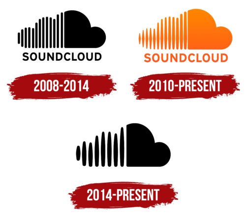
The combo sign contains two elements: a stylized cloud image and a brand name written in sans serif capital letters. Orange also plays an important role. It is a defining part of the SoundCloud identity, its trademark in the music streaming world.
What is SoundCloud?
It is an online service for distributing audio recordings and a website for sharing music between users. SoundCloud is designed to download and promote sound files for streaming content. It appeared in 2007 and is headquartered in Berlin (Germany). The founders of the platform are Eric Wahlforss and Alexander Ljung.
2008 – 2014
The first SoundCloud logo was black and white. It contained a stylized cloud whose left side consisted of thirteen wide vertical stripes with rounded ends. All lines were of different lengths. The right side of the emblem was completely painted over and looked like a heart symbol turned on its side. At the bottom was the name of the music streaming platform. The lettering was done in Interstate Bold, a geometric grotesque with clear lines.
2010 – today
In 2010, both the stylized cloud and the letters on the SoundCloud logo changed to orange. And at the same time, the designers changed the shape of the stripes, expanding them in the middle – so that all the thickenings were symmetrical; that is, they were approximately at the same level. In addition, they used a subtle gradient: if you look closely, it becomes clear that the top is slightly lighter than the bottom. As for the inscription, only the color has changed, so now all logo elements look bright.
2014 – today
In 2014, another emblem version appeared – this time without a word mark. After the redesign, only the cloud remained, but it also began to look different. First, the developers have reduced the number of vertical stripes to eight. Secondly, they expanded them, giving each fragment the shape of an ellipse with thickened ends. The logo is presented in classic black color.
SoundCloud: Interesting Facts
SoundCloud started in 2008 and changed how artists share their music, making it easier for them to reach listeners.
- Founders: Alexander Ljung and Eric Wahlforss started SoundCloud in Sweden and then launched it in Berlin. They wanted to make sharing audio online easier.
- User-Generated Content: SoundCloud stands out because it mostly consists of music, podcasts, and audio uploaded by its users. It’s a go-to place for new and independent artists.
- Waveform Player: SoundCloud’s player shows the audio’s waveform, allowing listeners to see the track’s highs and lows and comment on specific parts.
- Growth: Since starting, SoundCloud has become huge, with millions of users and tracks. It helps artists reach fans directly, bypassing traditional music labels.
- SoundCloud Rappers: The platform helped create “SoundCloud rap,” known for its raw sound and DIY distribution. Artists like XXXTentacion and Post Malone first got noticed here.
- Making Money: Artists can make money on SoundCloud through its Premier program. SoundCloud Pro also offers more tools and stats for creators.
- Creative Commons: SoundCloud allows artists to use Creative Commons licenses, making collaborating and remixing tracks easier.
- Sharing: Music from SoundCloud can be shared easily on other social media, helping artists gain more exposure.
- SoundCloud Go: In 2016, SoundCloud added SoundCloud Go, a paid service with more tracks, offline listening, and no ads, competing with other streaming services.
SoundCloud has significantly impacted the music world by making it more accessible for creators and fans. It’s a key place for discovering new music and supporting emerging artists.
Font and Colors
At first glance, the emblem seems very simple: there is an abstract cloud at the top and the usual sans serif lettering at the bottom. But the details are important here because they carry the ideological load. The vertical lines that make up the left side of the cloud deserve special attention. There are only thirteen of them: two high, six medium, and five low. Some stripes have an elongated diamond shape.
This is not just a “zebra pattern,” but a stylized image of sound waves. A similar visualization of audio is displayed when playing any track in the SoundCloud app. The cloud, in turn, symbolizes the scale and versatility of the platform. It indicates that a huge amount of content is concentrated on the website.
Below is the service’s name, with “Sound” under the waves of the audio file and “Cloud” under the solid cloud. The graphic part of the logo illustrates the meaning inherent in these words and is inextricably linked with them.
The logo, website, and SoundCloud app all use the same font – Interstate Bold. It was created by American printer Tobias Frere-Jones specifically for the Font Bureau digital foundry. It has something in common with the Highway Gothic grotesque that FHWA developed for road signs.
The palette appears monotonous because the only orange is represented in it. But this is not entirely true – there are versions of the logo with a gradient of several shades: Portland Orange, Coral Red, Smashed Pumpkin, Deep Saffron, and Orange (Crayola).
FAQ
Why did SoundCloud change its logo?
SoundCloud changed its logo from orange to blue to promote Billie Eilish’s new album, “Hit Me Hard and Soft.” The album cover is mostly blue, showing Billie floating in water with a door above her. The brand visually connected with the album’s theme by changing the logo color.
This change was part of a marketing strategy to highlight Billie Eilish’s album and offer a cohesive visual experience for listeners. The blue logo matched the album’s look, making the promotion more effective and memorable. This temporary logo change showed SoundCloud’s support for a major artist’s release and engagement with the music community.
Is SoundCloud better than Spotify?
Comparing SoundCloud and Spotify involves examining music quality, artist variety, and platform features. Spotify generally offers better music quality, higher audio fidelity, and a more consistent sound. It features many well-known artists and polished tracks.
Spotify excels at curating playlists and providing a seamless listening experience. It uses algorithms to suggest music based on user preferences, making discovering new tracks and artists easy.
SoundCloud appeals to independent artists and fans of niche genres. It allows anyone to upload music, resulting in diverse content. This inclusivity is a strength, allowing emerging artists to share their work and gain exposure.
While Spotify provides a polished and consistent experience, SoundCloud offers a sense of community and discovery that is hard to match. The choice between the two depends on what the user values more: high-quality, mainstream music with excellent curation or a diverse array of independent tracks.
What does the SoundCloud logo color mean?
The orange and white color palette of the logo represents the optimistic character and creativity of the company. The vibrant orange evokes energy, enthusiasm, and warmth, aligning with the brand’s dynamic and creative nature. This color conveys positivity and excitement, encouraging users to explore and share new music.
The white in the logo adds simplicity and clarity, balancing the boldness of the orange. It reflects the clean and user-friendly design of the platform, making it accessible and inviting. The combination of orange and white creates a visually appealing and harmonious logo. It evokes happy and energetic feelings, reflecting the brand’s mission to inspire and connect people through music.
What do the SoundCloud symbols mean?
The logo’s symbols represent sound waves on the left side that gradually form a cloud on the right. The sound waves symbolize individual sounds or audio tracks. These waves combine to create a cloud, showing the brand as an internet platform for sharing and discovering music.
The design highlights collaboration and community, where individual creators contribute unique sounds to form a collective audio experience. The cloud symbolizes the platform’s online nature, where all these sounds are stored and accessed digitally.
This design emphasizes the platform’s role in bringing individual audio tracks together in a shared online space for music discovery and collaboration.
Why is the SoundCloud logo orange?
The brand chose orange for its logo because it represents positivity, good humor, and optimism. The developers wanted their service to evoke positive emotions and bring joy to users.
Orange is a vibrant, energetic color that stands out, making the logo easily recognizable. It creates a sense of excitement and enthusiasm, aligning with SoundCloud’s mission to inspire creativity and connect people through music. The color conveys the brand’s friendly and approachable nature, encouraging people to explore and share their music on the platform.


