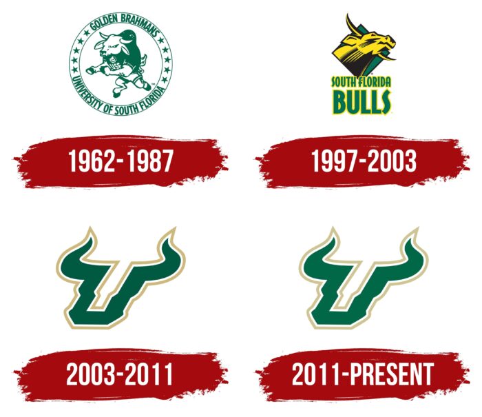
Designed for the South Florida Bulls the logo represents the first letter of the USF acronym. The green “U” is stylized as a bull’s head: curved horns with sharp ends are depicted on top, and thickenings in the lower part look like nostrils flared in anger. The emblem’s sharp lines and tilt to the right create a sense of dynamism.
South Florida Bulls: Brand overview
| Founded: | 1997 |
| Headquarters: | Florida, United States |
| Website: | gousfbulls.com |
Meaning and History
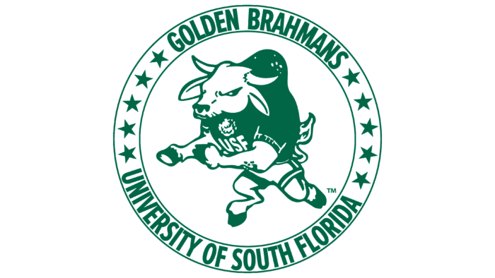
The history of the South Florida Bulls logos began in the 1960s when USF had its first sports team. The mascot of the athletes was the powerful and mighty bull American Brahman, which was associated with strength, perseverance, and longevity. This animal has become famous for its special resistance to high humidity and tropical heat. The artists depicted him in some detail on early emblems, albeit in a cartoon style.
At first, he was presented in full growth, and then only one head remained – yellow, with black shadows. That all changed in 2003 when marketing agency Silverman Group designed the South Florida Bulls’ iconic Bull U, a green “U” with horns.
What is South Florida Bulls?
The South Florida Bulls are almost two dozen sports teams that play for the University of South Florida at the NCAA Division I level. Most of them compete in the American Athletic Conference, except the sailing team participating in the South Atlantic Intercollegiate Sailing Association. The USF athletics department began in 1964 when President John S. Allen changed his mind about intercollegiate competition and decided that students’ daily lives should not be limited to education.
1962 – 1987
The circular emblem, consisting of an anthropomorphic bull of formidable appearance and the surrounding inscription, dates from that time. The animal stands on its hind legs, dressed in a sports uniform with the abbreviation “USF” on its chest. The horns are spread wide, the ears are down, and a high hump can be seen on the back. The large trim ring bears the name of the athletic department, “Golden Brahman. It is separated from the lower text by ten stars – five on each side. All elements of the logo are in green on a white background. The letters are grotesque, bold, and elongated.
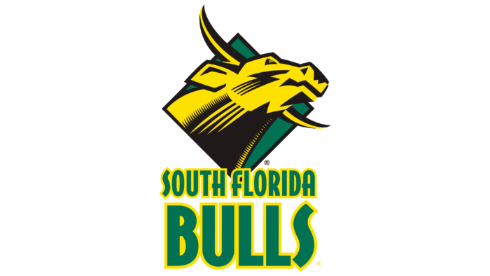
1997 – 2003
After a redesign before the fall soccer season, the image of the bull was changed to show the power, strength, and bravery of the athletes. For this, the designers used confident lines, jerky strokes, geometric proportions, and precise angles. The result was a golden head of a cloven-hoofed animal placed on a dark green rhombus background. It has a red eye, sharp side-splitting horns, and a trapezoidal ear.
The muzzle shows a zigzag pattern resembling a lightning bolt with a 4-line branching at the end. The same stripes are located on the massive neck but in different colors. The combination of black and yellow emphasizes the atmosphere of increased danger. The bull has his head up and looks down at his opponent. Nearby is the name “South Florida Bulls,” typed in flat, streamlined letters with yellow trim. Prominent among them is a wavy “S,” an “H” with a protruding crossbar, and a capital “F,” made as if it were a lowercase letter.
2003 – 2011
This period is famous because that’s when the current version of the emblem was first proposed – simple but very symbolic. It is called Iconic Bull. The author of the modified logo is the Silverman Group studio. The new visual identity mark presents a harmonious two-in-one concept: the first letter of the university’s abbreviation, to which the sports department belongs, and the image of a steep bull. The associative connection between the symbol and the animal’s muzzle can be seen in the shape and thickness of the lines.
2011 – today
The result of the redesign was a correction of the color palette. It was shifted by several tones towards lightening, so now the colors on the logo are a little softer than before.
Font and Colors
In their identity, the South Florida Bulls use a typeface similar to Serpentine Italic or Serpentine Bold Oblique. But neither the first nor the second has the iconic letter “U” with sharp horns. So the sports team logo features a custom glyph, custom-created in collaboration with the Silverman Group. This non-standard pattern imitates a bull’s head and repeats its shape, except for the central recess.
The emblem’s color palette consists of dark green (PMS 342 / #006747) and gold (PMS 4535 / #D6CCA3). Approximately the same shades were presented in the original logo, which, as is known from the archives, was used until 1981. The golden color appeared in the team’s identity because their first mascot was a bull of the Golden Brahman breed.
South Florida Bulls color codes
| Lion | Hex color: | #cfc493 |
|---|---|---|
| RGB: | 207 196 147 | |
| CMYK: | 0 5 29 19 | |
| Pantone: | PMS 4535 C |
| Bottle Green | Hex color: | #006747 |
|---|---|---|
| RGB: | 0 103 71 | |
| CMYK: | 100 0 31 60 | |
| Pantone: | PMS 3415 C |
