The Southern Airways logo exudes strength and tranquility. Like a smooth river, the company’s airplanes continuously ascend into the sky. These are powerful large liners, and passengers can be confident in their reliability.
Southern Airways: Brand overview
Southern Airways began as a regional airline in 1949 under the leadership of Frank Hulse. Based in Birmingham, Alabama, the airline began with a small piston aircraft fleet, offering short flights to cities in the southeastern United States.
In the 1950s and 1960s, the airline expanded its route network to all southern states, including Georgia, Florida, Tennessee, and others.
In the late 1960s, Southern Airways converted to jet airplanes, switching from piston to turbine engines.
Under Frank Hulse’s visionary leadership, Southern Airways expanded beyond passenger transportation and diversified its services. The company opened subsidiaries specializing in aircraft maintenance, ground handling, and cargo transportation, leveraging its regional expertise.
In 1979, Southern Airways merged with North Central Airlines to form Republic Airlines. The merger created a larger, more competitive airline with an expanded route network and operational capabilities.
Meaning and History
What is Southern Airways?
It is a regional airline based in the United States. It operates a network of domestic flights, focusing on providing air connectivity to smaller communities and connecting them to major hubs. Known for its convenient service, the company offers several scheduled and charter flights. The airline’s fleet comprises small commuter aircraft well suited for short routes, making it an indispensable air transportation provider for low-income regions.
1944 – 1966
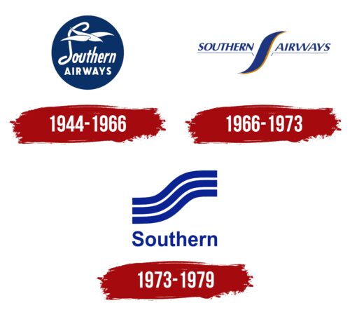
Founded in 1944 and operating until 1966, Southern Airways actively used its logo to reflect the key aspects of its aviation activities. The logo was designed to visually convey the ideas of harmony and perfection the company aimed to offer its passengers.
The central element of the logo is an image of a white bird styled in an elegant loop resembling the letter S, which represents both the company’s name and the speed of its service. This bird is depicted against a blue circle, evoking the color of the sky. The bird is shown gliding smoothly through the air, executing a landing—a dynamic yet graceful maneuver.
Southern Airways operated a limited number of routes designed for short flights, allowing passengers to reach their destinations very quickly, almost as if they had just boarded the plane. The logo emphasized this feature through the symbolism of swiftness and the beauty of flight.
The company’s aircraft were known for their smooth and streamlined shape, which allowed them to glide easily and freely through the sky, much like the bird. This aspect was crucial for creating an image of comfort and ease of flights offered by the airline.
The white font in the Southern Airways logo emphasizes cleanliness and comfort, with an additional emphasis on the high level of service and coziness passengers can expect on board the company’s planes. Cleanliness and comfort on board are key components that make traveling with Southern Airways a pleasant and memorable experience.
1966 – 1973
The visual design of Southern Airways’ aircraft is notable for its vivid blue and orange stripes that merge, creating an impressive fuselage design. These colors serve both decorative purposes and carry symbolism and functionality. The dominant blue in the design evokes the vast expanses of the sky, which is the natural environment for any aircraft. Orange adds warmth and comfort, crucial for passenger comfort during flights.
The aircraft’s wings are adorned with thin lines bearing the airline’s name—Southern Airways. The distribution of letters on both sides of the fuselage ensures visual balance, symbolically emphasizing the aircraft’s stability and reliability. This design decision makes the airliner appear harmonious and stylish, highlighting its readiness for long and safe flights.
The combination of these colors and elements forms an attractive appearance and speaks to the airline’s commitment to creating the most pleasant conditions for its passengers.
1973 – 1979
The Southern Airways logo consists of just two elements: An “air wave” and the first part of the company name. The wavy structure consists of three cobalt blue stripes of equal width. They are separated by two white stripes, exactly repeating the shape of the neighboring lines. Underneath these design elements is a one-word text. Visually, the text echoes the upper “waves” in color and the smoothness of the strokes. The font is predominantly lowercase, except the letter “S.” The letters are optimally spaced and not serifed.
The cobalt blue stripes symbolize movement and travel, while the white stripes symbolize purity and clarity, corresponding to the air travel theme. A predominantly lowercase font with a single capital “S” gives the design a modern, accessible look. Optimal letter spacing ensures easy readability, essential for quick identification in a business environment.


